


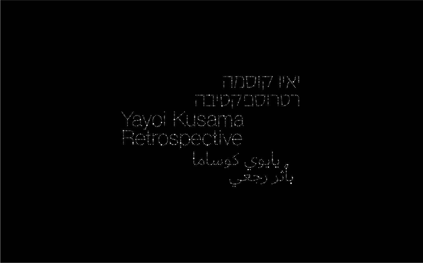


LOGOS & MARKS
Commissioned logos & marks for various clients throughout my career as a graphic designer.Credits: Studio 58 created with Dan Alexander & Co. Hamachon - done in collaboration with Itai Raveh. HKU-TLV & Yayoi Kusama Retrospective exhibition - done in collaboration with Noa Schwartz. 88 - done in collaboration with Ofir Liberman

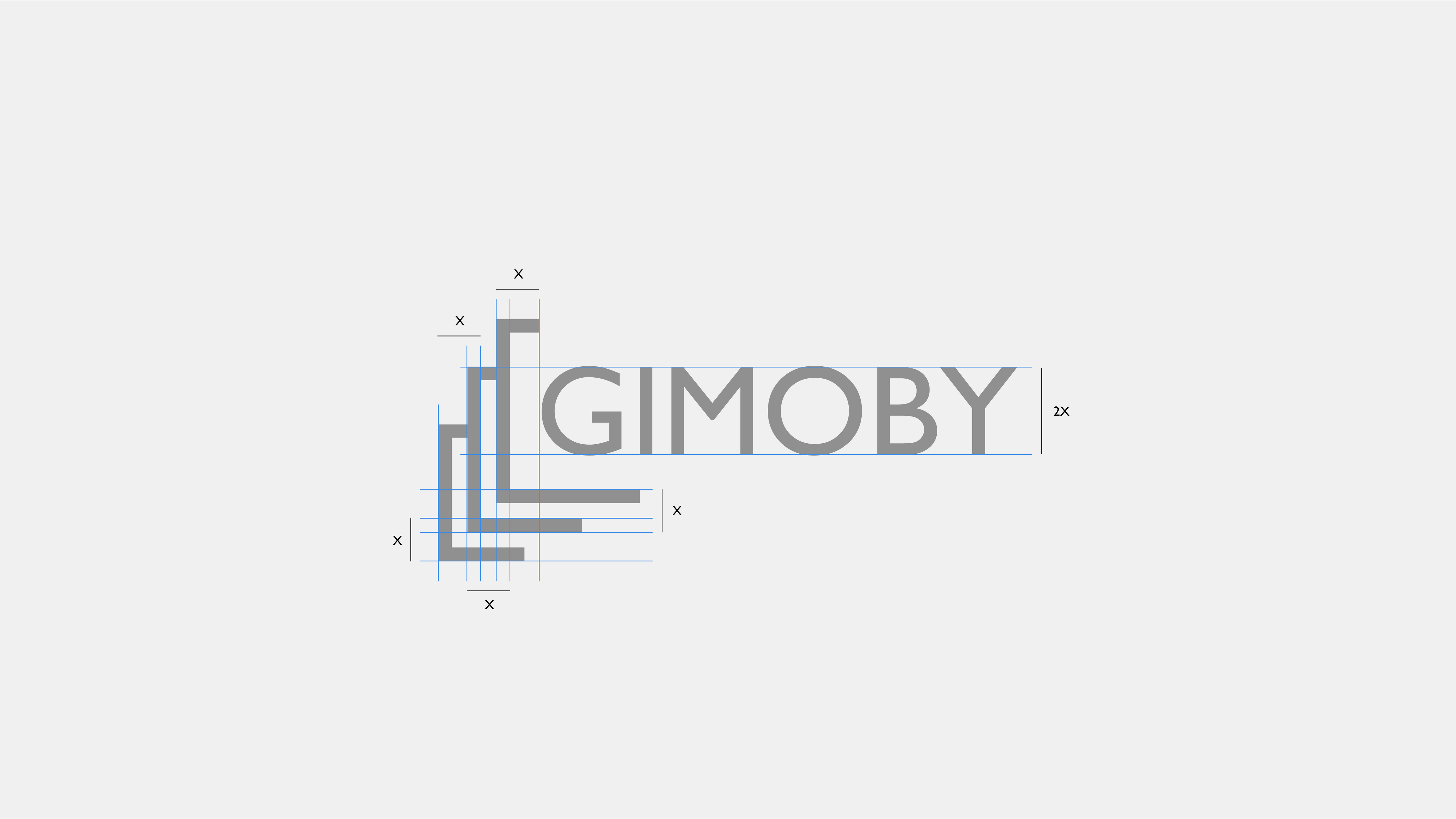

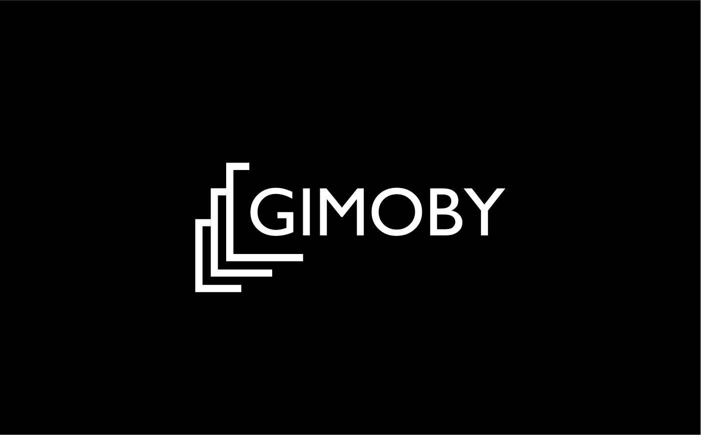
GIMOBY
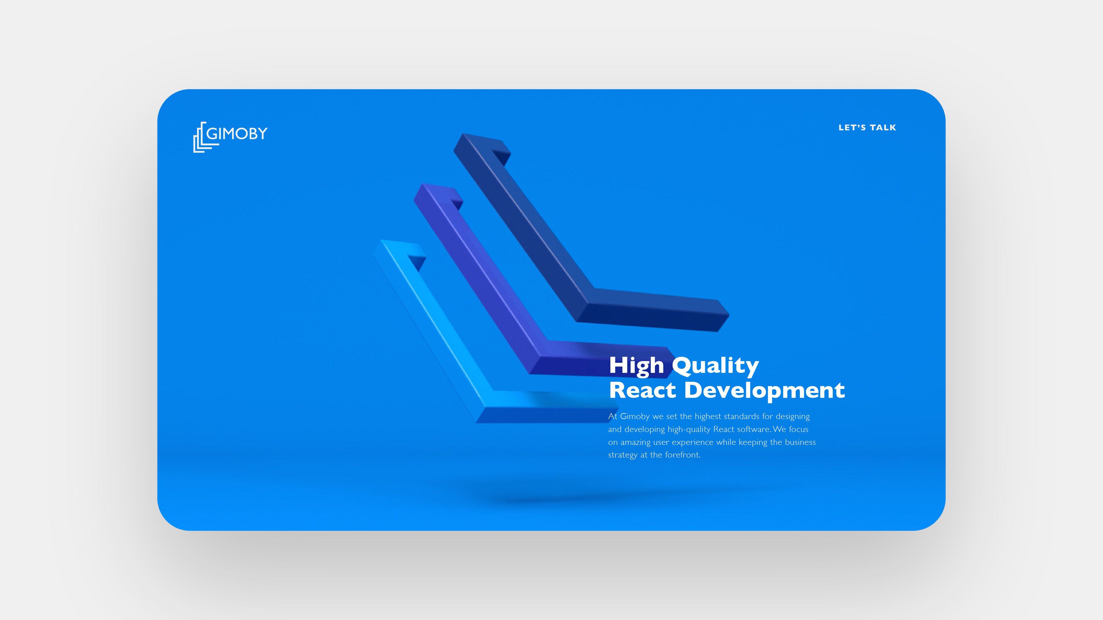
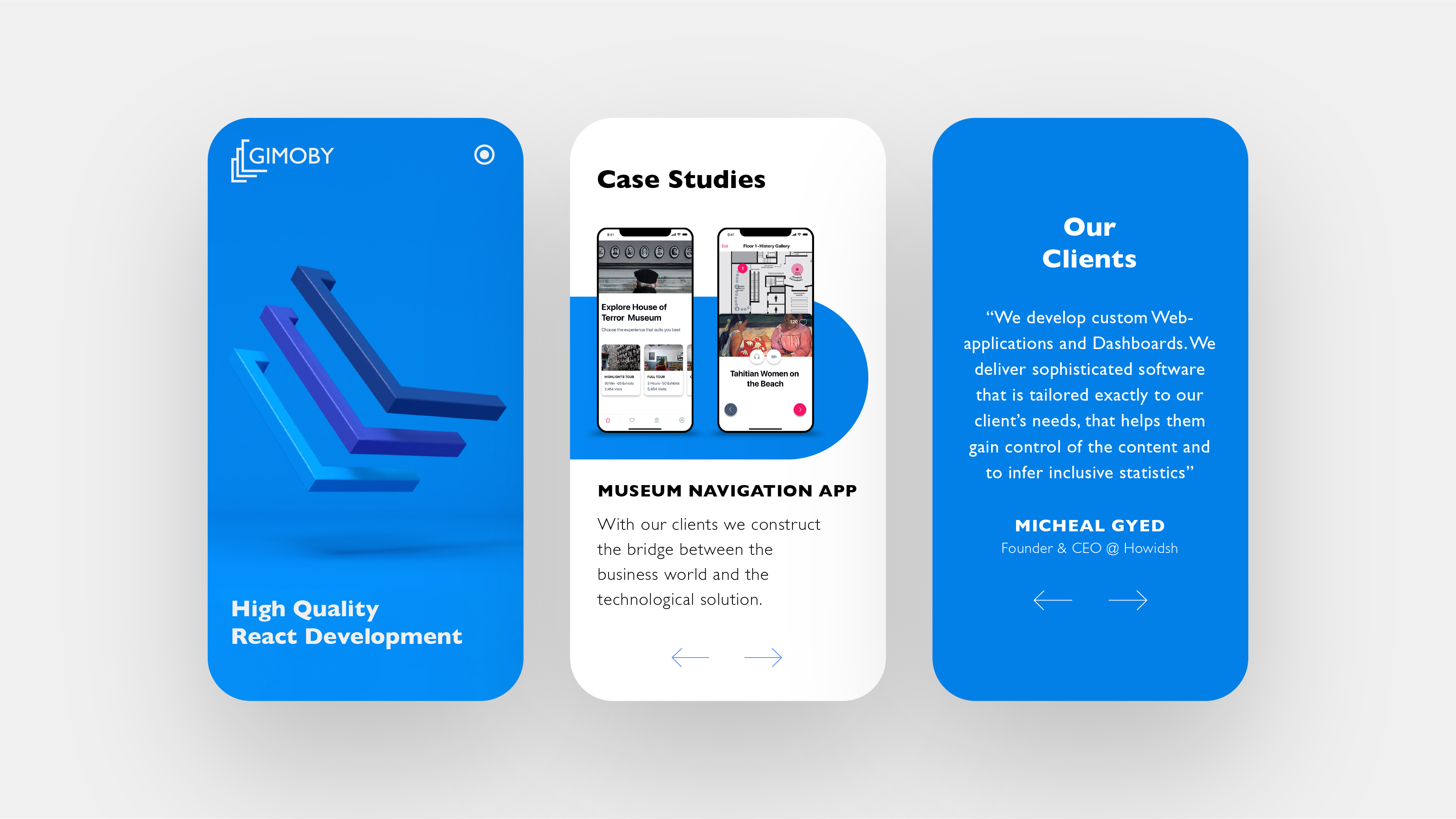
Branding for React software development company based in Tel Aviv. The company provides quick, tailored end-to-end technological development services. Gimoby was established to fill this perpetual need and supply the market with fast, custom-made interfaces.In software development, there are ones and zeros, and then there’s the developer. Three parts that come together and make a program. This concept was used as inspiration for the Gimoby logo: three elements resembling brackets – a shout out to the very brackets used in coding – that merge together to create a three-tiered unit.
The design language is minimalist, evoking vibes of hi-tech innovation with three shades of blue. Here, again, the triple-actor element was brought to life. The banner ... is a three dimensional representation of the logo, to inspire a sense of realness, nearly plastic, of the product itself. This is technology incarnate – ideas and code materializing.
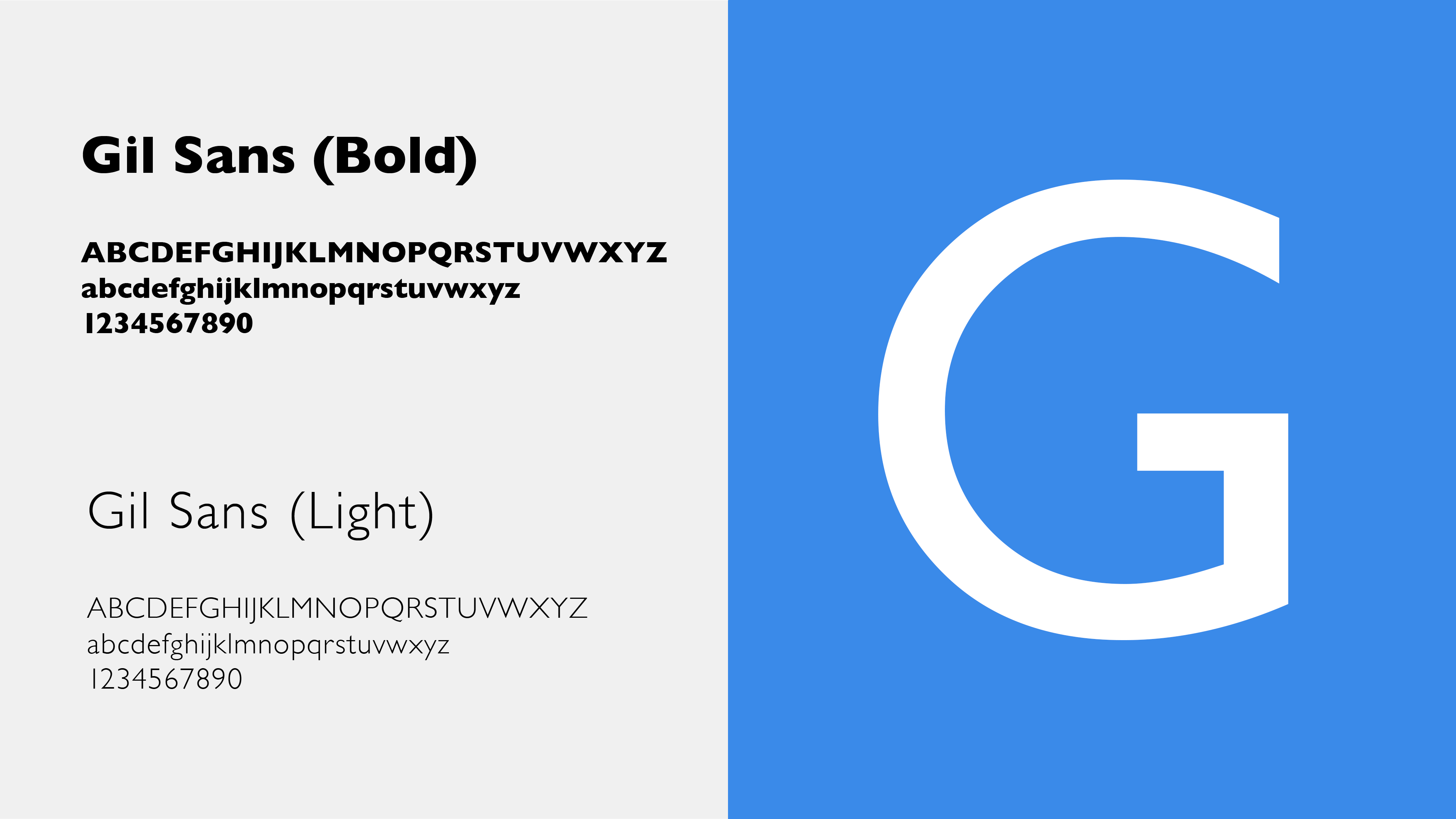
The rest of the website follows a very minimalist theme – linear icons in three variants of blue, alongside black texts in Gill sans, a font associated with a sort of restrained professionalism. The larger bold fonts grab the attention of the reader and attract their attention.
Commissioned work, 2019
Creative Director & Designer: Liad Shadmi
3D Animation: Elad Malca
Icon Animation: Ron Baltuch
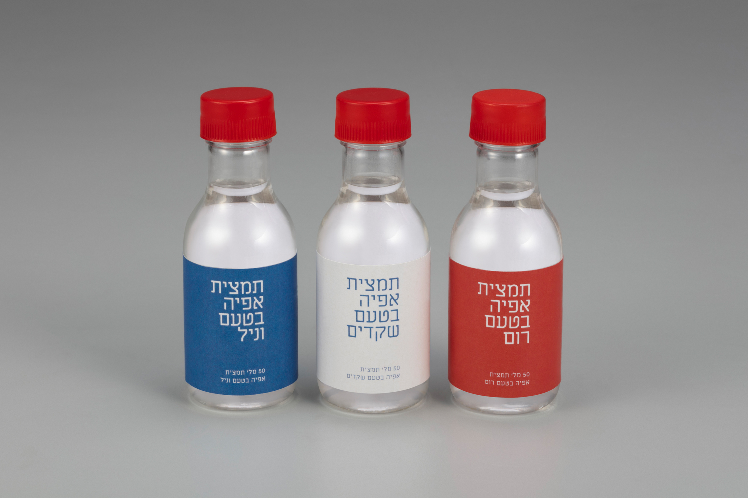
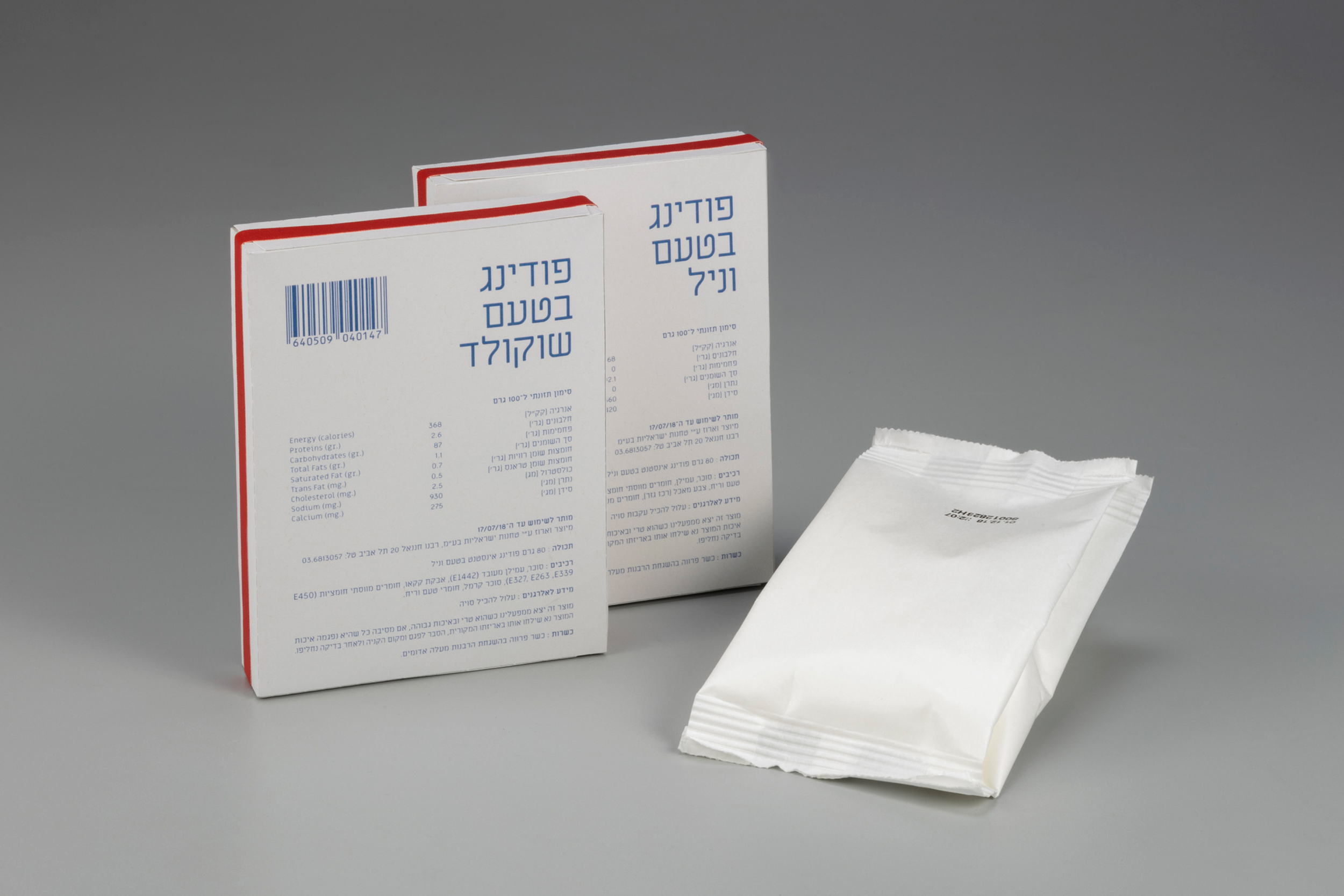
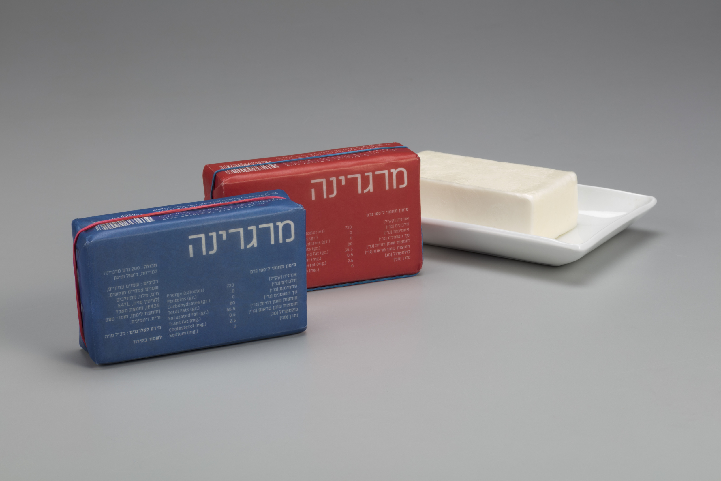
AUSTERITY PACKAGING
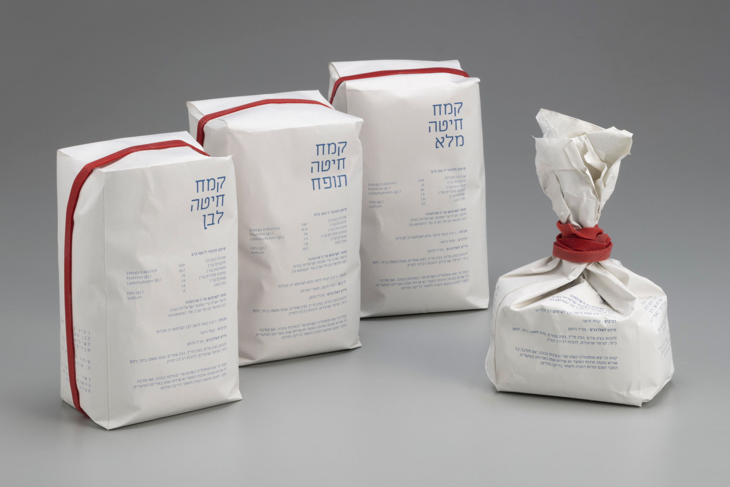
Baking materials Packaging influenced from the Austerity regime in Israel. From 1949 to 1959, the state of Israel was, to a varying extent, under a regime of austerity (Hebrew: צנע, Tzena'), during which rationing and similar measures were enforced.The design draws values of simplicity, functionality and meagerness. Each package has a red mark that indicates the opening.
Featured on Packaging of the World
Featured on World of Packaging Design
Featured on Fonts in Use
Selected as semifinalist on Adobe Awards
Packaging Design Course, Shenkar, 2018 | Guidance: Dekel J. Maimon


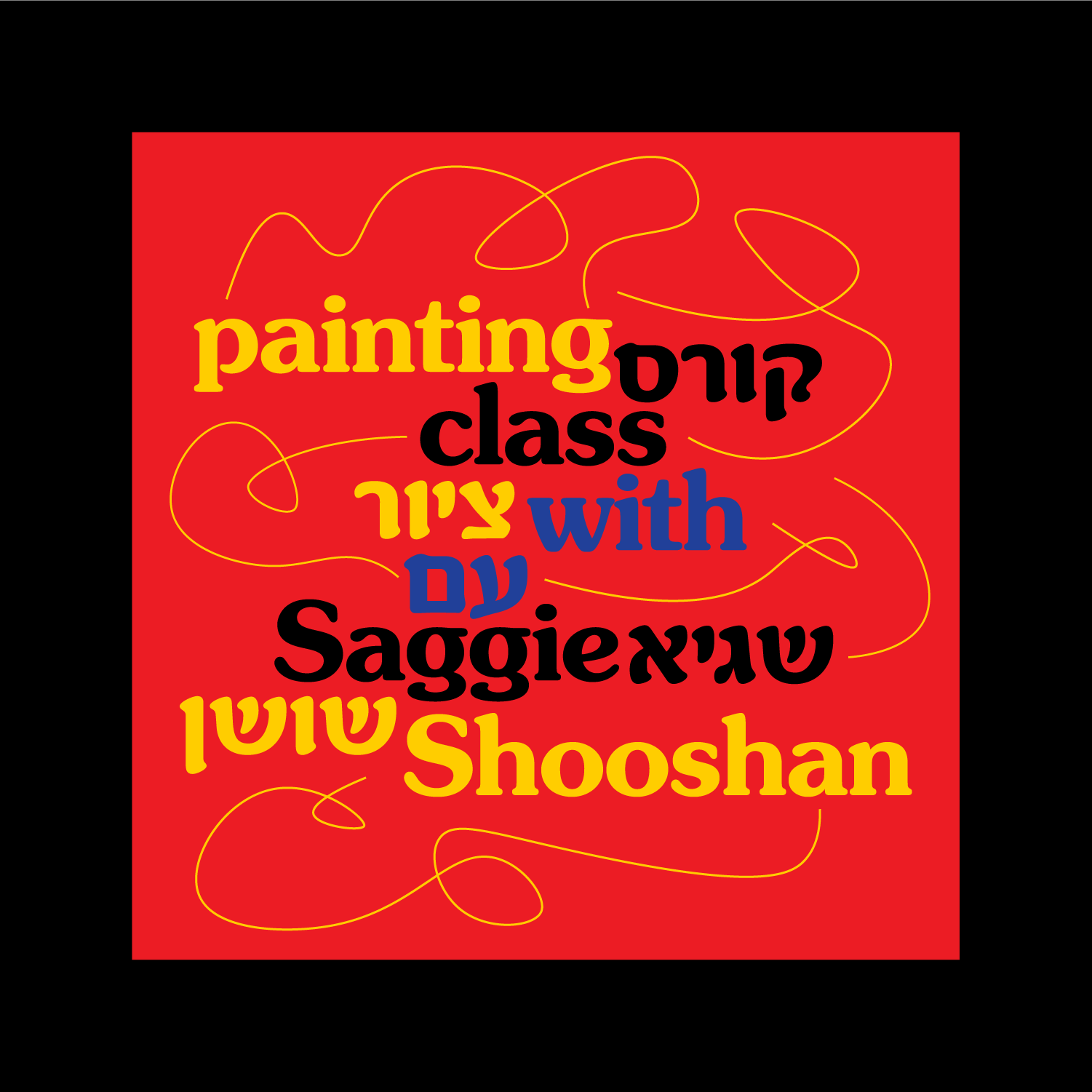


GOOD ENOUGH PAINTING
For this project, I created a bilingual brand identity and logo for a drawing school in Tel-Aviv. The school's target audience consisted mostly of young millennials who may not necessarily speak Hebrew. My objective was to tap into the nostalgic memory that people often have from their first drawing lesson in school - the magic of mixing primary colors to create a full spectrum of colors. I aimed to connect the target audience with their childhood memories and to encourage them to overcome their inhibitions about drawing in a playful and creative way.
To achieve this, I used the Hebrew font Narkis Hen together with the Latin font Souvenir, which is associated with the Art Nouveau and Arts & Crafts movements, both of which have a strong connection to drawing and painting. I also incorporated elements from the Bauhaus movement, which is closely tied to the city of Tel-Aviv.
Commissioned work, 2022Image Credits: Store Closing Everything Must Go, Safe-Sex, Austerity Baking Brand, Kleen (P. 1, 2) and Typography in Circular Motion (P. 1, 9) were shot by Keith Glassman. The Alphabetical Room was shot by Michael Kohls. Fahrenheit 451 was shot by Revital Topiol. The Road Begins in Capernaum shot by robstolk®.