

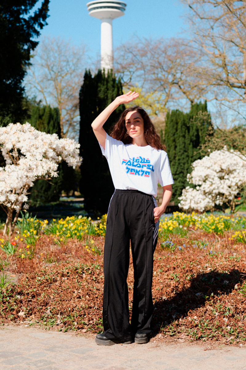
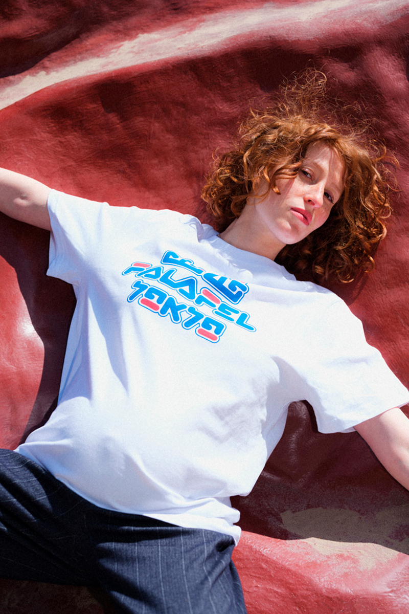
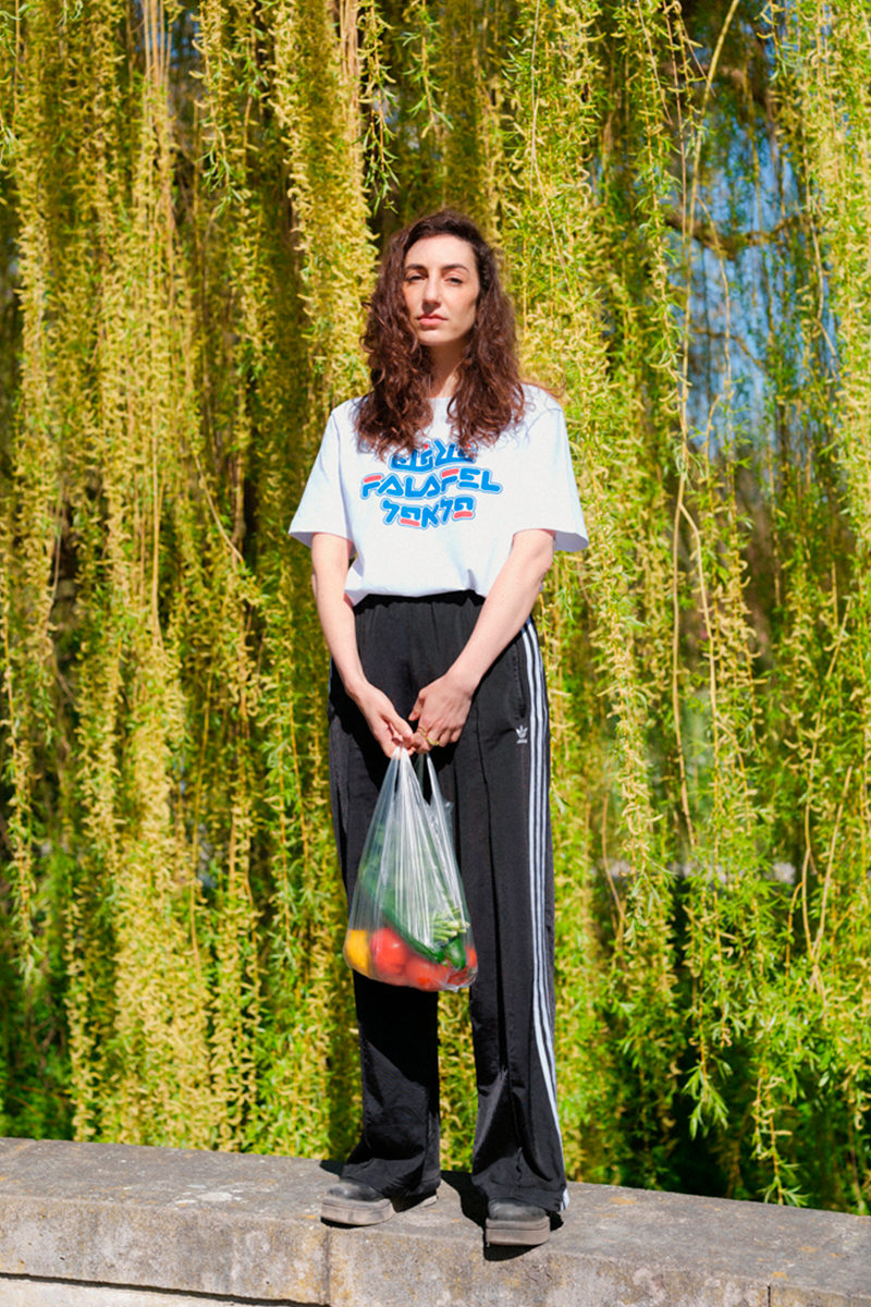
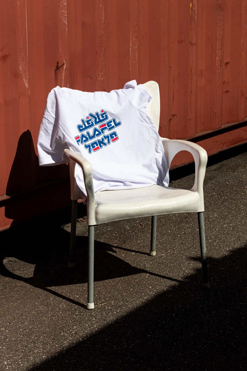
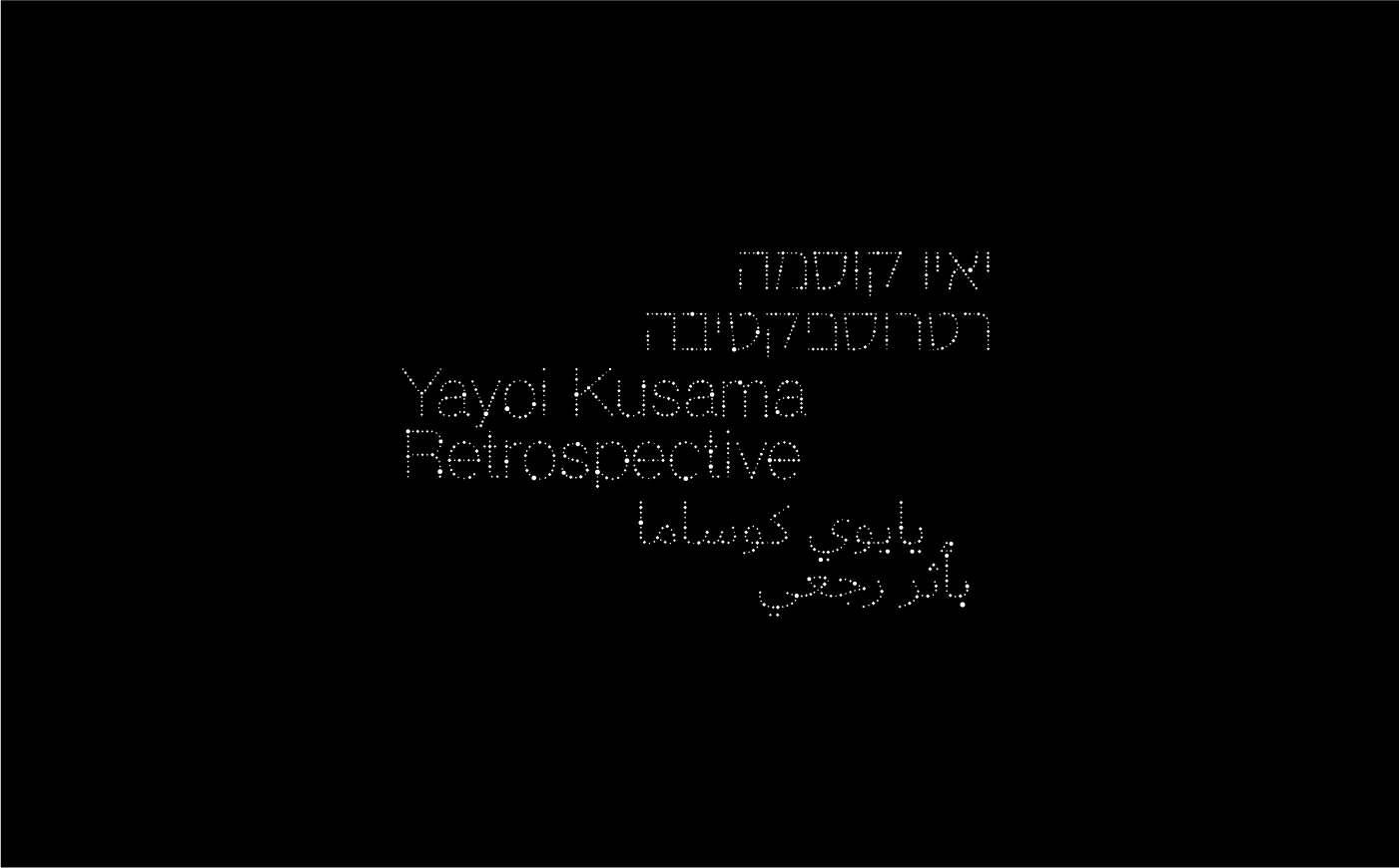
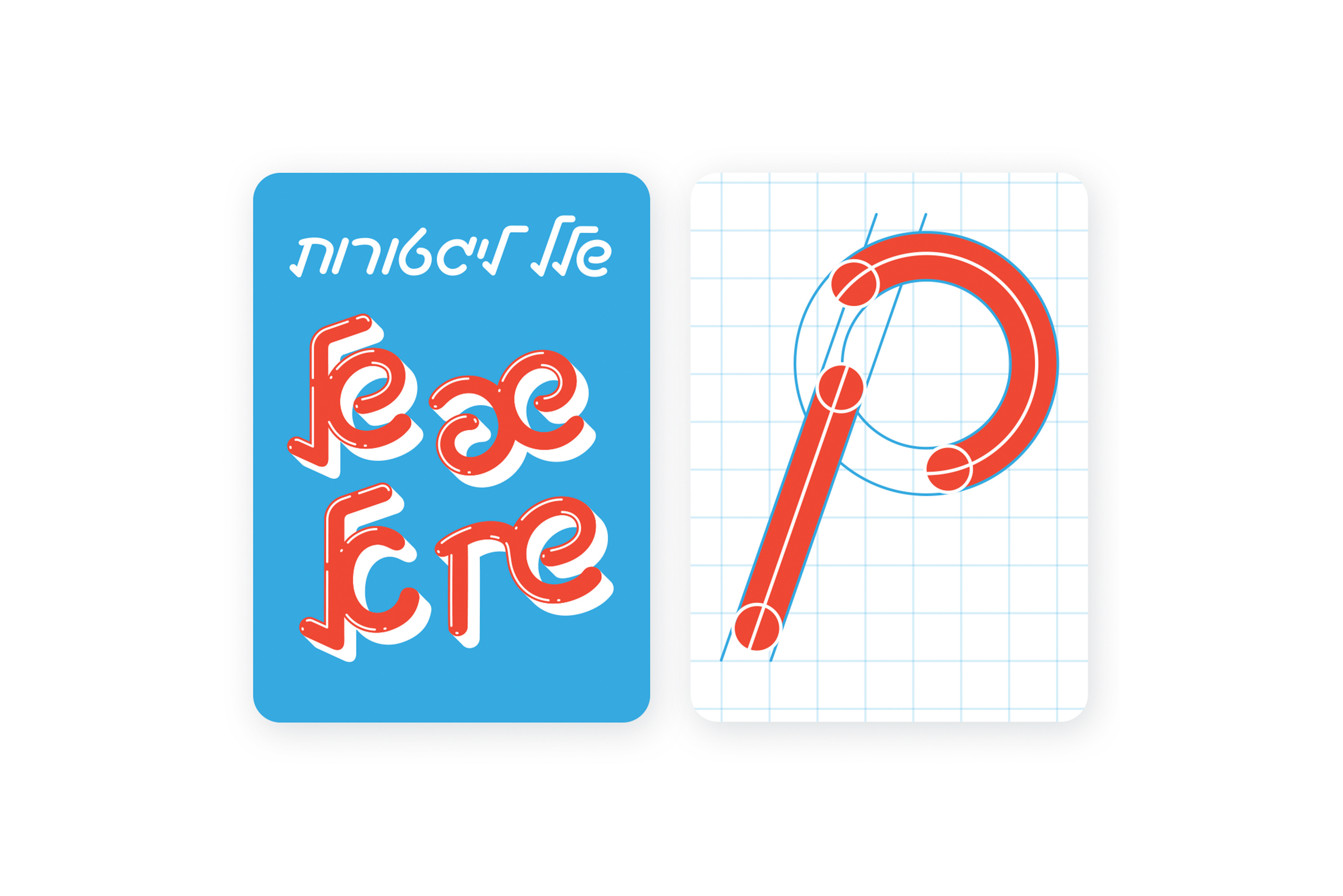
FALAFEL HUMANITY SHIRT
The Falafel Humanity Shirt is a collaborative design by Nikolai Dobreff, Golnar Kat Rahmani, and Liad Shadmi. Featuring the word Falafel in Arabic, Hebrew, and Latin script, the shirt stands as a symbol of unity, coexistence, and peace across cultures.
All proceeds are donated to Women Wage Peace, a grassroots, nonpartisan movement of Israeli and Palestinian women advocating for a peaceful and respectful resolution to the conflict.
Collaborative, Non-profit, 2023Design & Art Direction: Nikolai Dobreff
Arabic Design: Golanr Kat Rahmani
Hebrew Design: Liad Shadmi
Models: Roxana Safarabadi and Alexandra Sinelnikova
Project Page
Featured in PAGE
Feutured in Porfolio
Features in Tagesspiegel
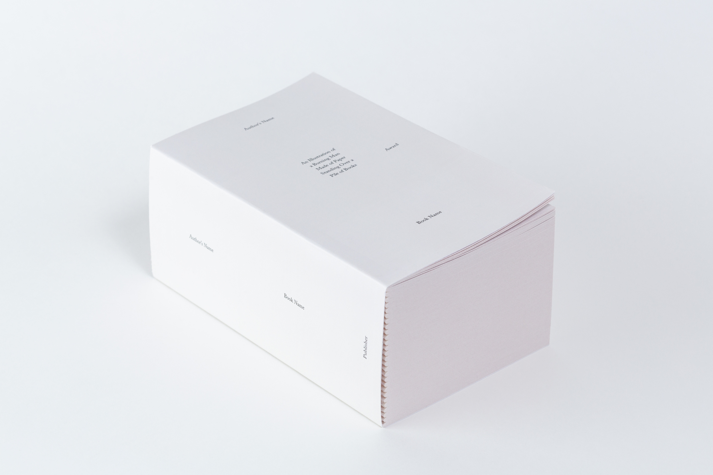
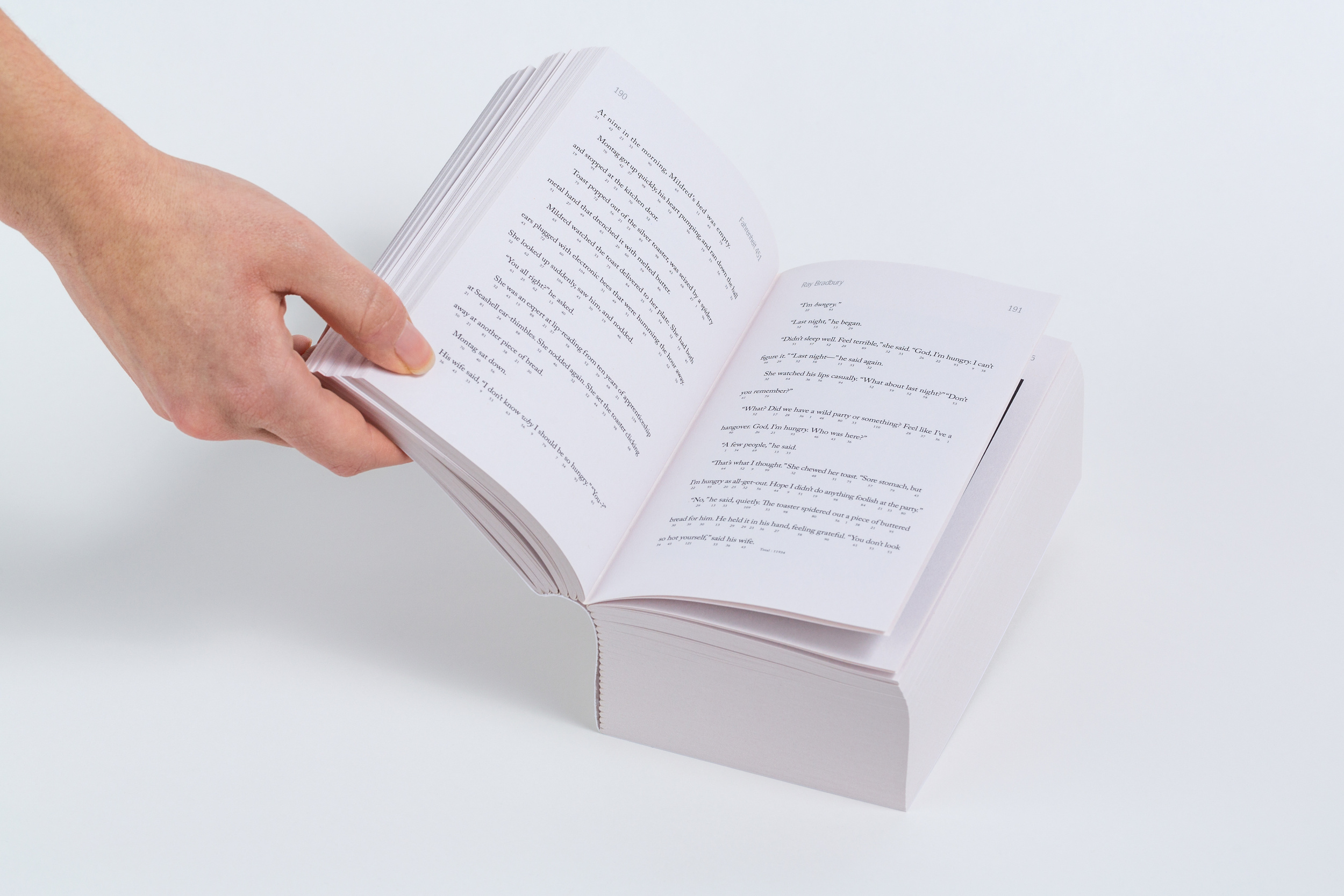
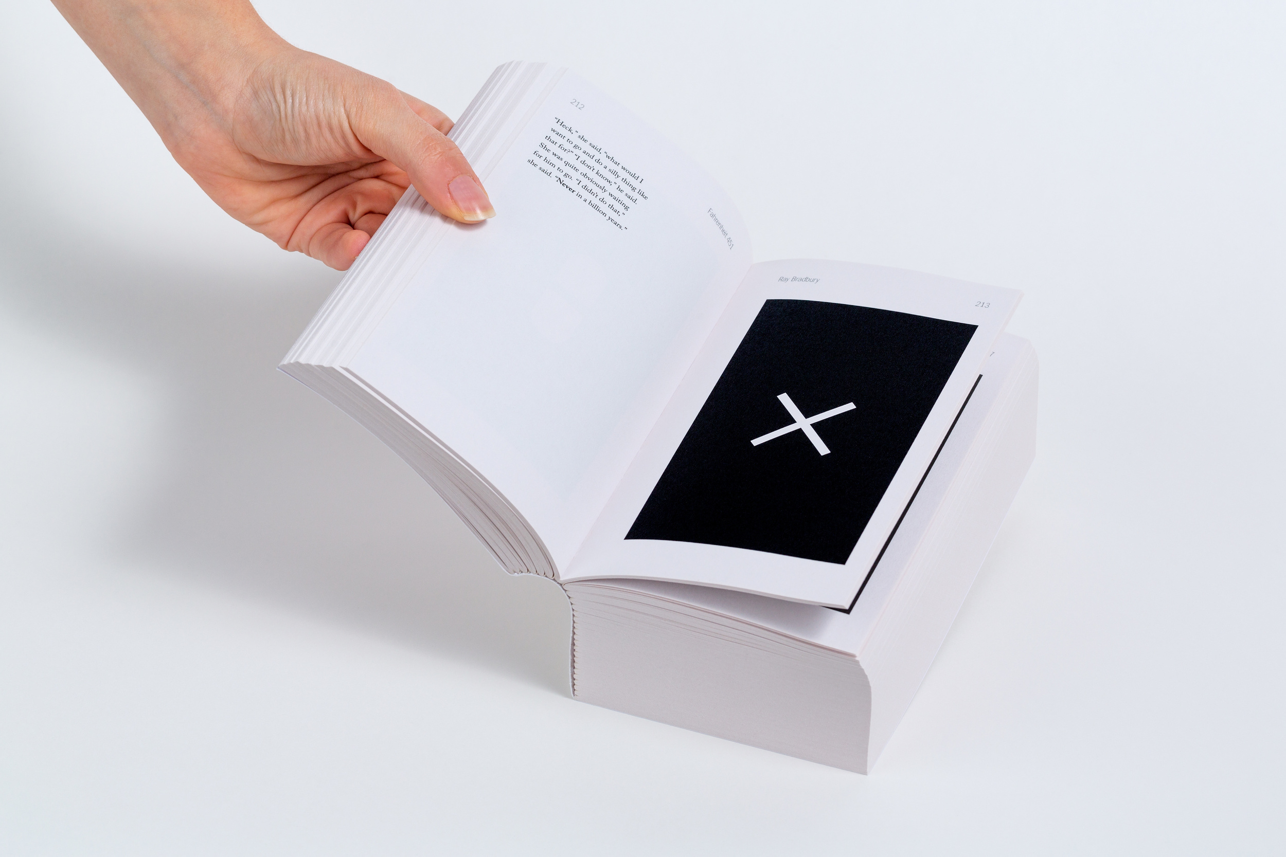

FAHRENHEIT 451
Fahrenheit 451 by Ray Bradbury is a dystopian novel that was first published in 1953. It presents a future American society where books are banned and "firemen" burn any that are found. The novel's protagonist, Guy Montag, is a fireman who begins to question his role in society and becomes drawn to books and the ideas they contain. As the story unfolds, he meets a group of rebels who are dedicated to preserving books and knowledge for future generations.
Redesigned as a 'Rote-Learning book', each scene is composed as a different memorization technique, such as acronyms, rhymes, gematria, hymns, lyrics, memory games, visual and graphic associations, written and spoken texts, and more. The project aimed to offer a unique way of experiencing the novel's content that inspires critical thinking.
Book Design Course, Shenkar, 2019 | Guidance: Noa Schwartz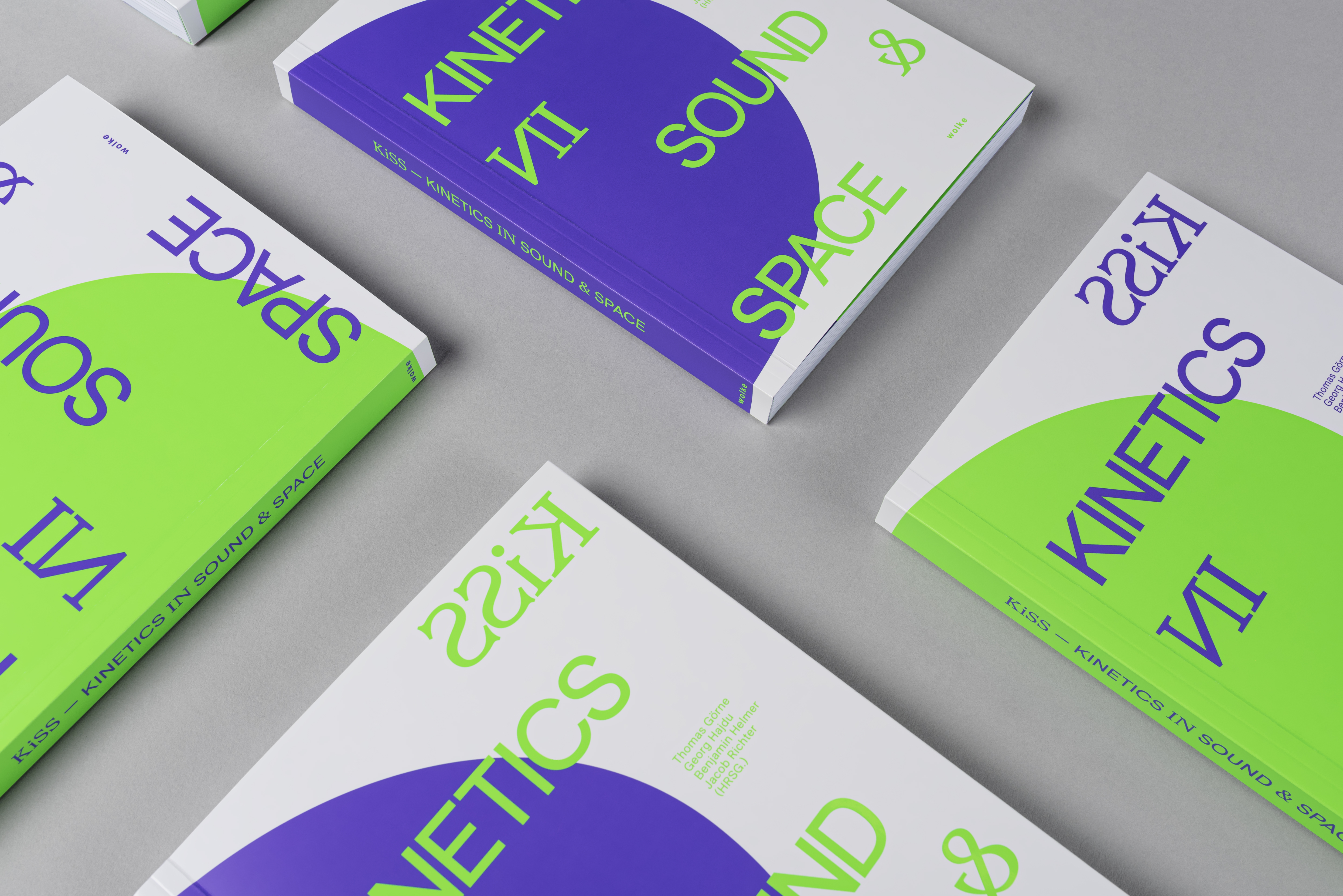
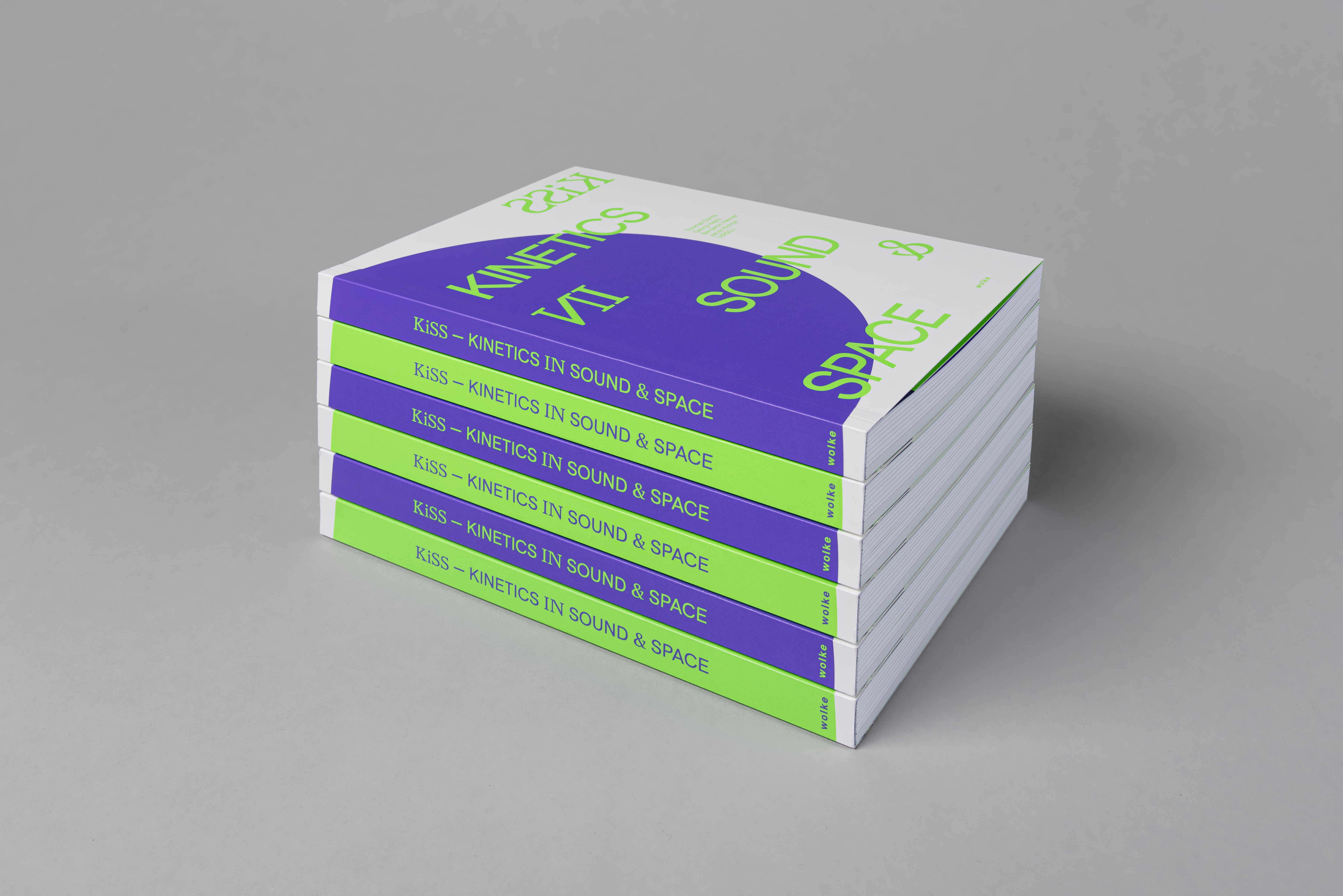
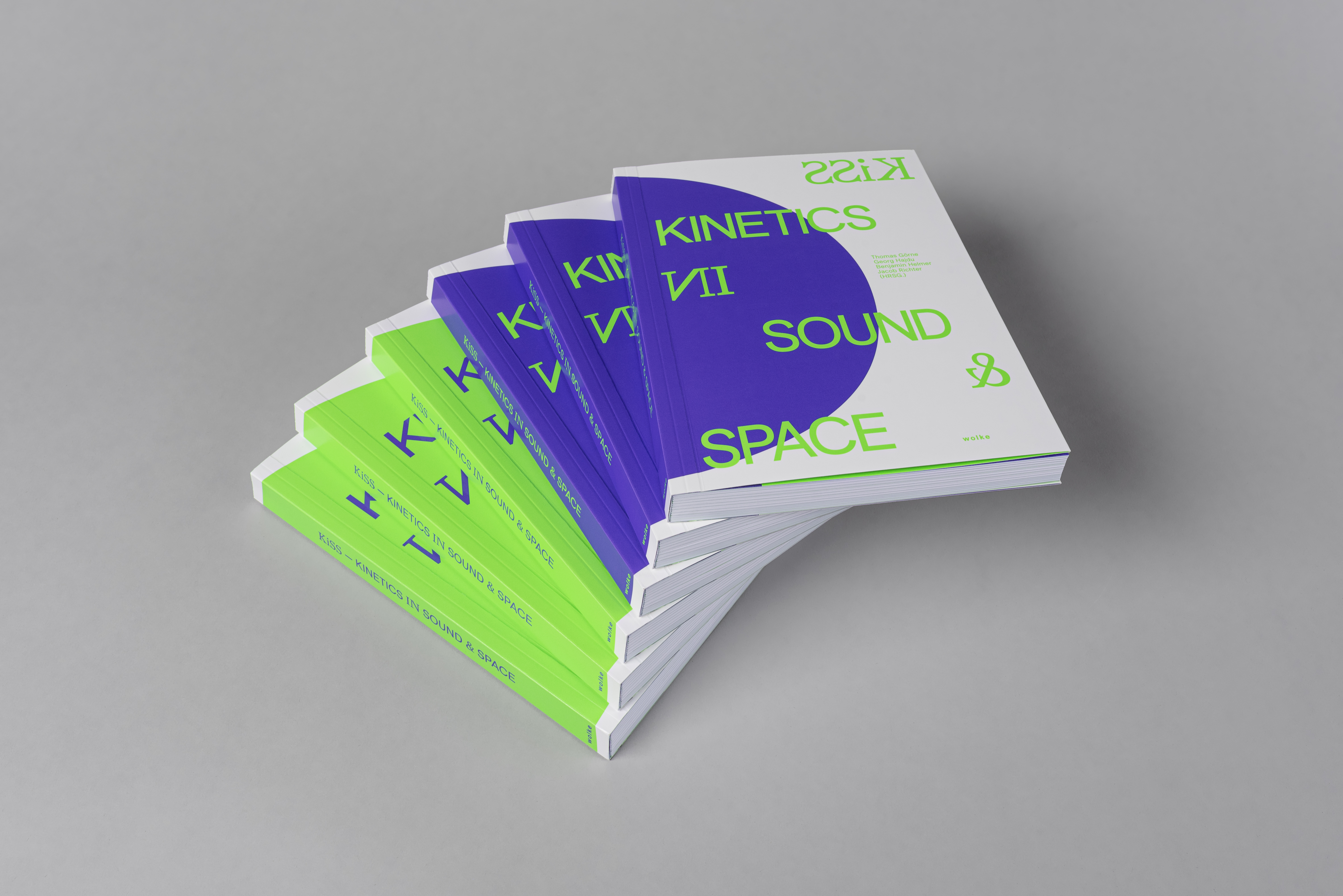
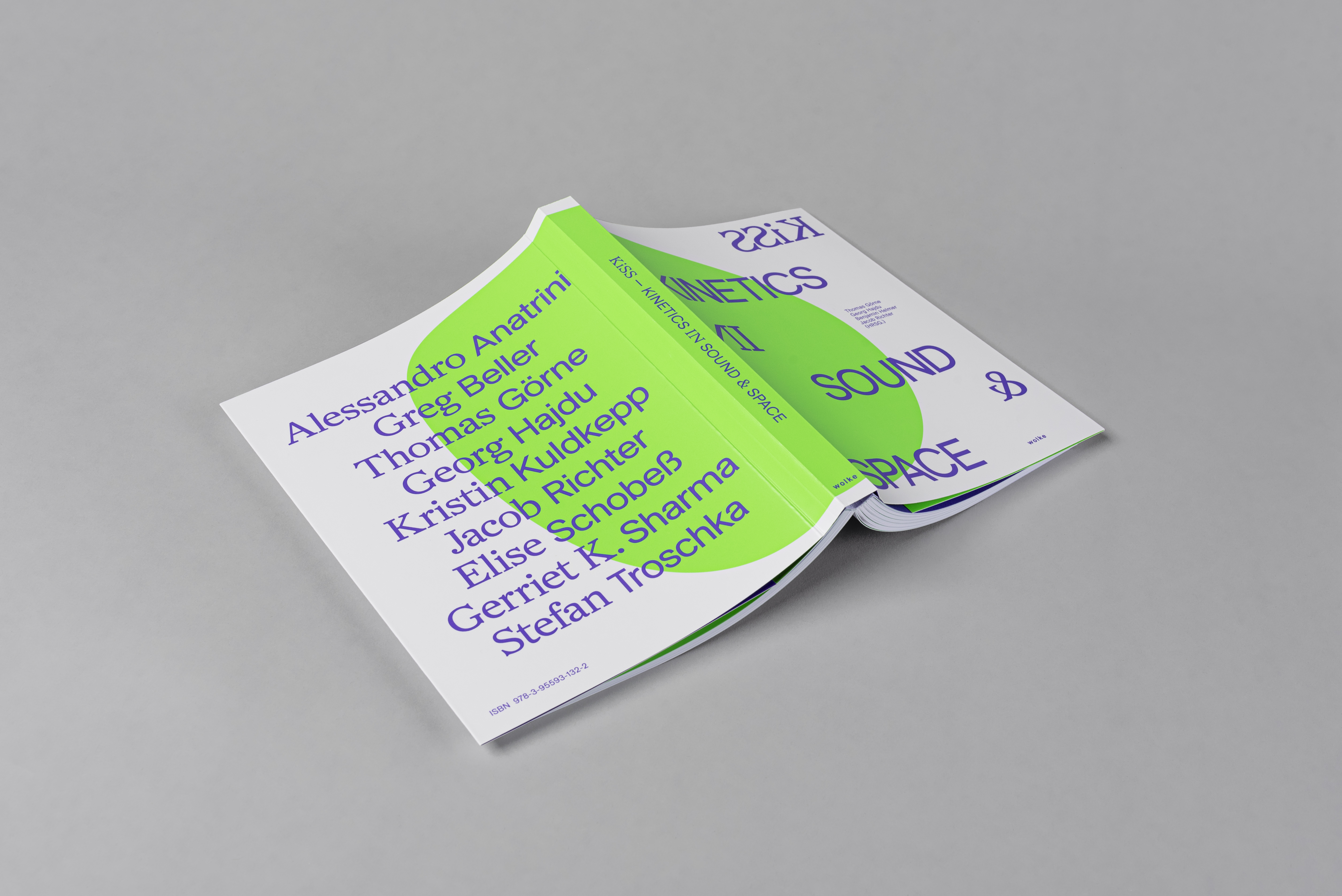
KiSS - KINETICS IN SOUND & SPACE
KiSS - Kinetics in Sound & Space: This acronym stands for the research group founded in 2019 by the partner universities HfMT Hamburg and HAW Hamburg under the direction of Prof. Dr. Georg Hajdu and Prof. Thomas Görne. As the name suggests, the focus of the research group was the examination of the dynamics of spatial sounds and sound spaces.
To enhance the dynamic nature of the research presented in the book, we developed a design concept centered around the concepts of contrast and movement. We recognized that presenting such a dynamic topic in a static medium would create an inherent contrast, and we wanted to emphasize this contrast through our design. The cover features two contrasting designs with switching colors, while the entire book uses only two contrasting Pantone colors (neon green and purple) and black, including all images and graphics. Our design approach not only reflects the research content of the book but also represents our own artistic research on spatial sound and sound space.
Featured in Fonts in UseFeatured in Selection.Blog
Designed in collaboration with Leoni Roosen & Claudia Schulz, HAW Hamburg, Master Program 2022 | Guidance: Heike Grebin & Lea Sievertsen
STORE IS CLOSING EVERYTHING
MUST GO
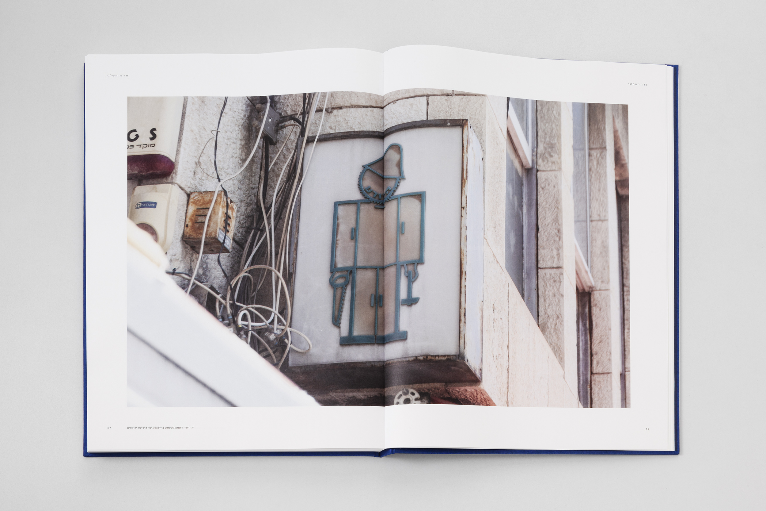
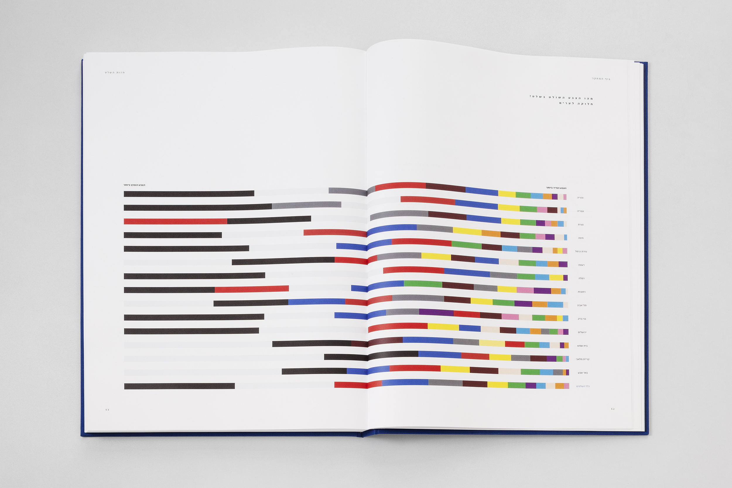
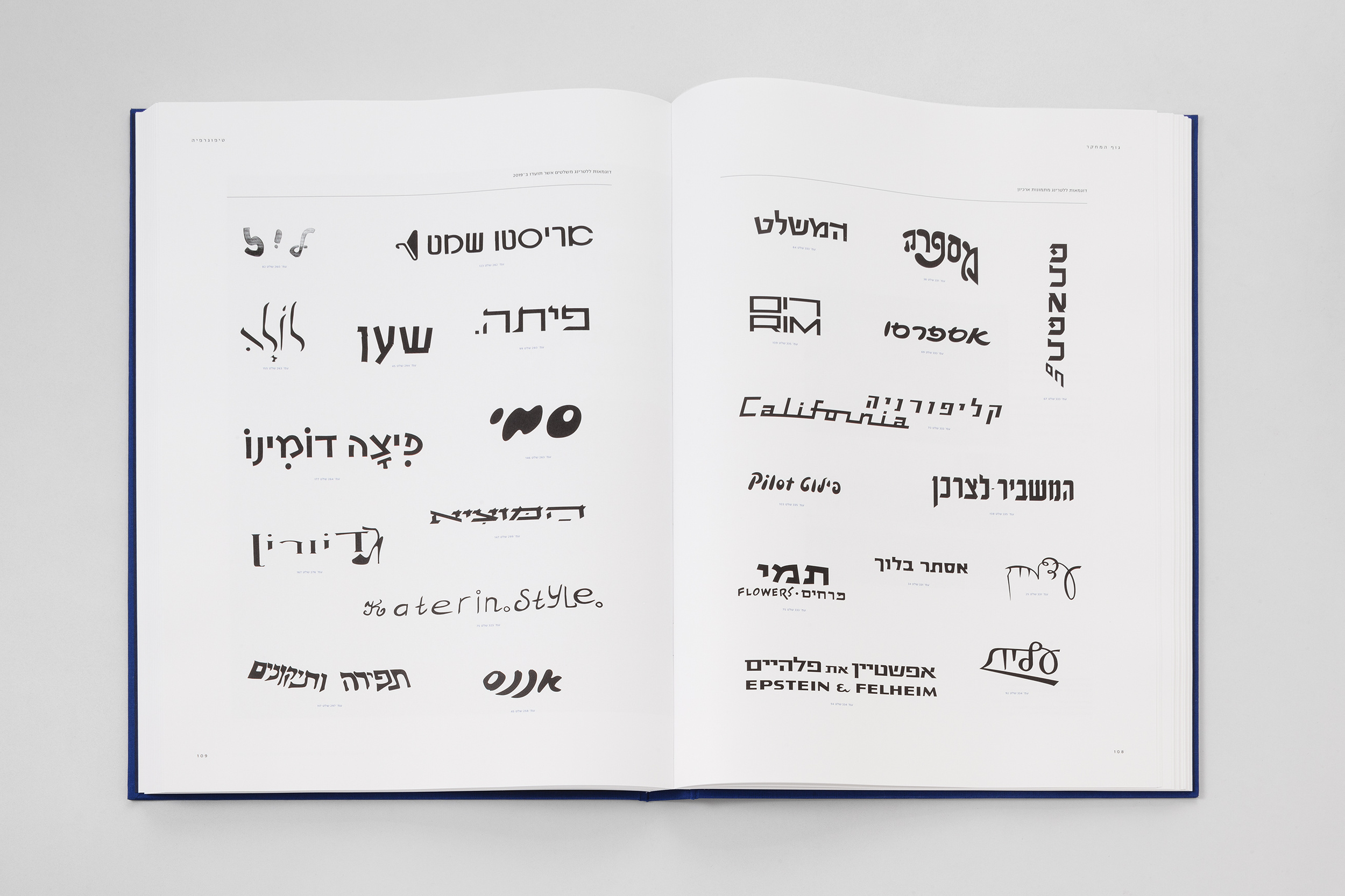
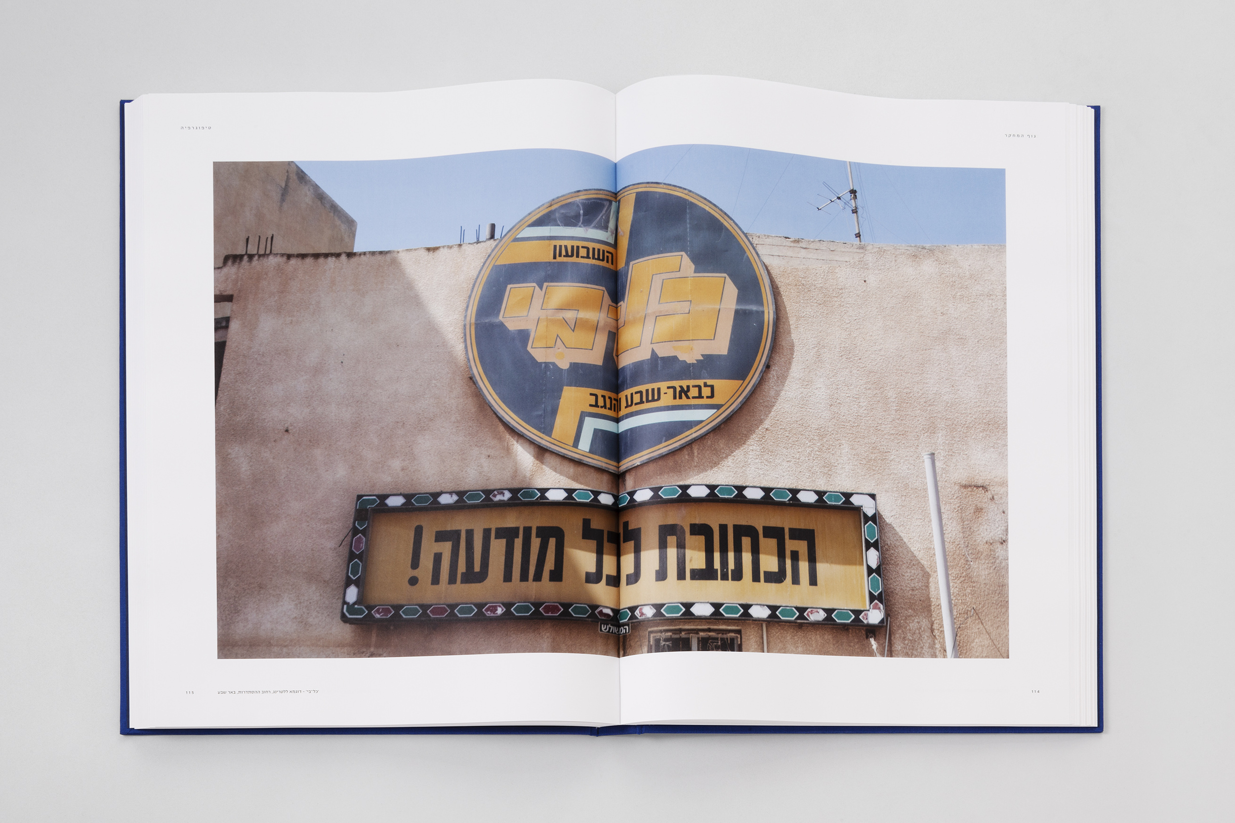
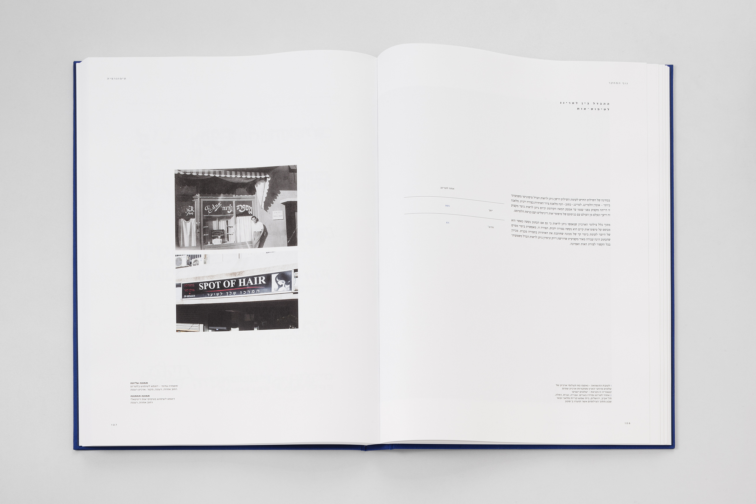
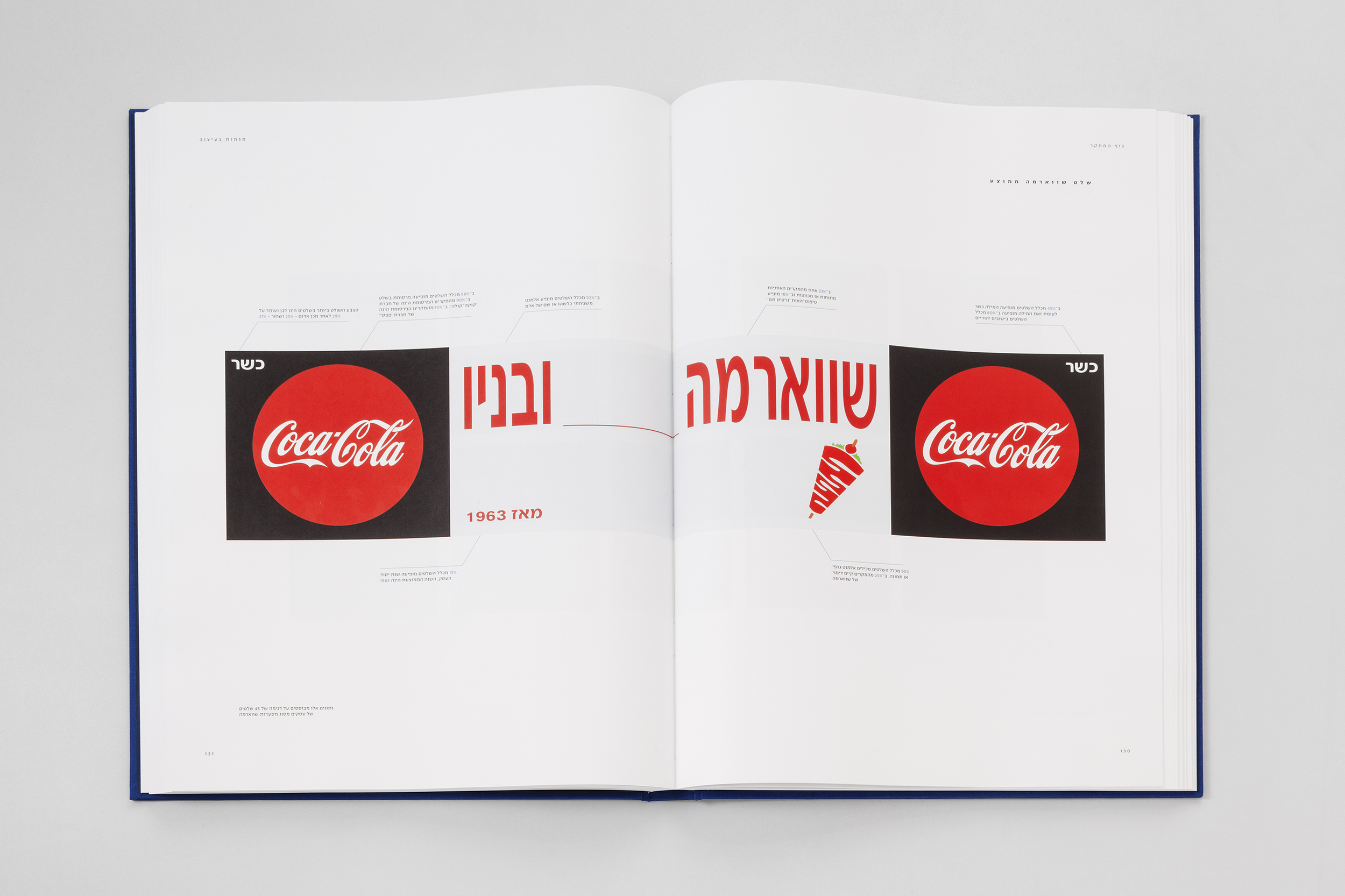
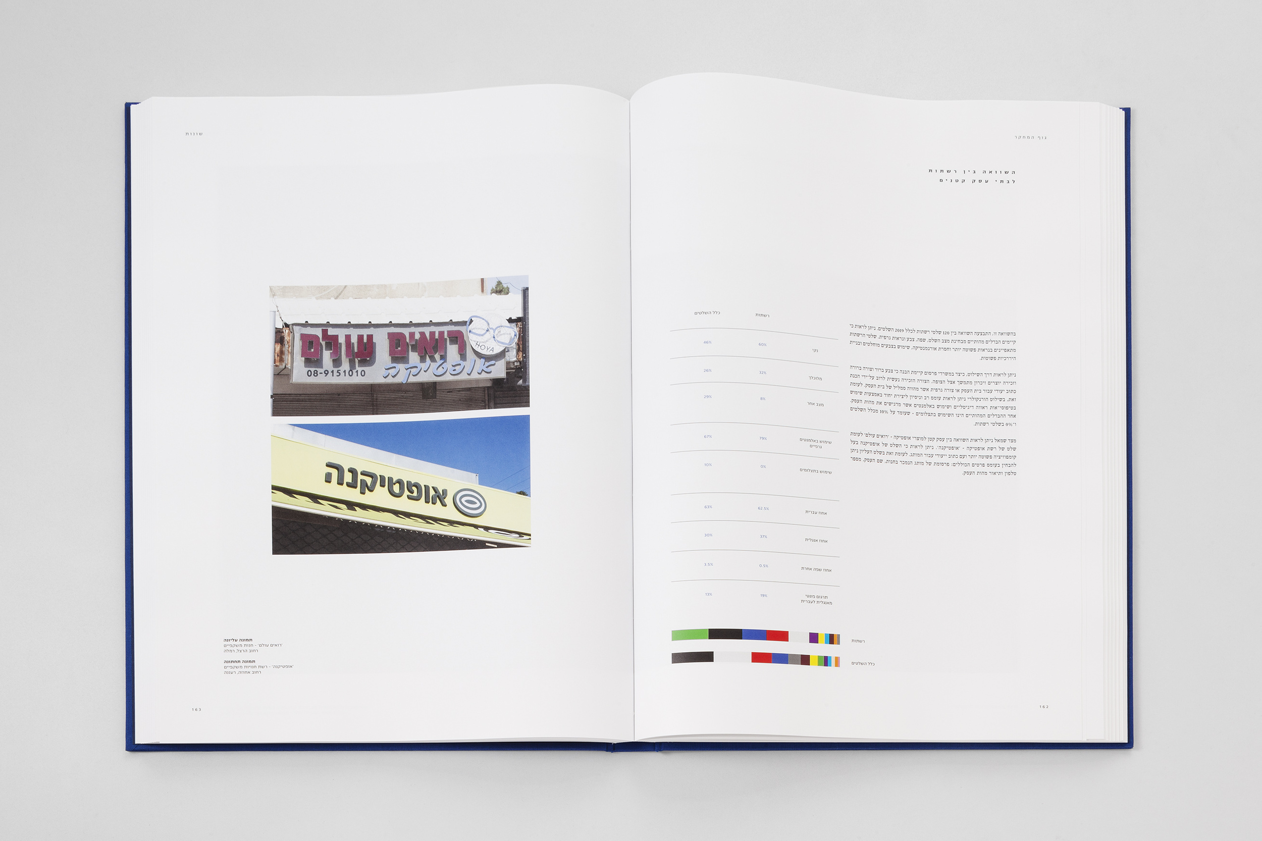
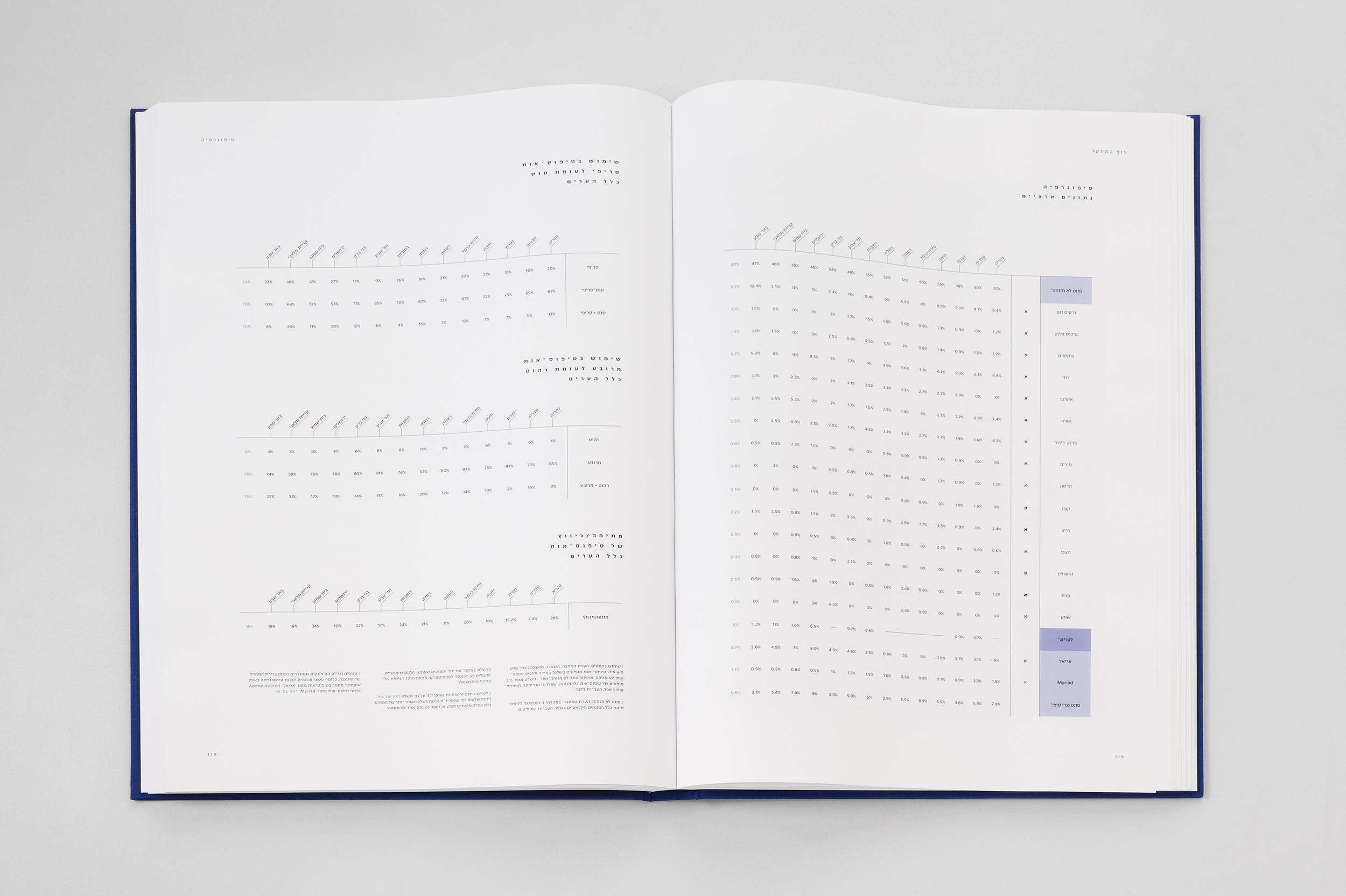
Visual research atlas of vernacular design found in store signage at main roads within Israel. The book contains documentation and research of more than 2,019 signs that were documented in 14 different cities throughout the country.
I have always been drawn to the chaos that is present in the world, especially the ebb and flow within the street, of not just people but the immersed design of advertising. Through the encounter with the shop sign I found a way to decode such disorder, that demonstrates an antithesis through a connected system of rules, patterns and order that are insidious within the environment.
The book contains an array of comparisons and contrasts the signage of the past via archives, an intrigue in the differences between small and large businesses, and the aesthetic visualization of trends and patterns that seem to be apparent (or not). All of which fall under a socio-economic status, defined by local demographics.
Featured in Portfolio MagazineFeatured in La-Culture Magazine
Graduation Project, Shenkar, 2019
Guidance: Nadav Barkan and Merav Shacham
Self-publishing, edition of 4 copies, Munken Lynx, 120 GSM, Digital printing on HP Indigo 10000 Digital Press. Presented in the annual graduate Exhibition, July 2019
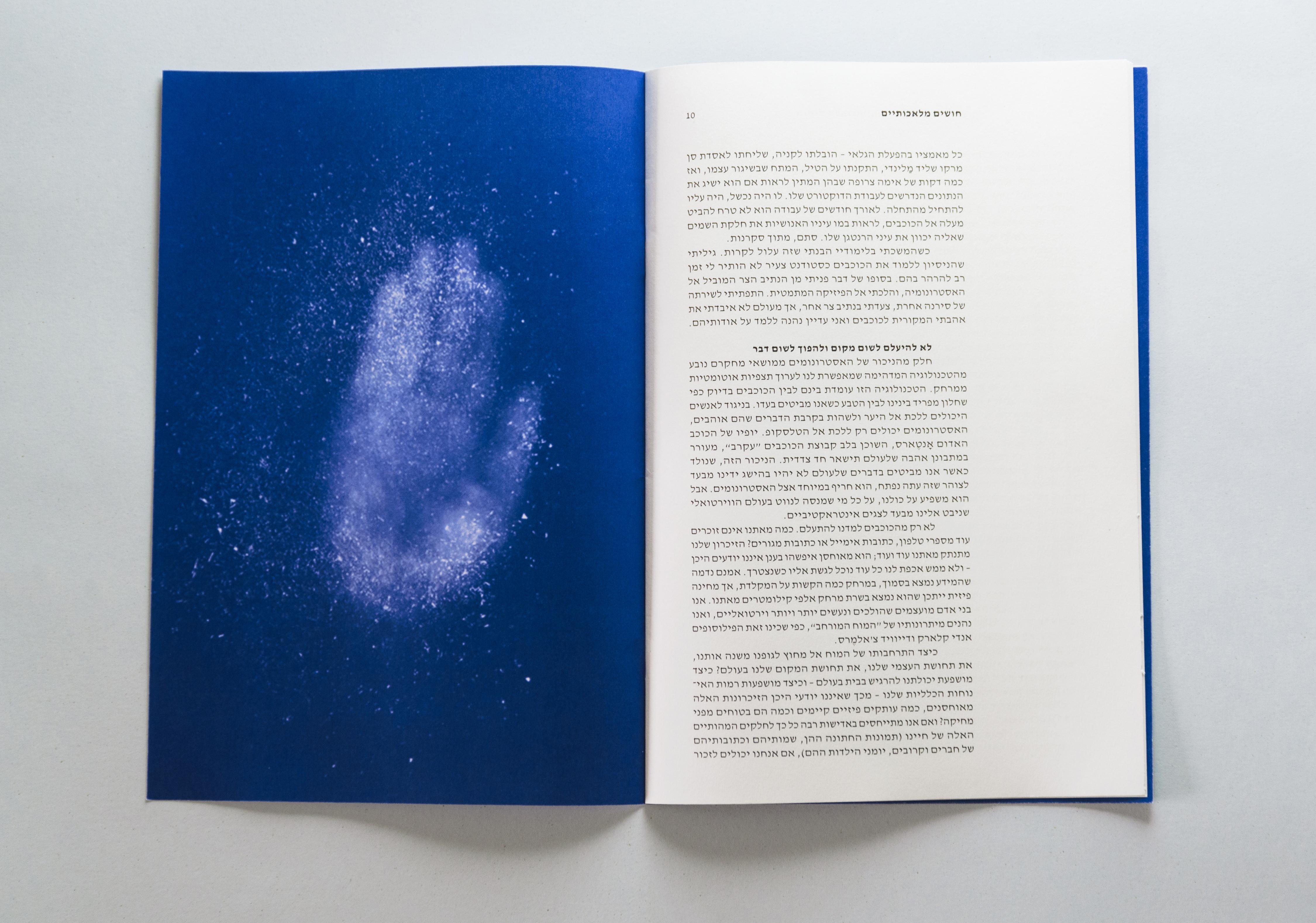
HEAD IN THE STARS
Short article design about spaceOriginal Photographs by: Hideo Kobayashi
Typography Course, Shenkar, 2017 | Guidance: Michal Pauzner
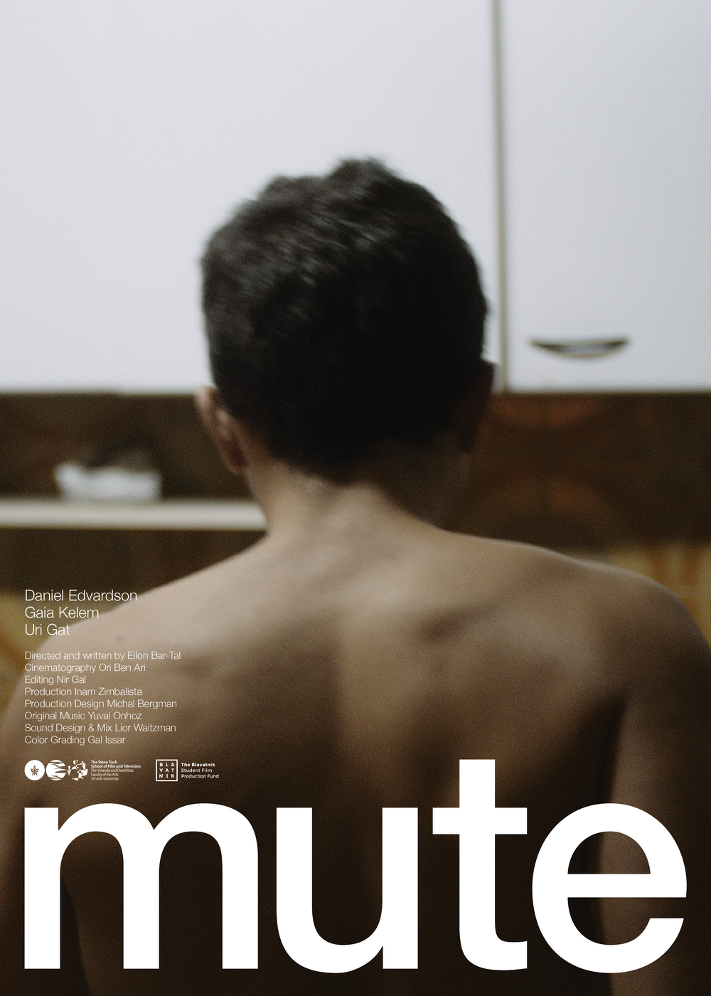
MUTE
Commissioned poster and title design for „mute“ ״מיועד להריסה״. A student film made by Eilon Bar Tal and filmed by Ori Ben Ari. Best Israeli student film award at the 24th Tel-Aviv International Student Film Festival.Commissioned work, 2021


LOGOS & MARKS
Commissioned logos & marks for various clients throughout my career as a graphic designer.Credits: Studio 58 created with Dan Alexander & Co. Hamachon - done in collaboration with Itai Raveh. HKU-TLV & Yayoi Kusama Retrospective exhibition - done in collaboration with Noa Schwartz. 88 - done in collaboration with Ofir Liberman
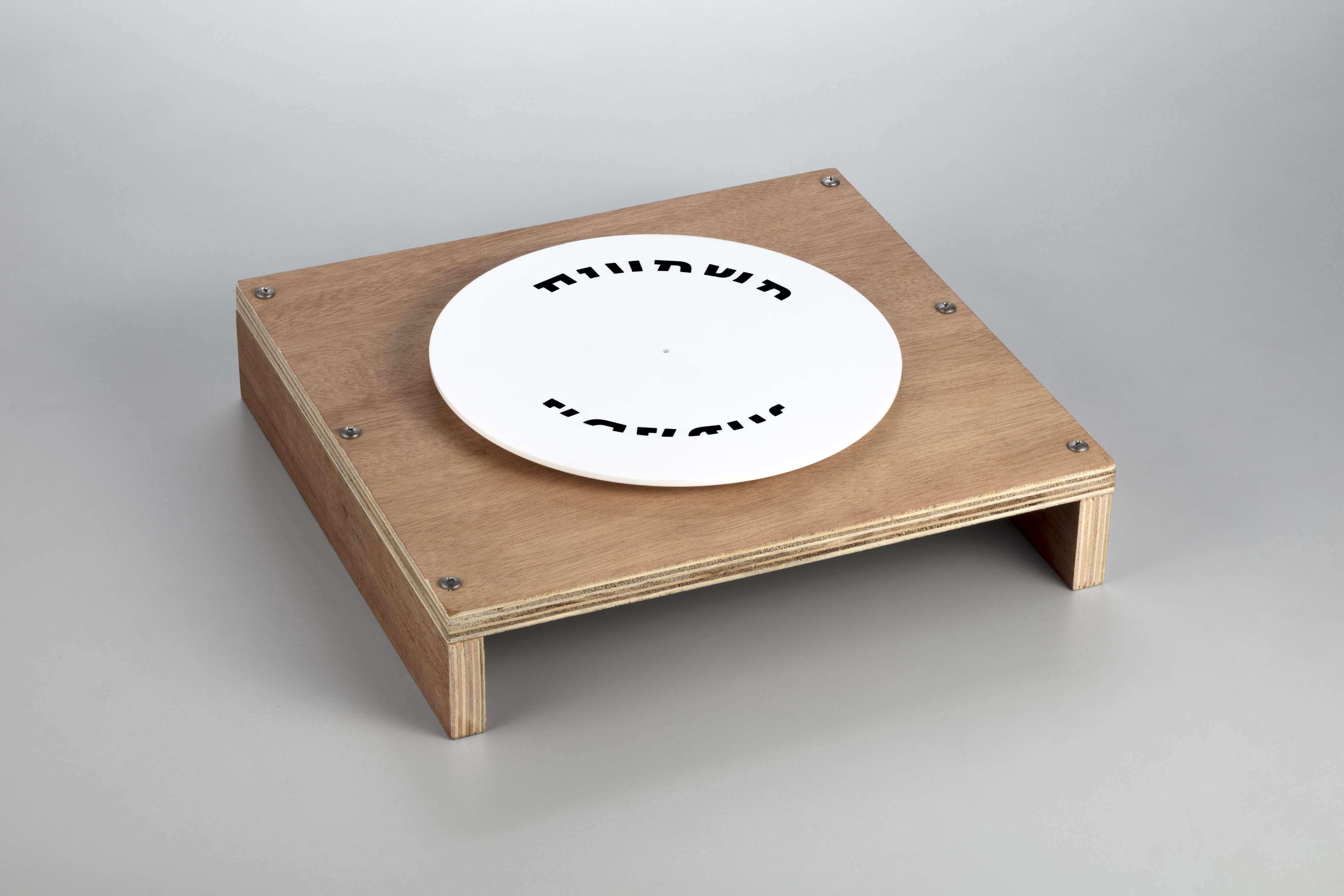
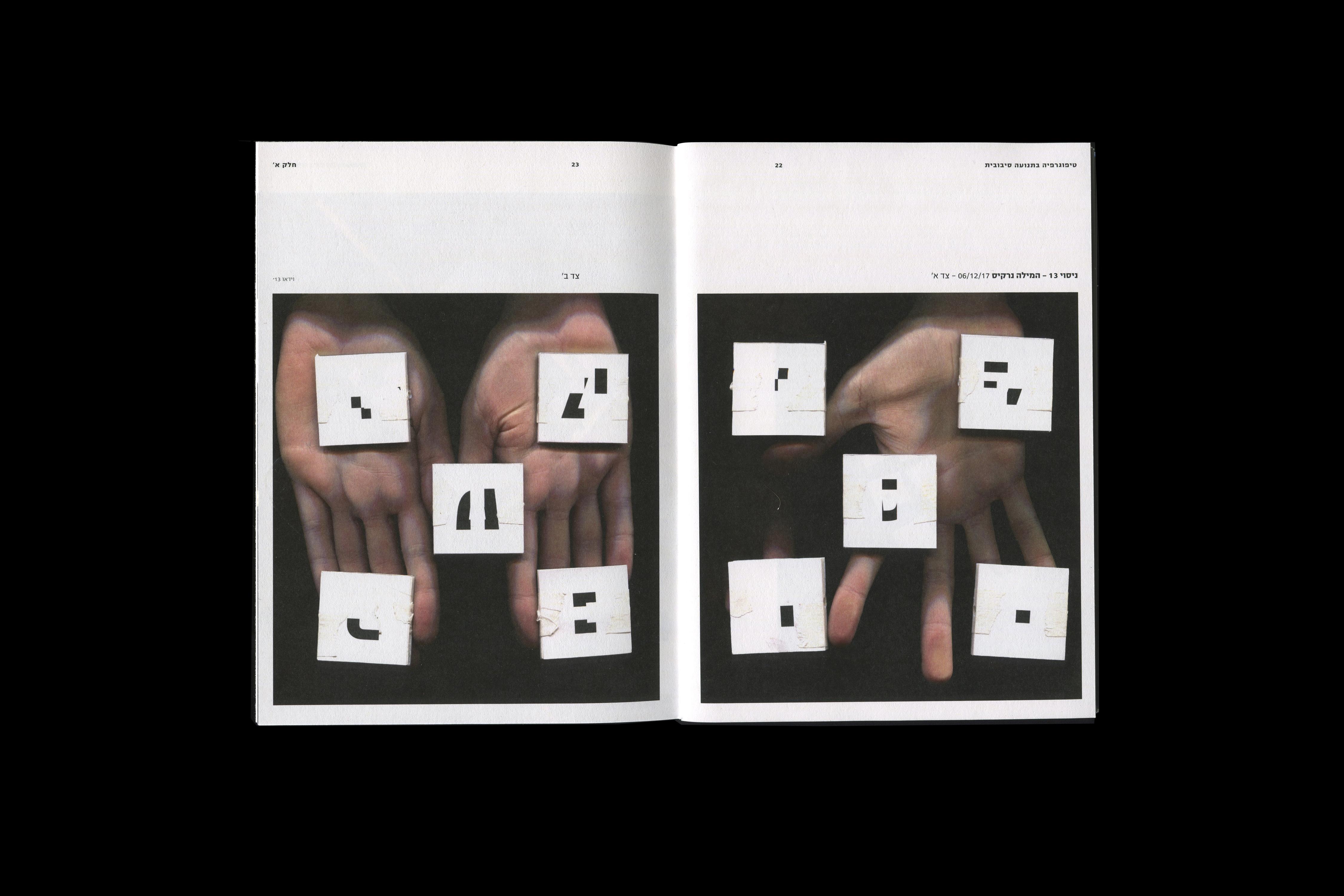
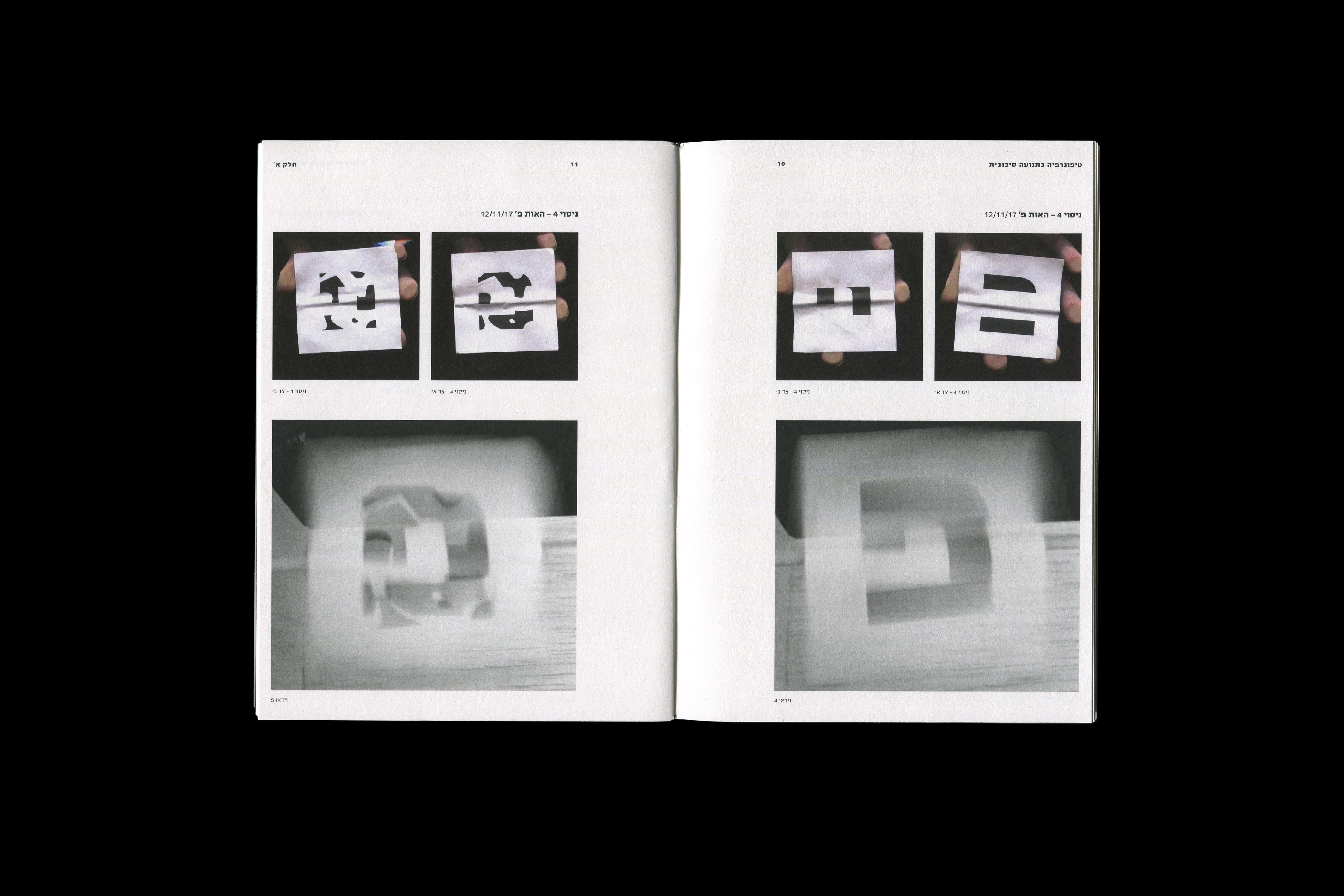
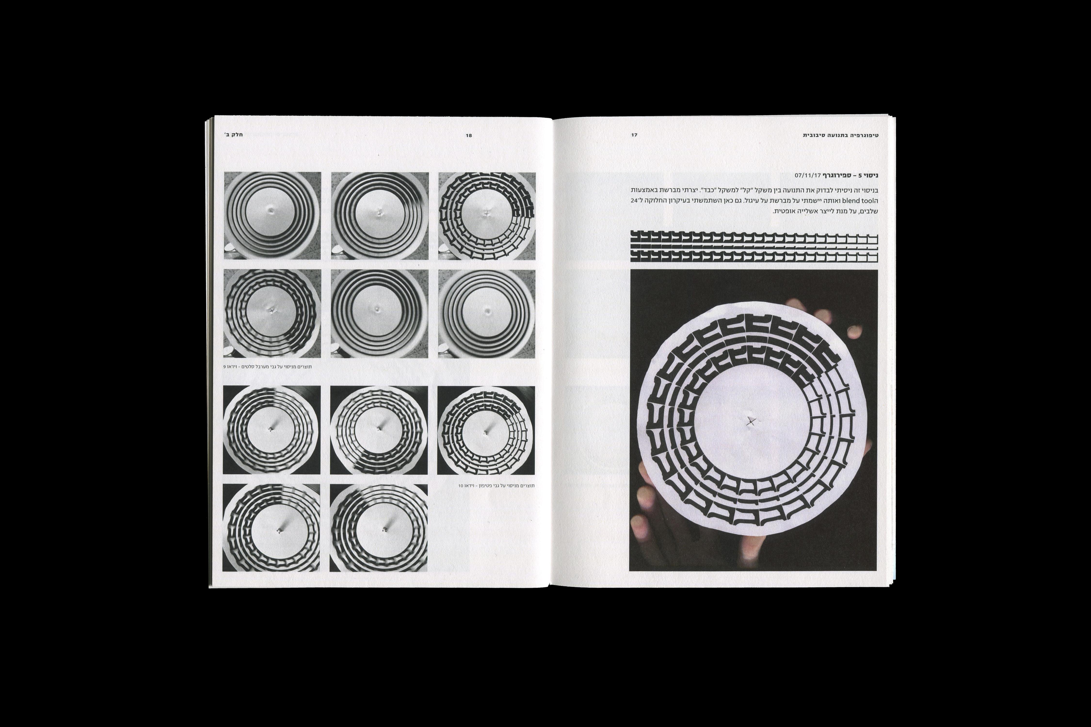
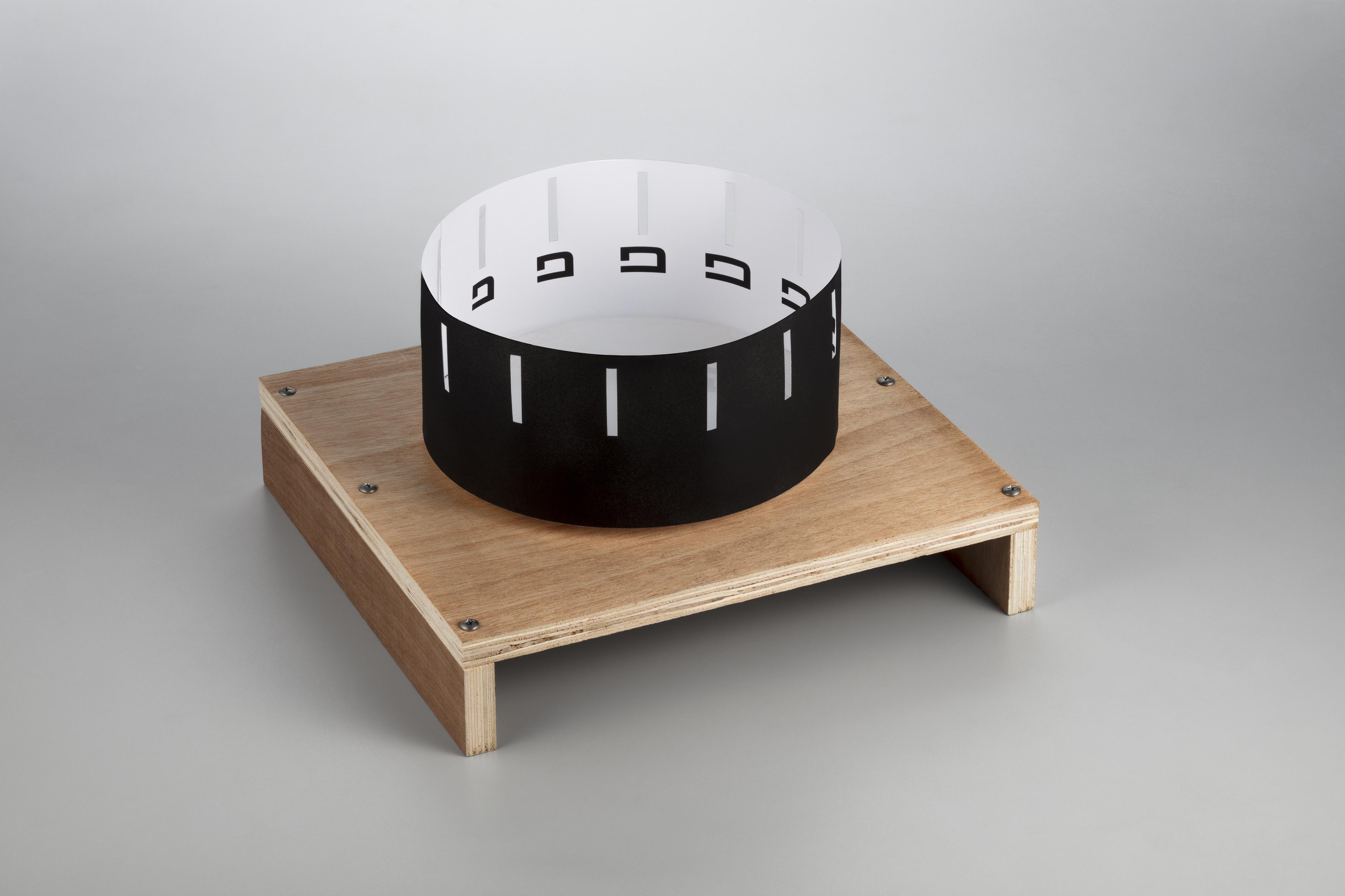
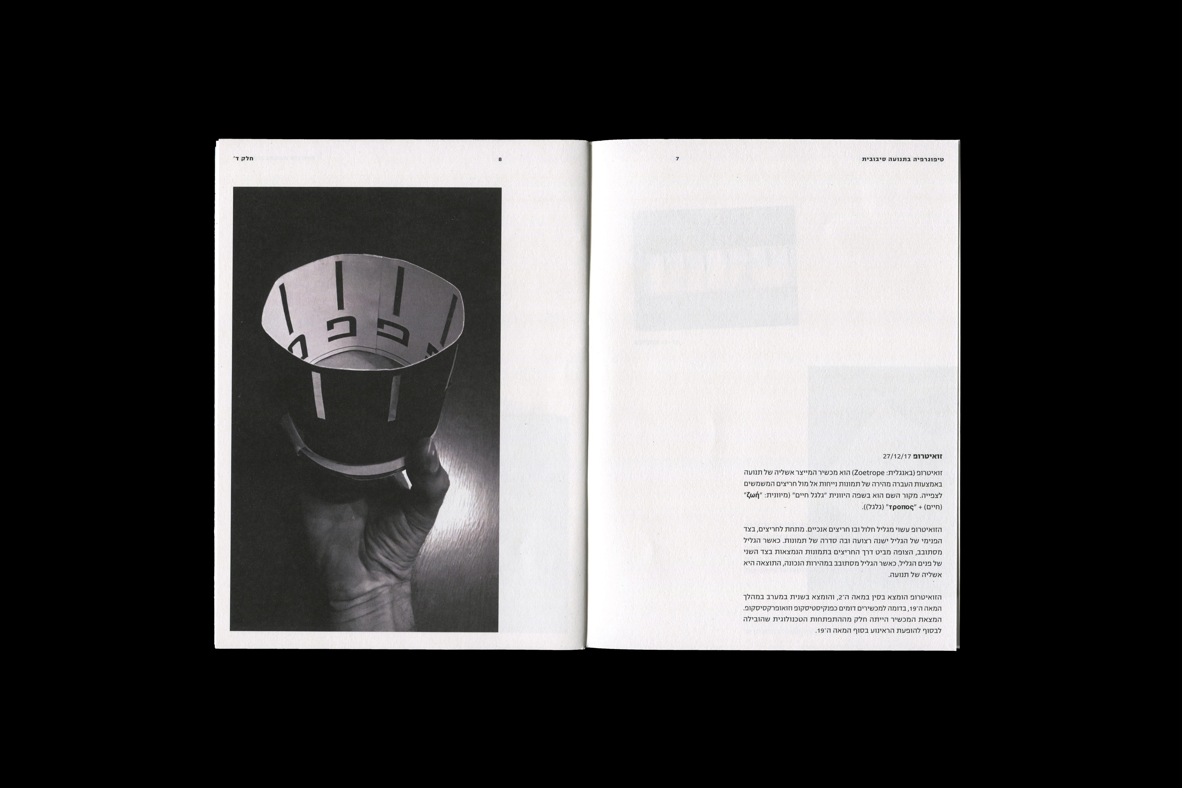
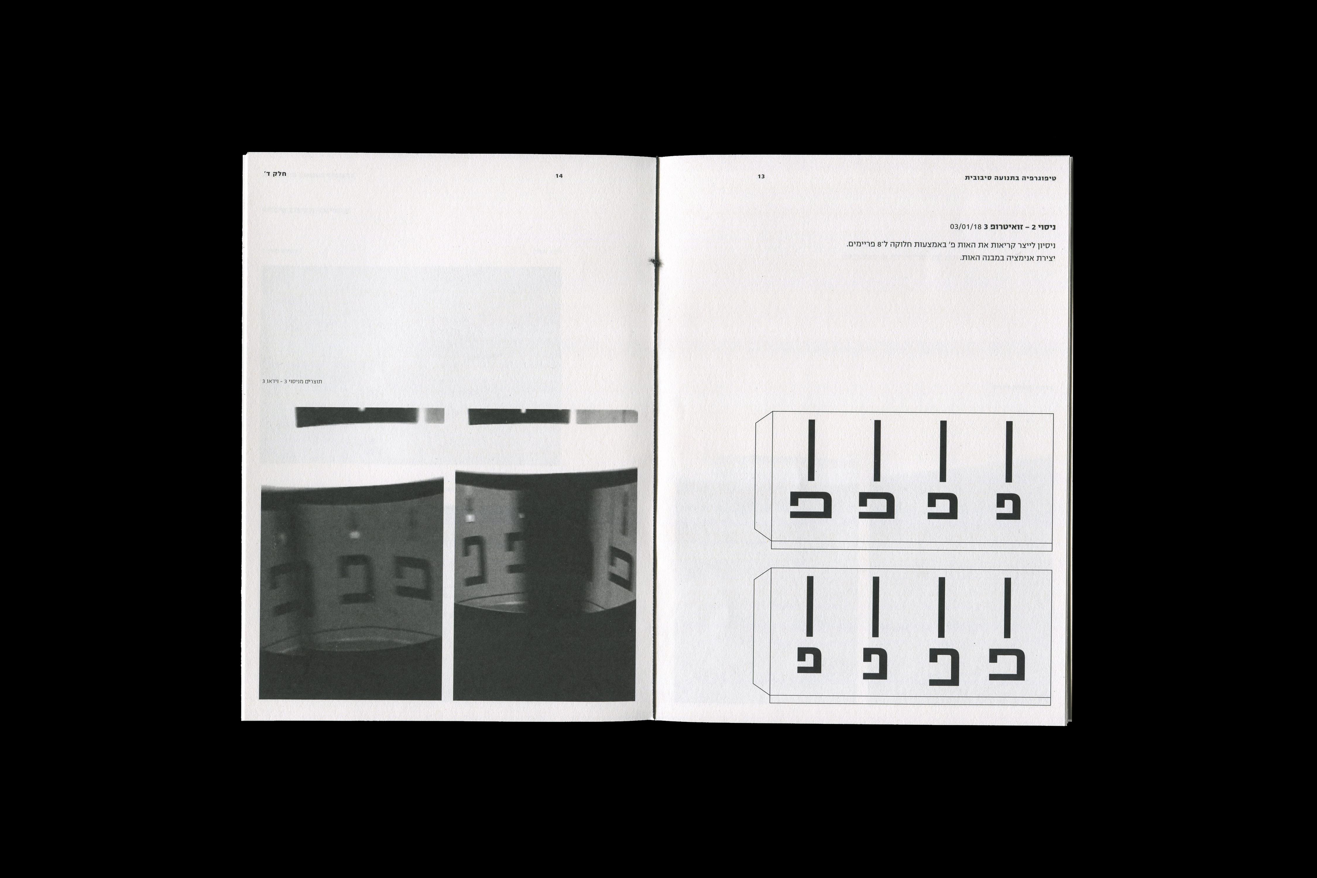
TYPOGRAPHY IN CIRCULAR MOTION
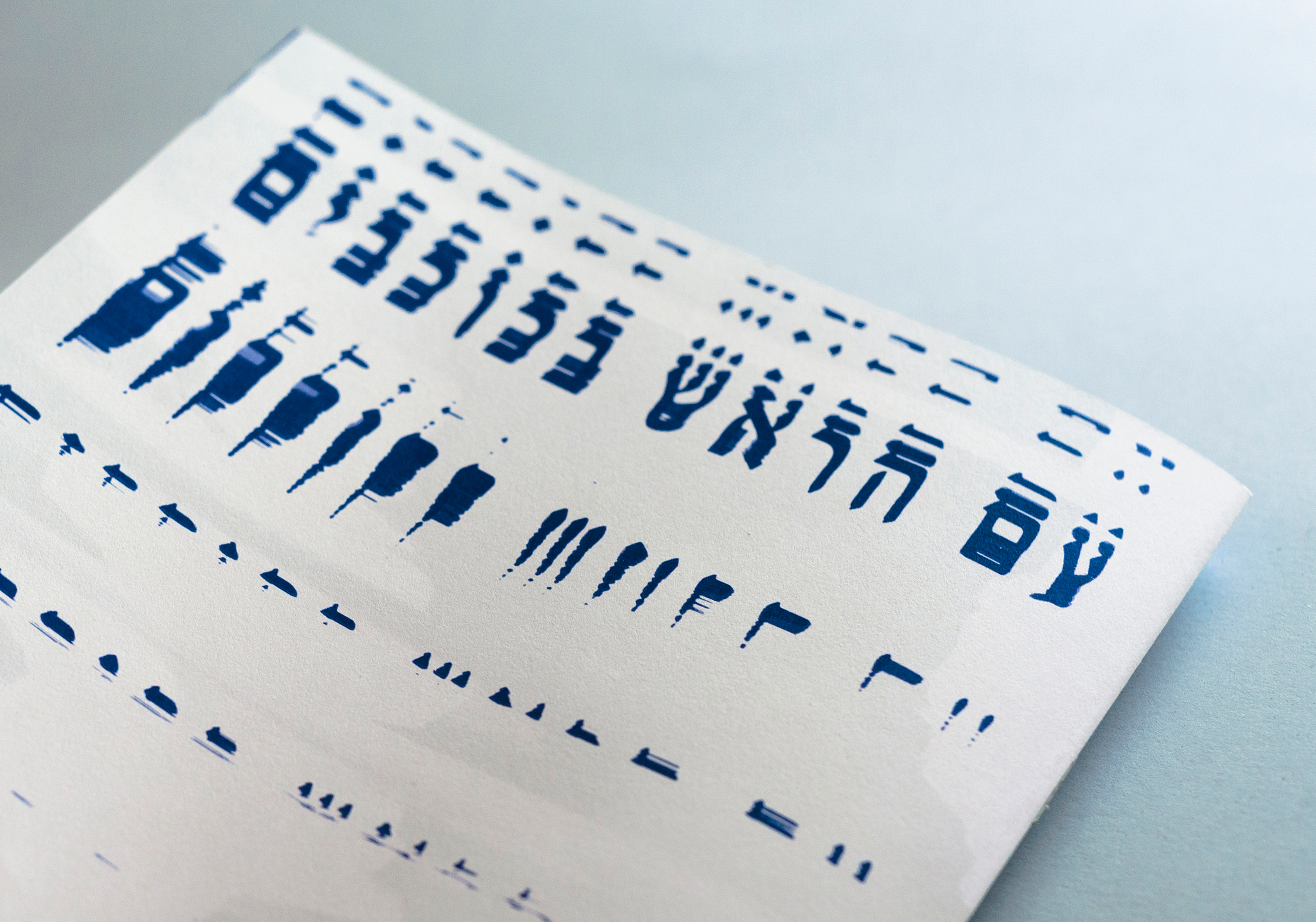
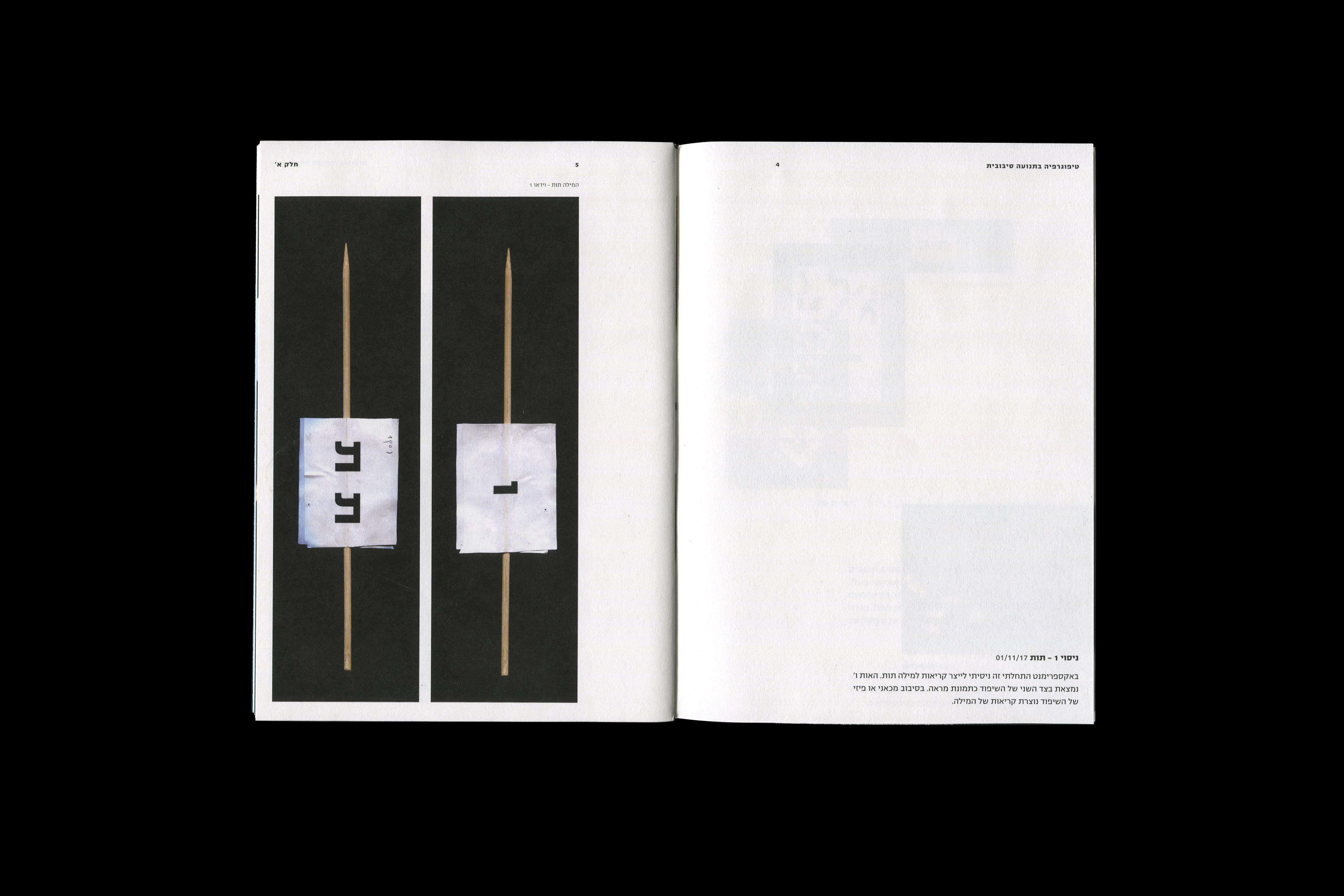
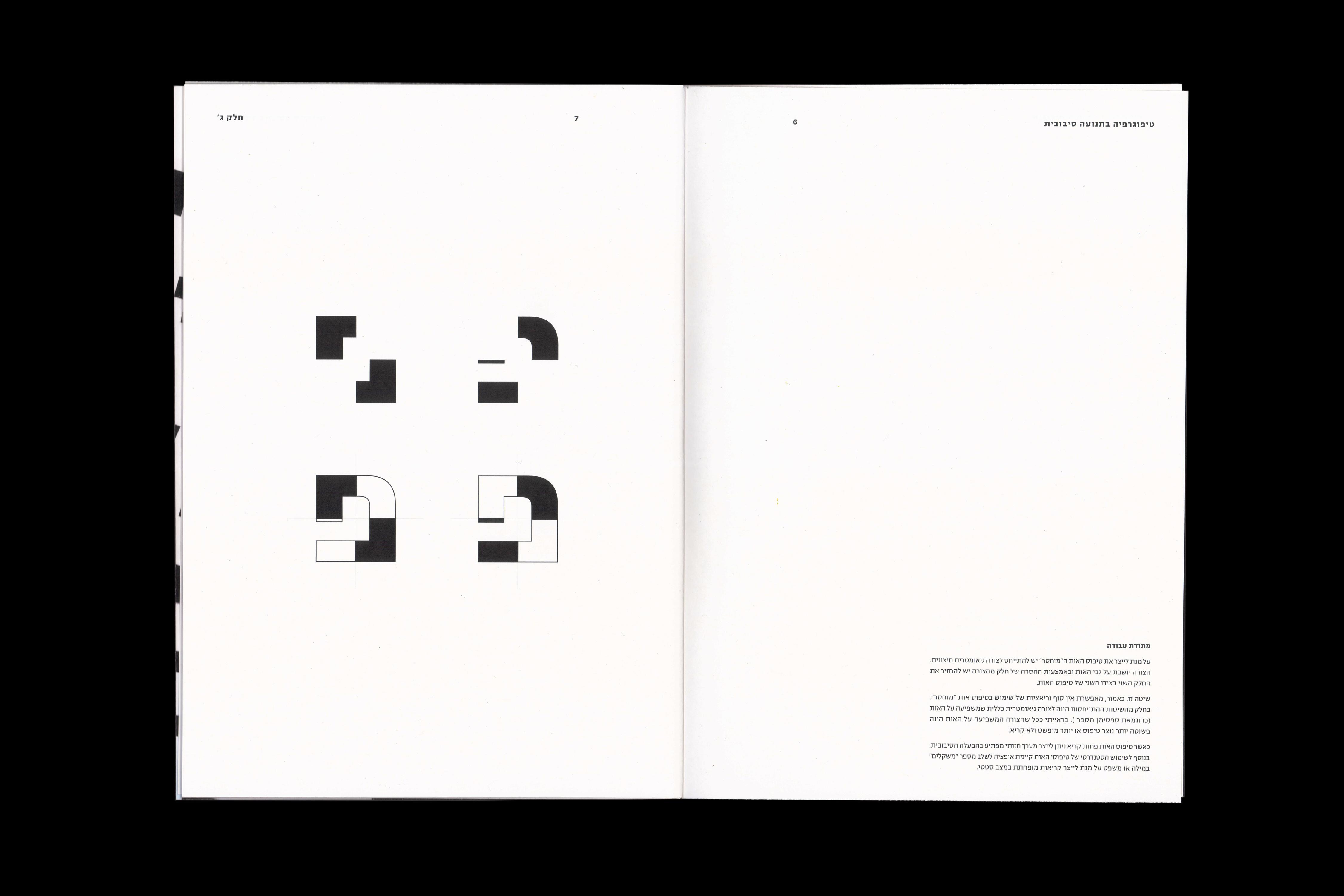
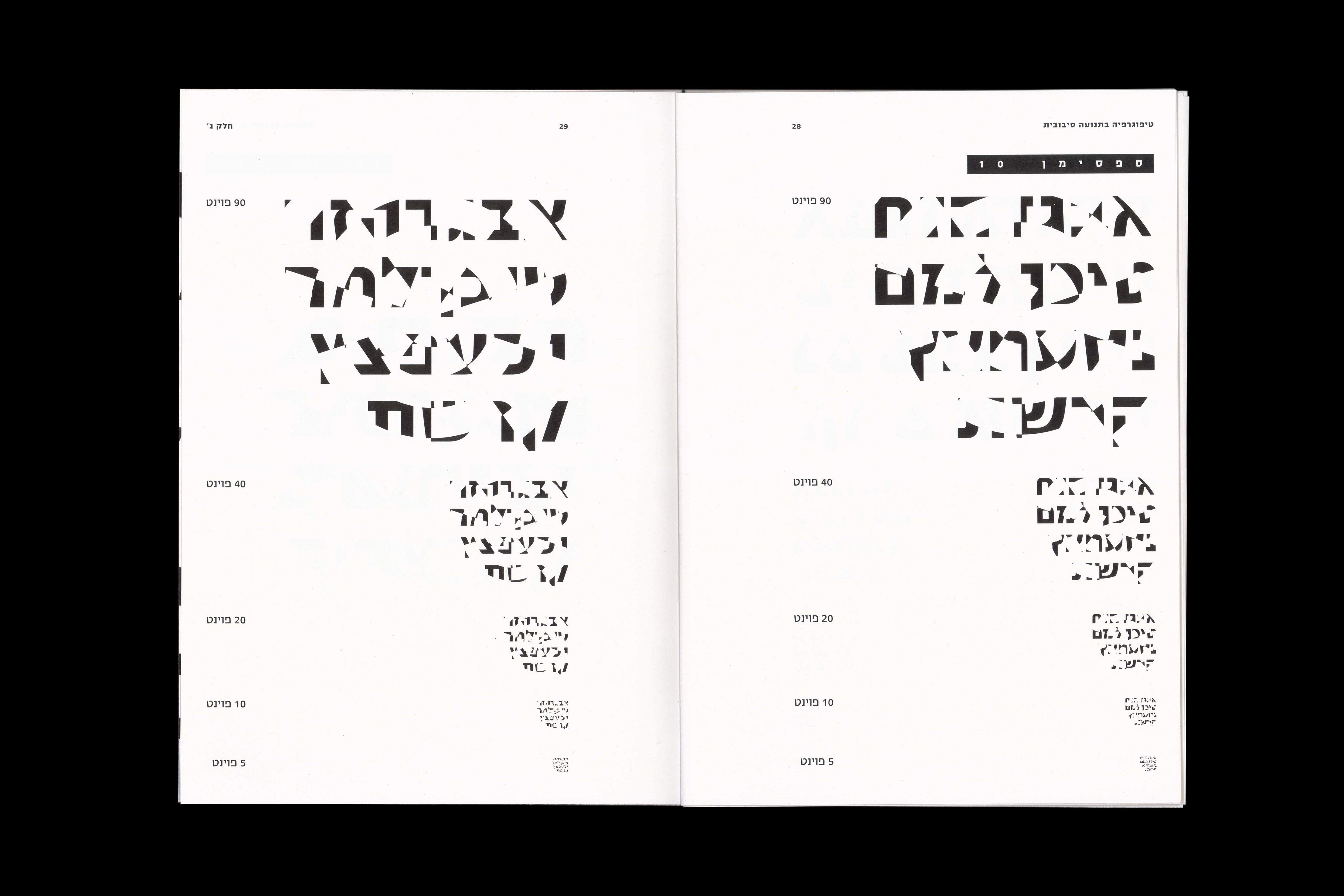
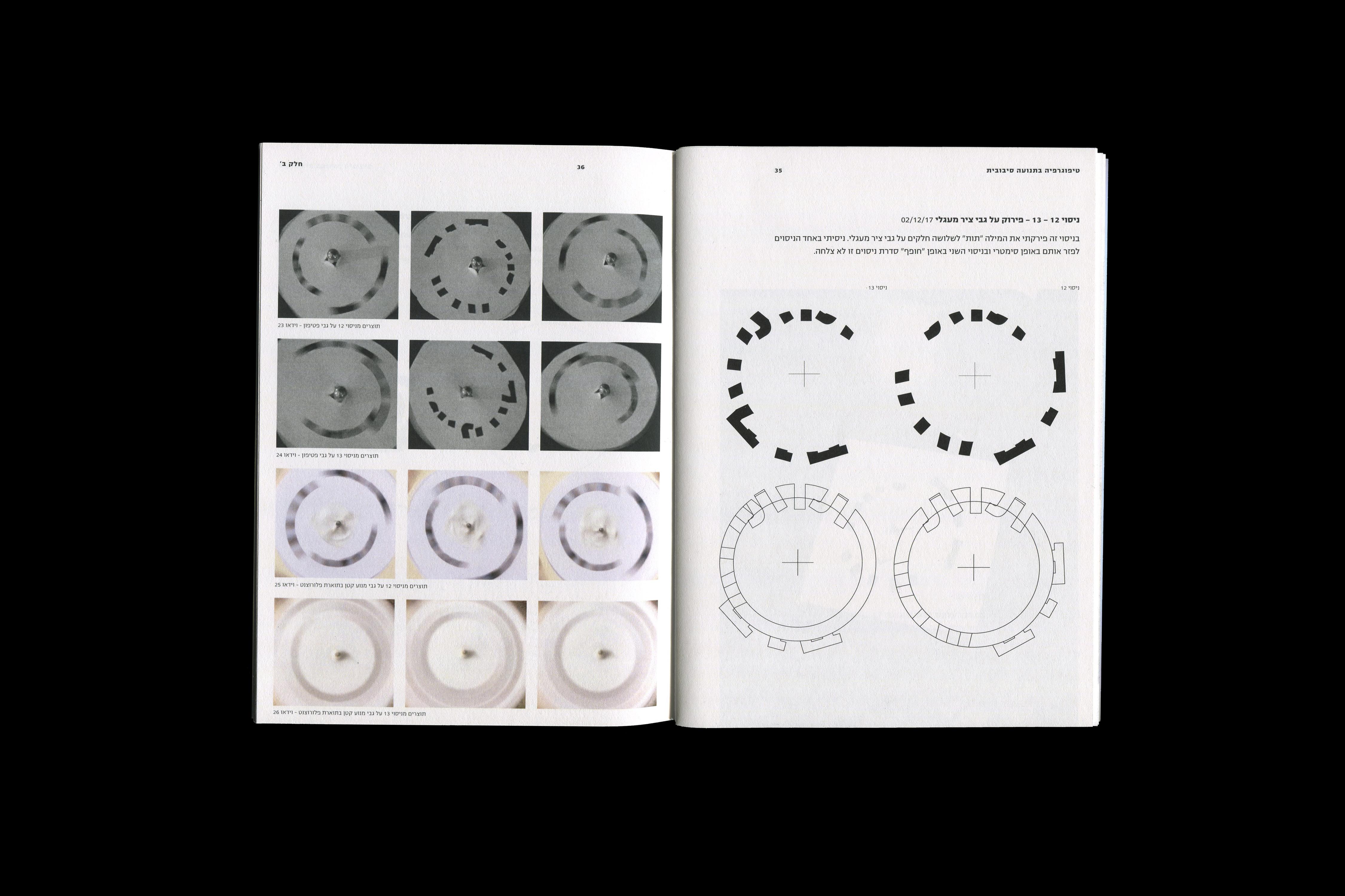
For this project, I experimented with different methods of creating irregular readability using type in circular motion. I explored techniques such as Thaumatropes, Strobescope, and Zoetrope, and built machines to sustain the circular motion required for these experiments. By adjusting typographical elements, I aimed to create an illusion of readability or illegibility. I printed these "amended" glyphs on the circular element of the machine and documented my findings in a type specimen booklet, as well as several small booklets that detail the experiments.
Videos:
Thaumatrope Method
Strobescope Method
Zoetrope Method

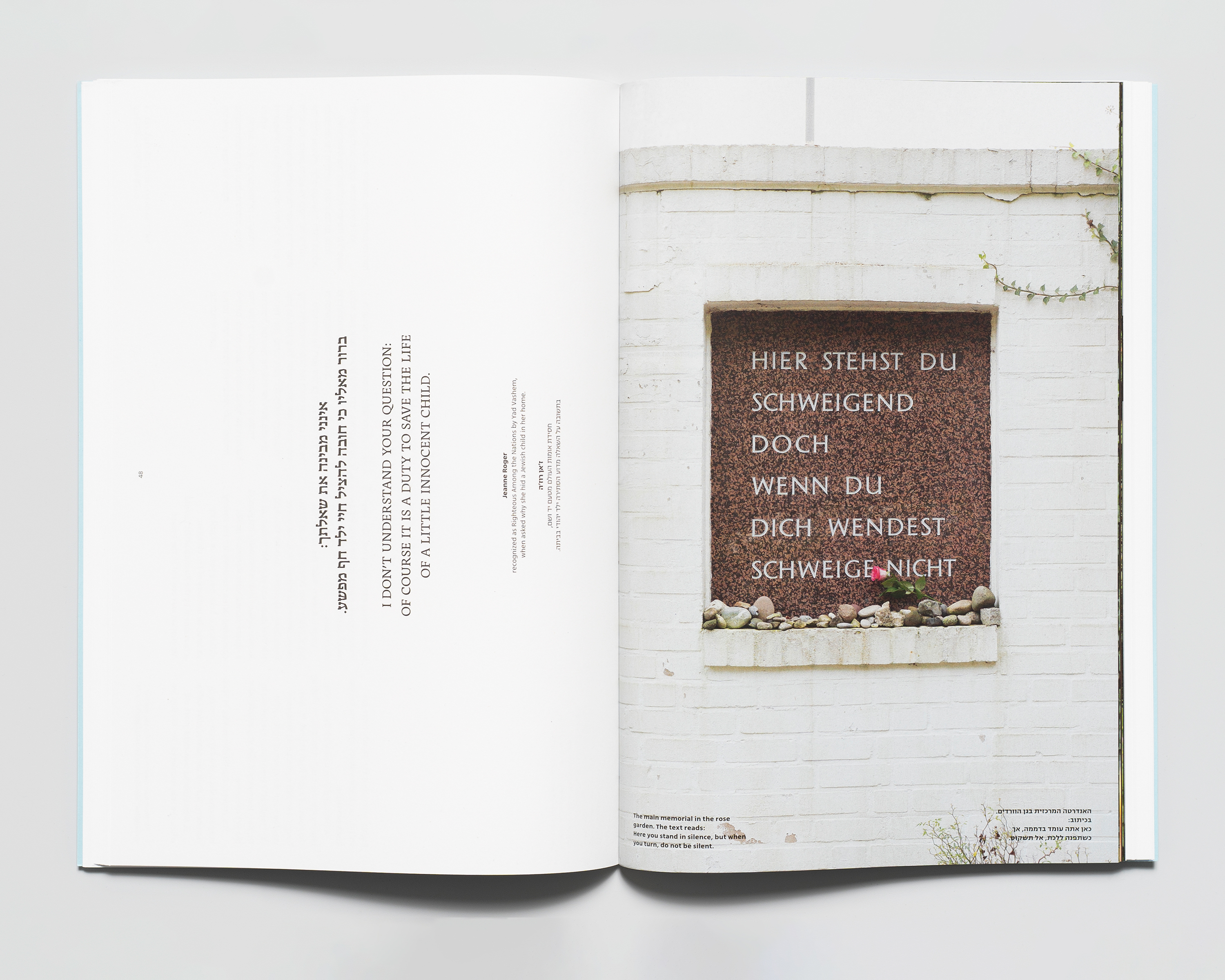
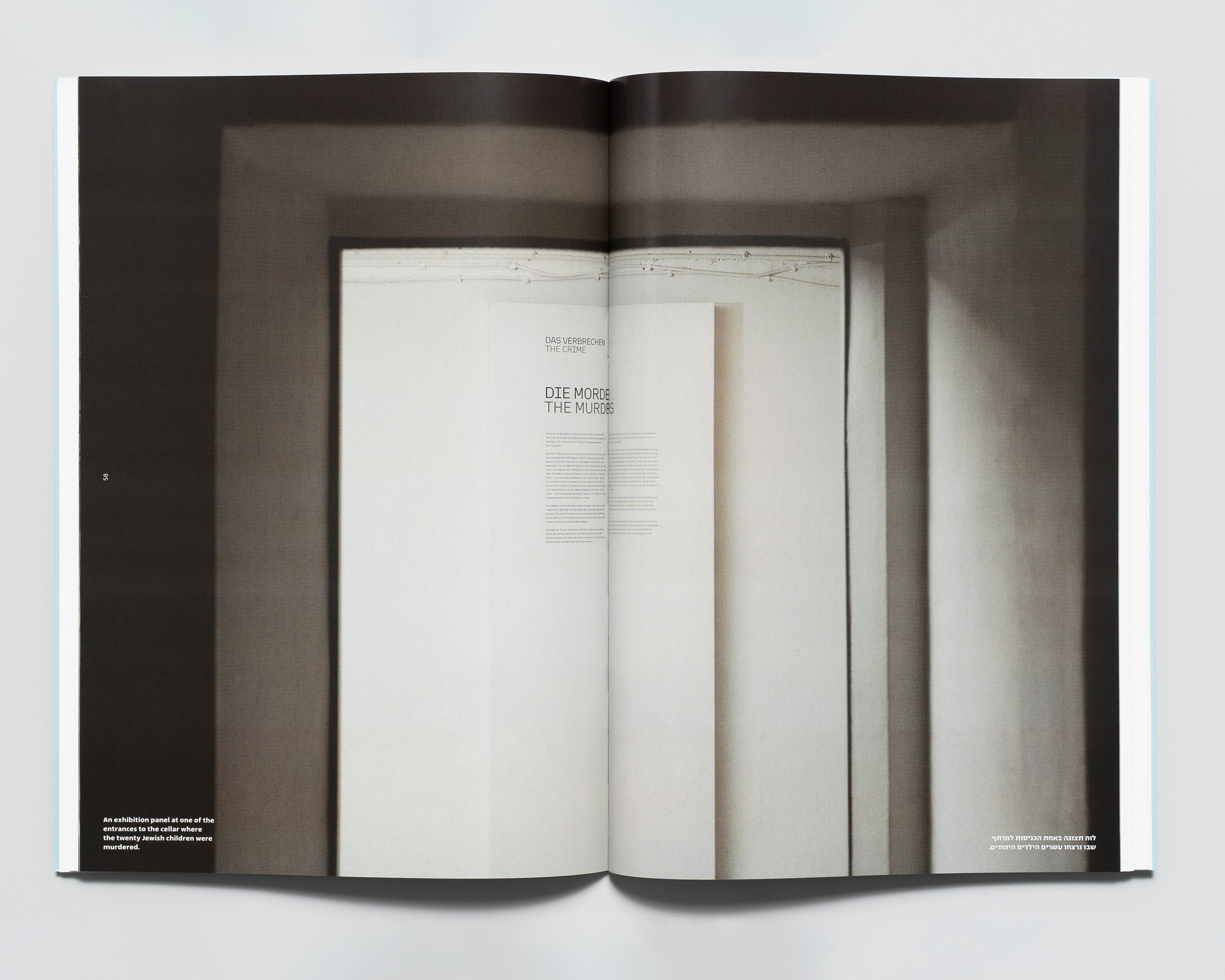
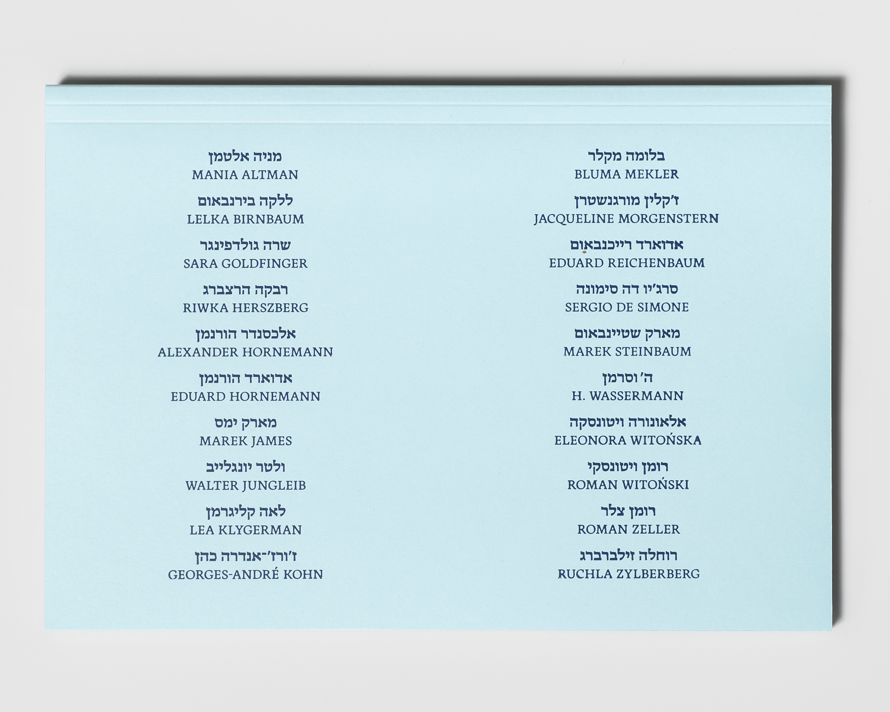
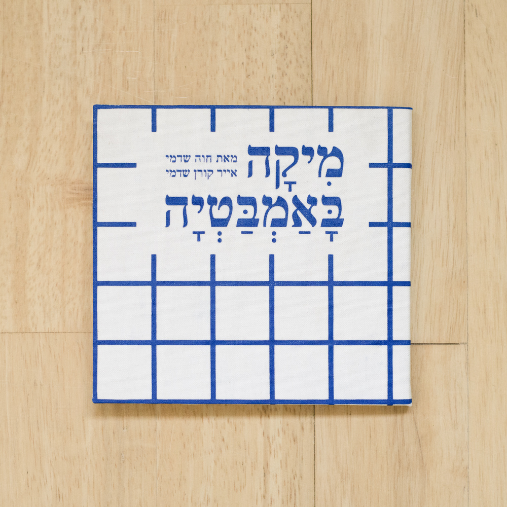
TWENTY JEWISH CHILDREN
A bilingual publication (Hebrew/English) created for the Bullenhuser Damm Memorial in Hamburg, commemorating twenty Jewish children and their caretakers who were brutally murdered in one of the most atrocious crimes of the Nazi regime.
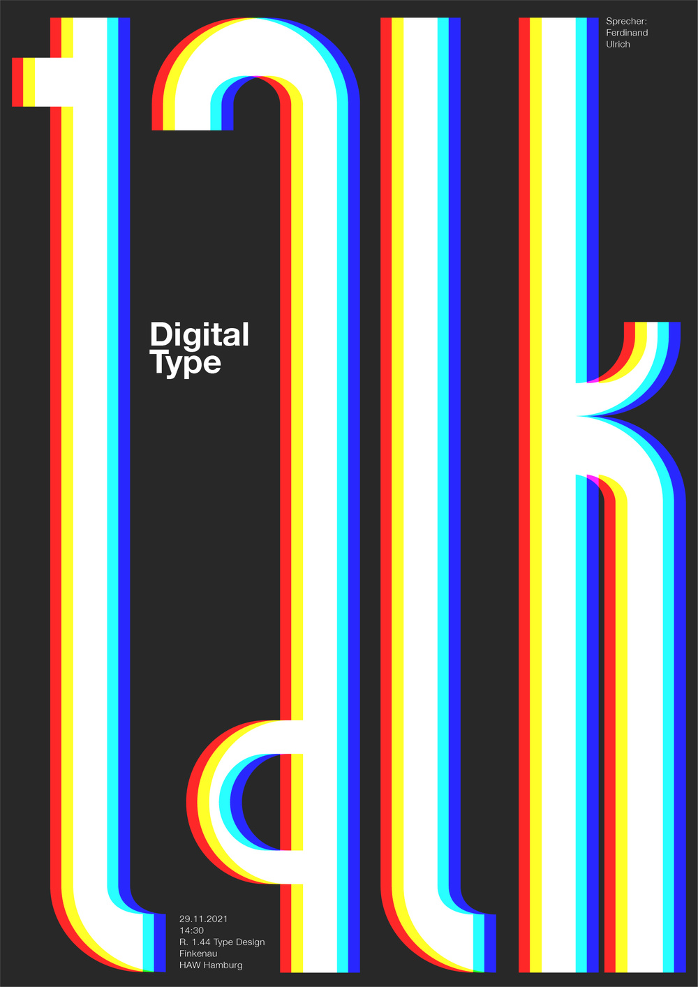
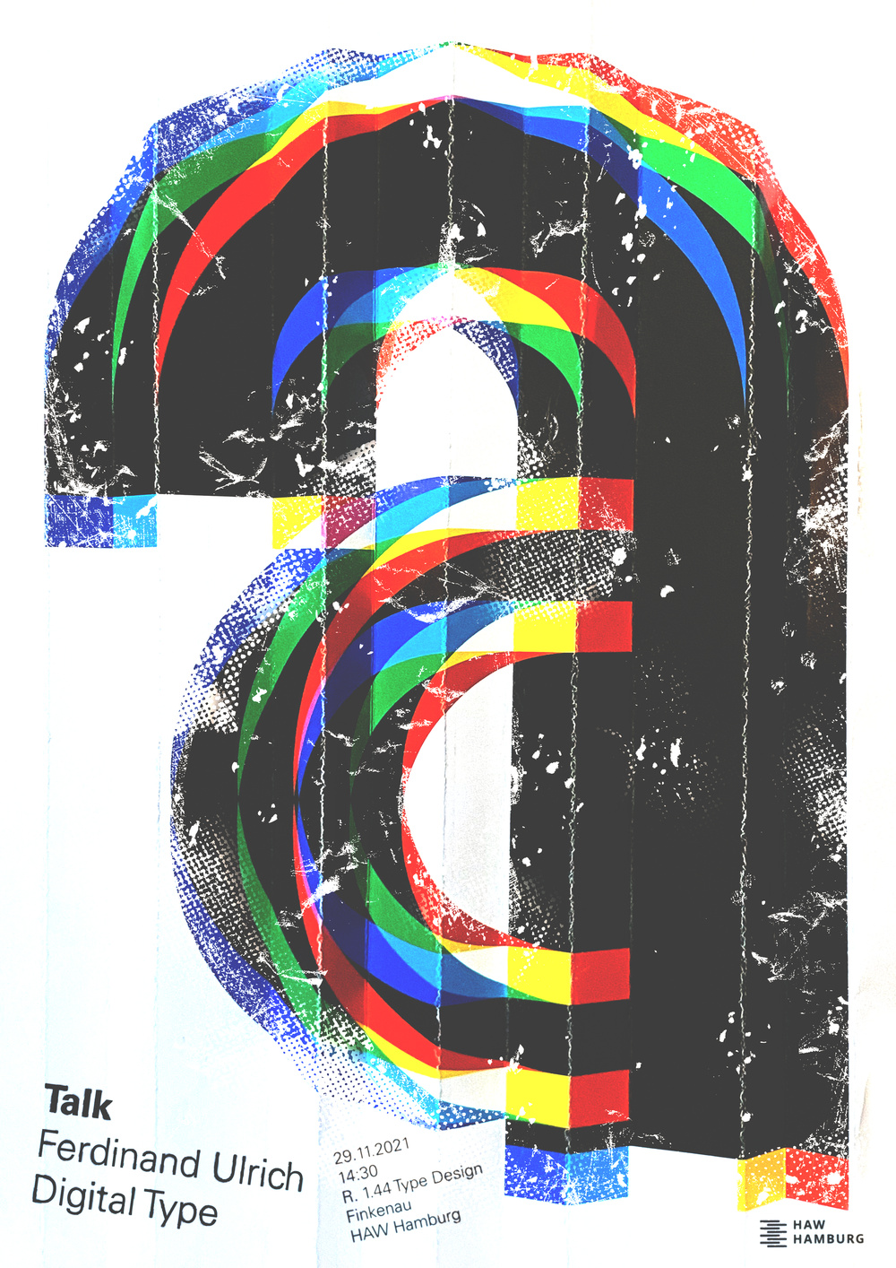
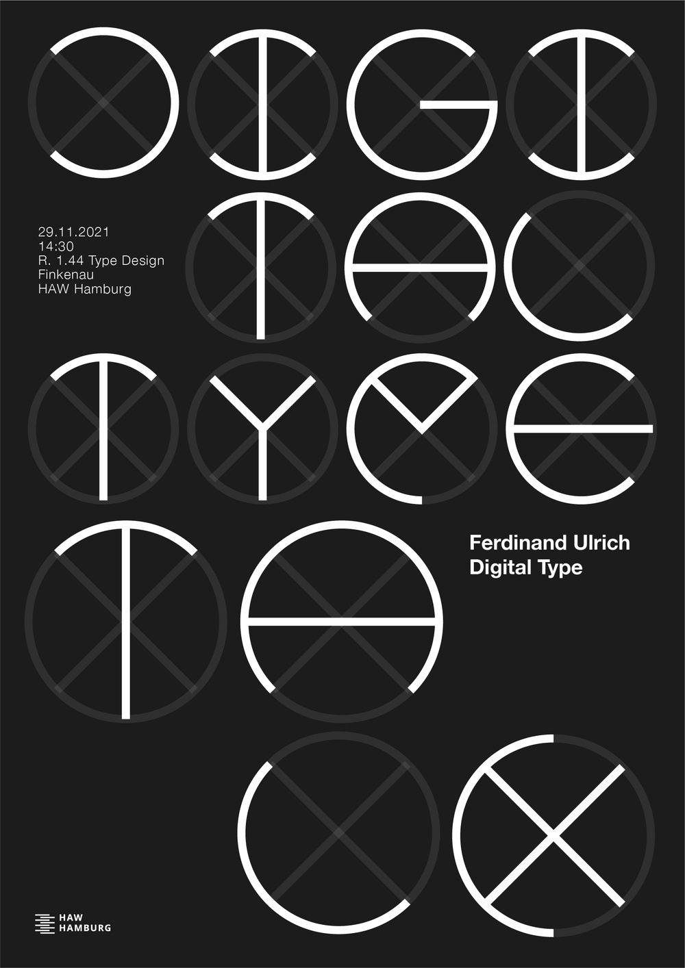
DIGITAL TYPE POSTER
This poster series was created to promote a lecture with Ferdinand Ulrich, in which he discussed the process and history of typography digitization. The series visually represents the topic of the lecture, which focused on how physical typography is transformed into digital formats. The design of the posters highlights the connection between the past and the present, showcasing the evolution of typography over time.
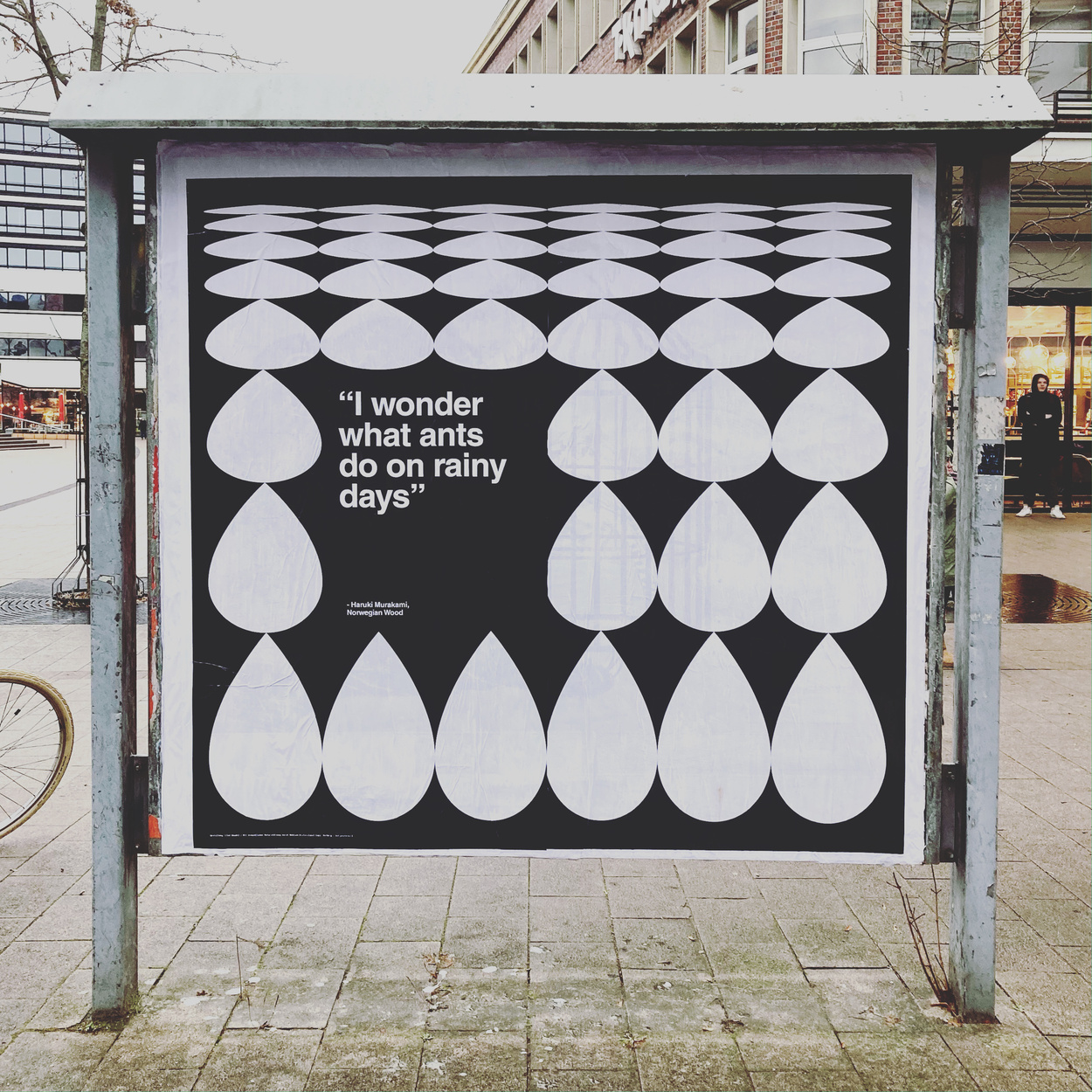
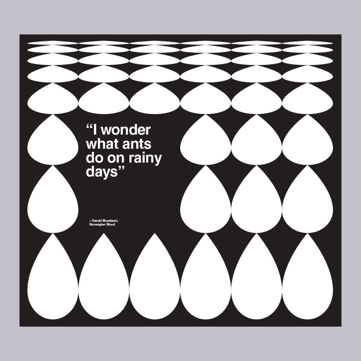
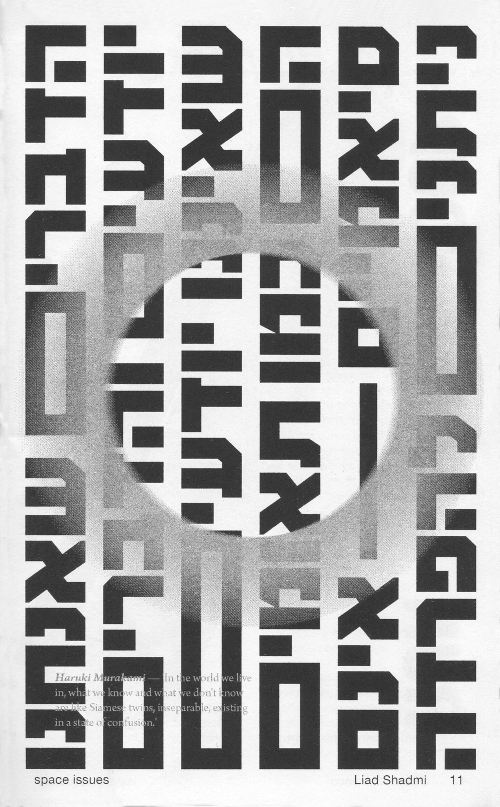
POSTERWALL
The quote 'I wonder what ants do on rainy days' is from the book 'Norwegian Wood' by the acclaimed Japanese author Haruki Murakami, known for his ability to evoke powerful emotions through his writing. For this poster design, I was inspired by the quote's sense of curiosity and enigma.Personal Project, 2020 | Presented at “Posterwall” exhibition, curated by studio Othertypes
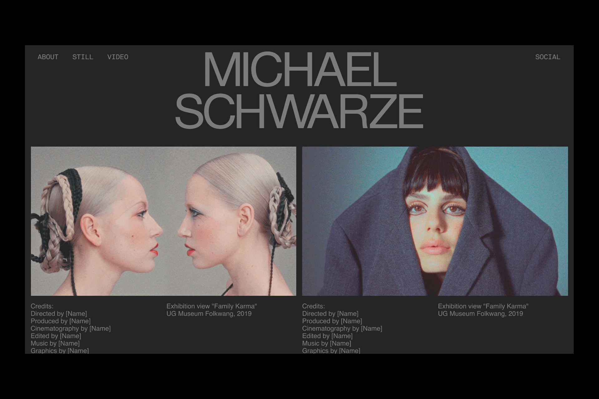


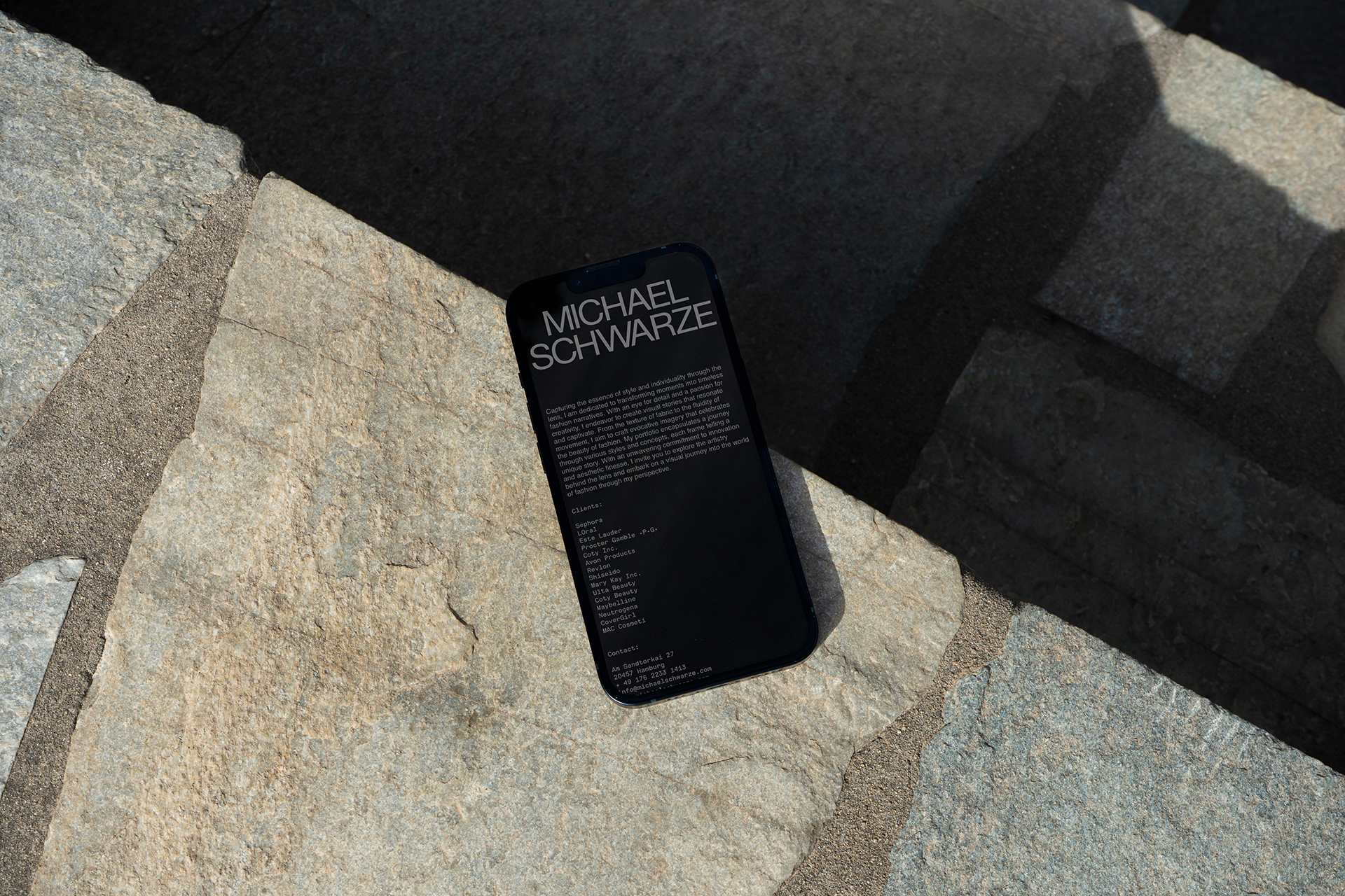

MICHAEL SCHWARZE
Logo and branding for fashion photographer and videographer Michael Schwarze. The branding draws direct inspiration from Michael’s distinctive photography style, which often conveys a sense of gloom and melancholy. Naturally, the name "Schwarze," meaning "black" in German, inspired me to experiment with the use of black-on-black color schemes.Fonts in use: Helvetica Neue, LL Replica
Printing: Siepmann GmbH
Reproduction shots: Michael Schwarze


UNVERZOLLT CATALOG
Catalog design for Unverzollt art collective, located in the Speicherstadt in Hamburg, Germany. The design is inspired by the brick stones that characterize the area surrounding the studio. The catalog showcases 26 artists from various mediums, including animation, design, illustration, painting, performance, photography, sculpture, textile, and text.Commissioned Project, 2024
Text: Lucia von Heusinger
End-Papers photos: Thomas Schmidt
Offset Printing, 80 g/m2 Holmen TRND 2.0, 250 g/m2 Grenita
Printing: Gutenberg Buys Feindruckerei GmbHTDC Tokyo Annual Awards 2025 “Excellent Work“ - Editorial/Book Design Category
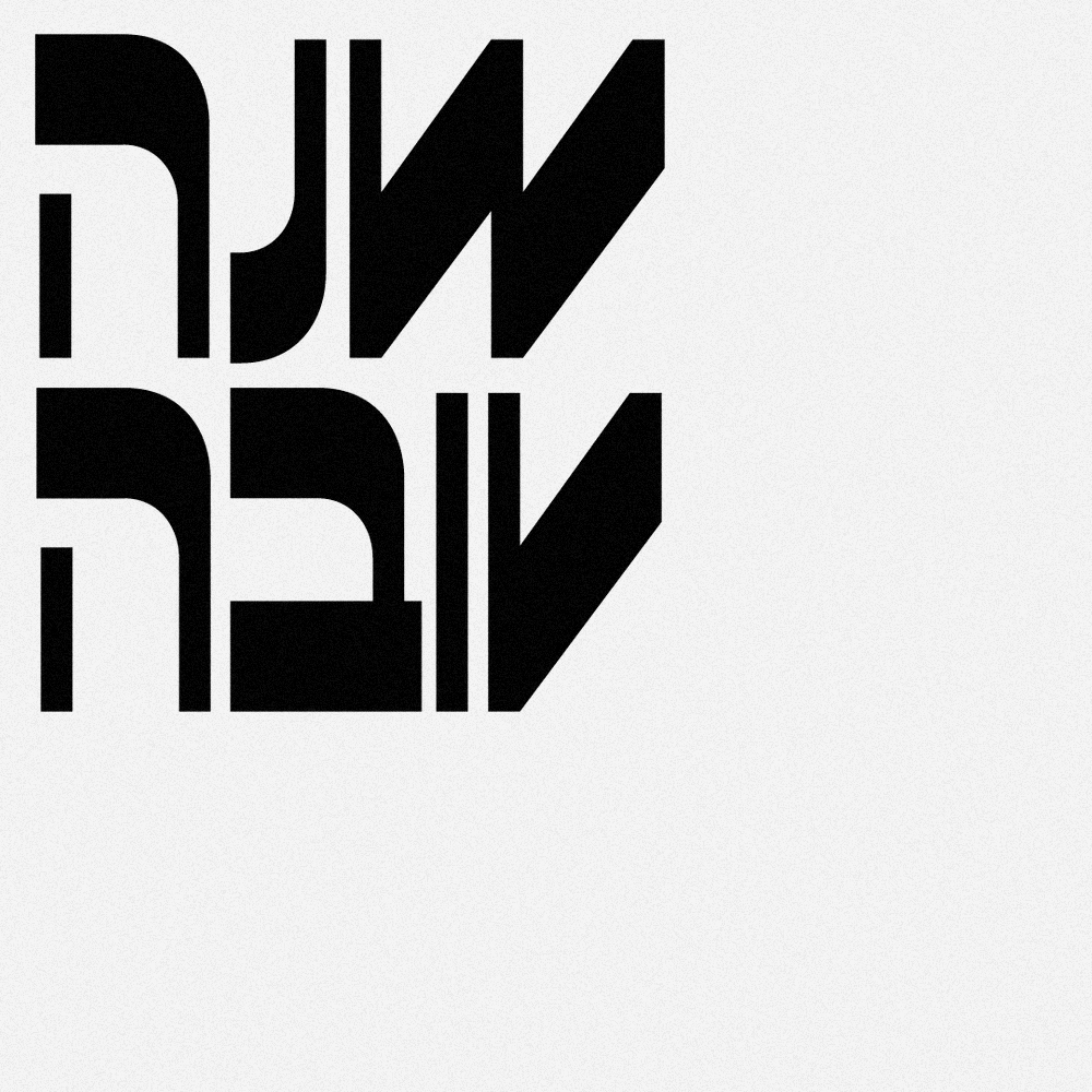
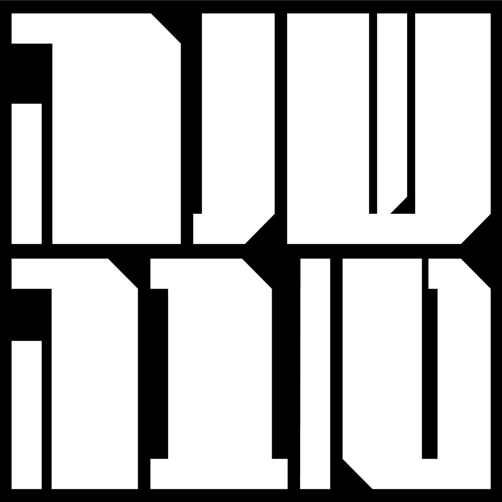
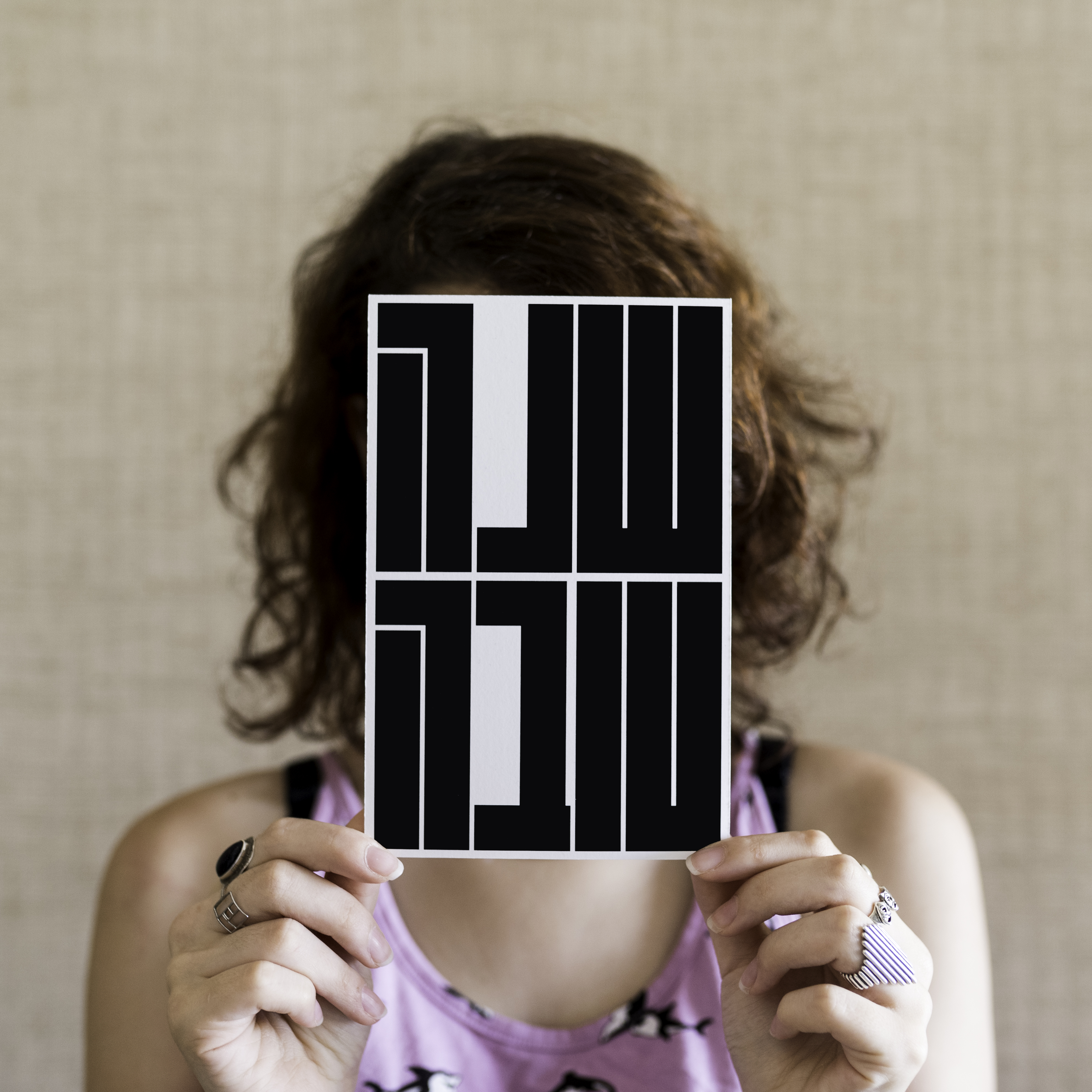
SHANA TOVA
As a yearly tradition, I create a digital postcard to celebrate the start of the Jewish New Year in September. Through these projects, I explore the boundaries of Hebrew typography and experiment with creating unique typographical units using simple shapes and grids.
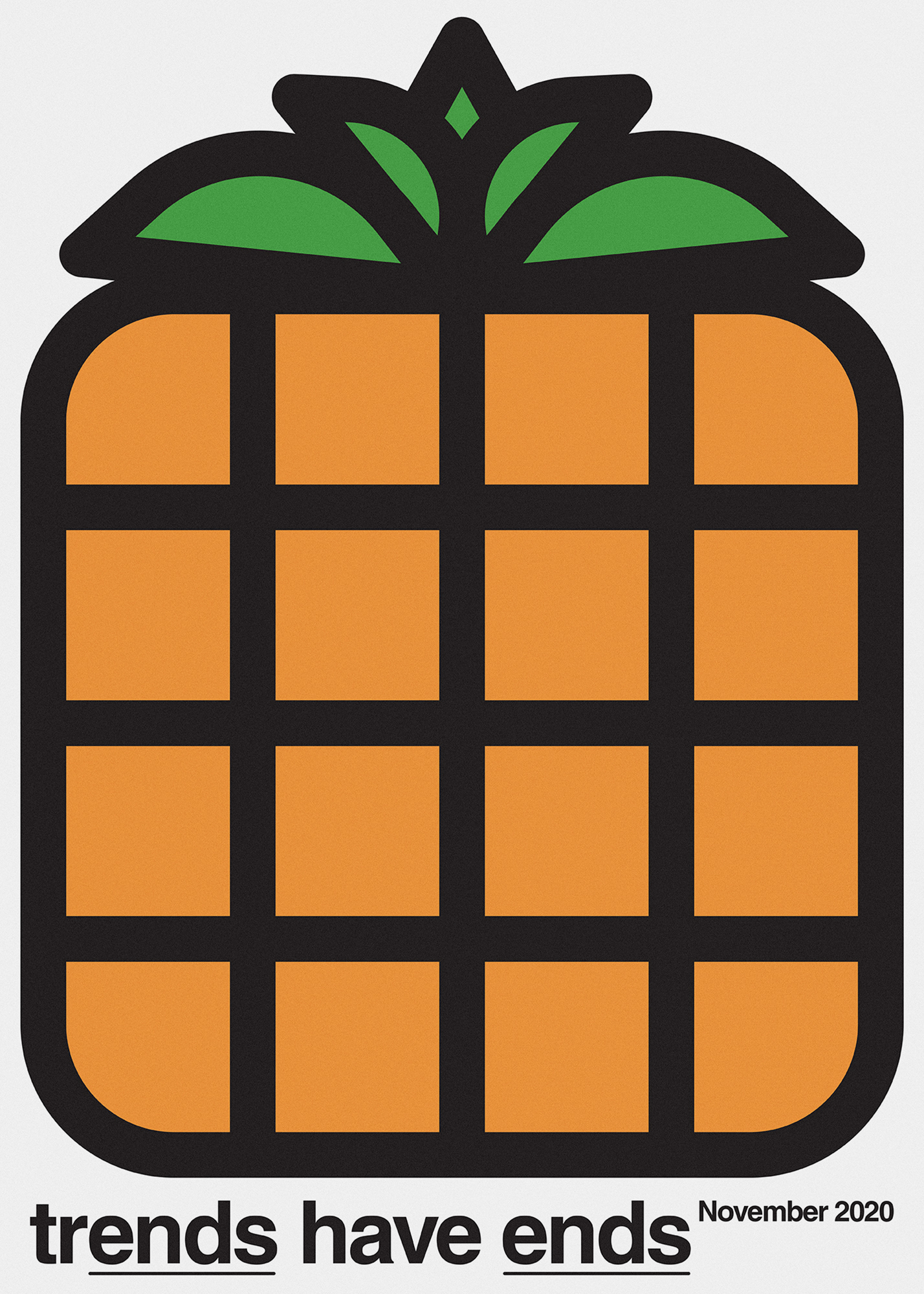
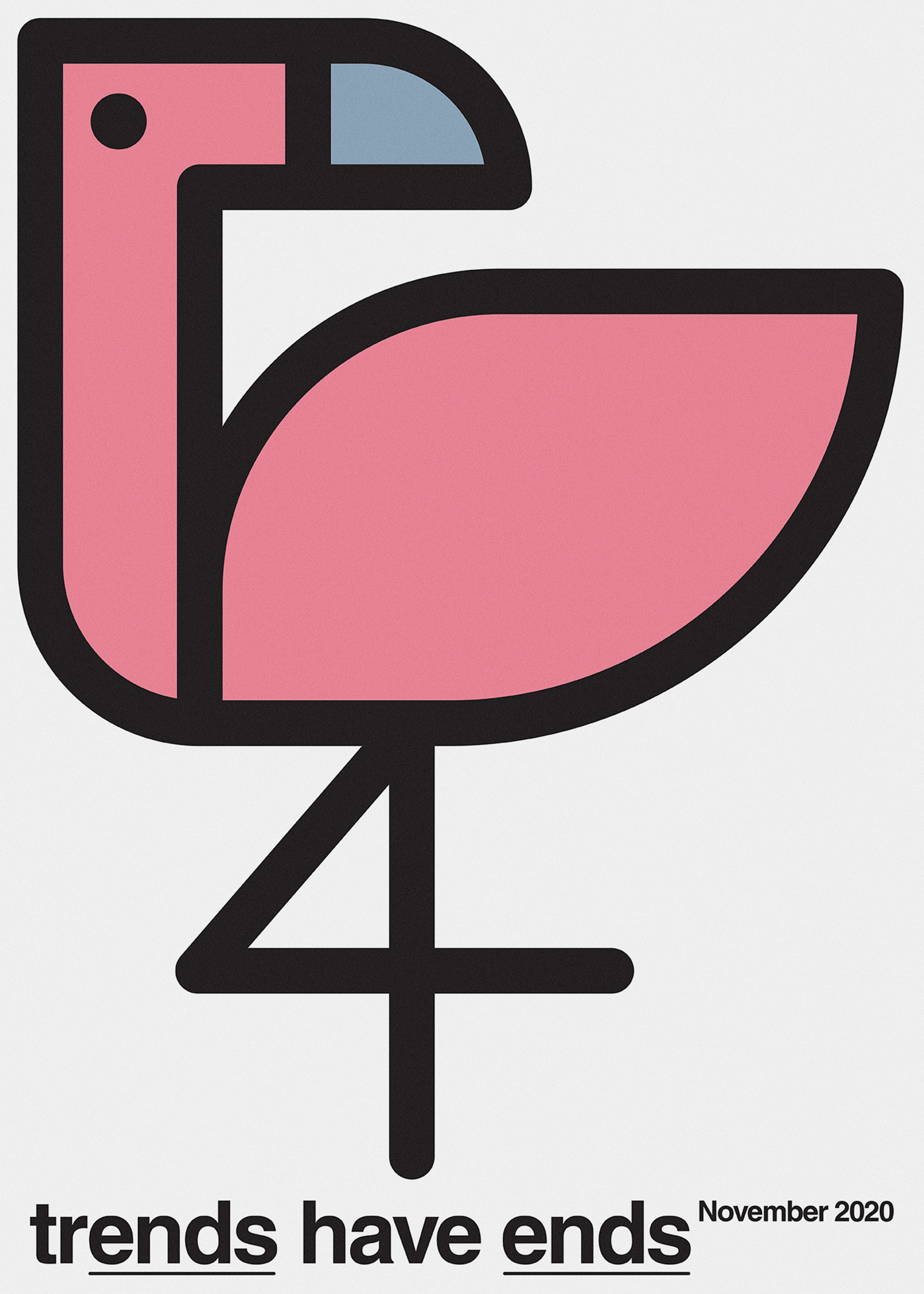

TRENDS HAVE ENDS
Personal Project, 2020


WHAT’S WRONG WITH THIS PICTURE?
Self-publishing, edition of 50 copiesDigiGold icewhite
Digital printing on HP Indigo 10000 Digital Press
Commissioned Project, 2023
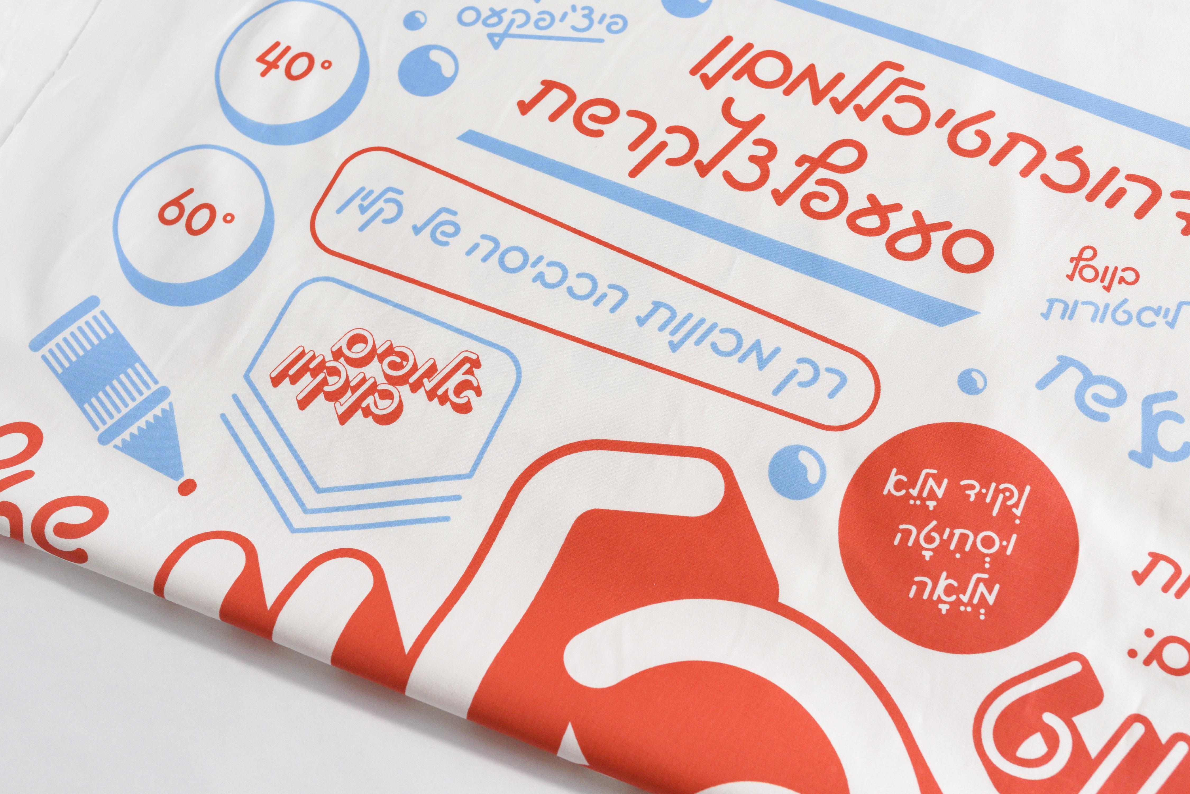
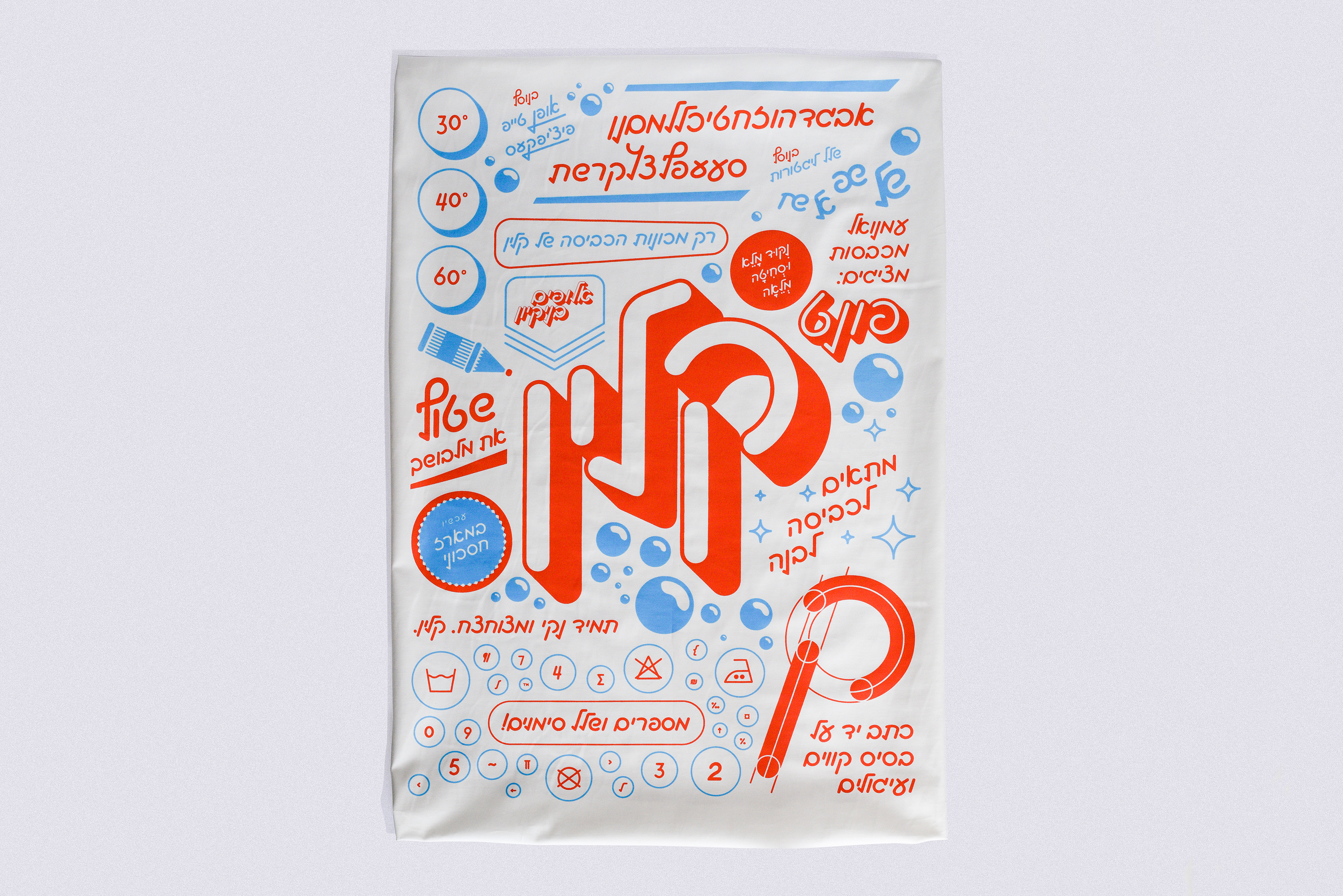
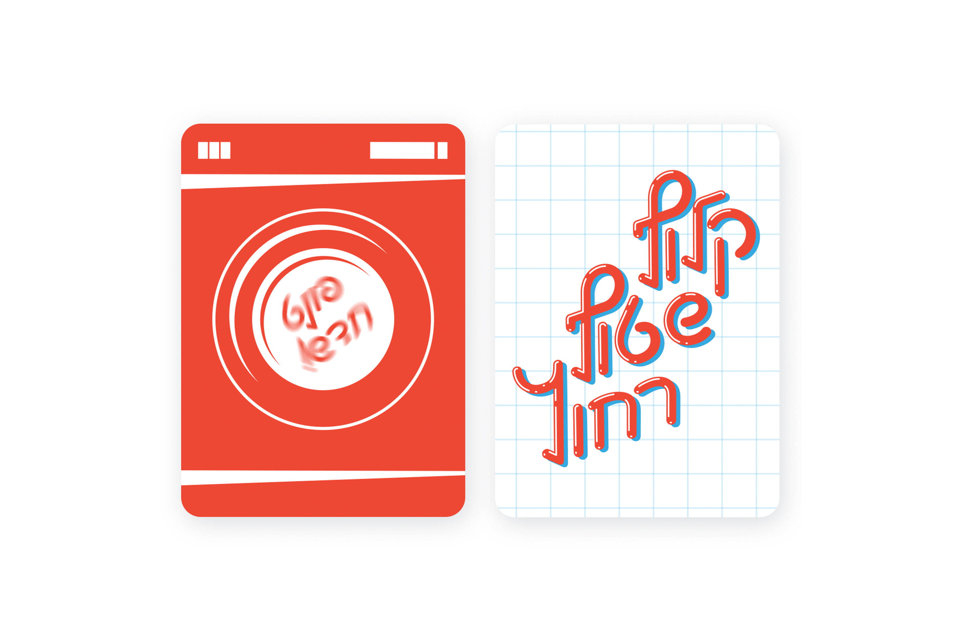
KLEEN
Hebrew script font design, based on radial shapes and straight lines. The original inspiration came from an old washing detergent company logo. The font includes open type features, swashes, laundry icons and ligatures.
Available for purchase here
Font Design Course, Shenkar, 2019 | Guidance: Avraham Cornfeld
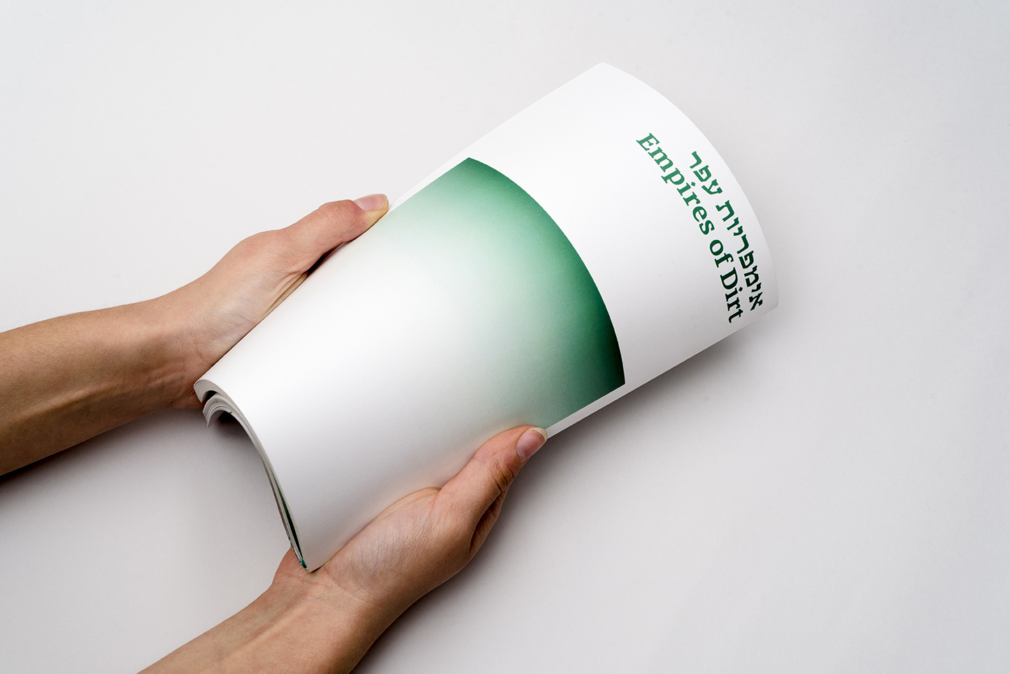
EMPIRES OF DIRT
A publication about abandoned architecture and the transience of our existence. The publication examines empty places that used to serve for leisure. Most of them were built by famous architects and built to grandiose dimensions.Typography Course, Shenkar, 2018 | Guidance: Tamar Bar Dayan


THE ALPHABETICAL ROOM
The project “The Alphabetical Room” is a systematic exploration into the boundaries and limits of writing within a strictly calculated mathematical three dimensional grid within the flat digital space. Treating the three dimensional grid in the second dimensional digital space was always an intriguing matter for graphic designers, programmers, creative coders and visual artists.
Starting from Josef-Müller Brockmann’s grid proposal for the design of interior spaces in 1961, the perspective of the viewer changes throughout the pages of the leaflet as does the resolution of the three dimensional grids in which the hypothetical letterforms are displayed. In addition I wrote a short introductory essay on the historical and on-going fascination of graphic designers, programmers, creative coders and visual artists on that topic.

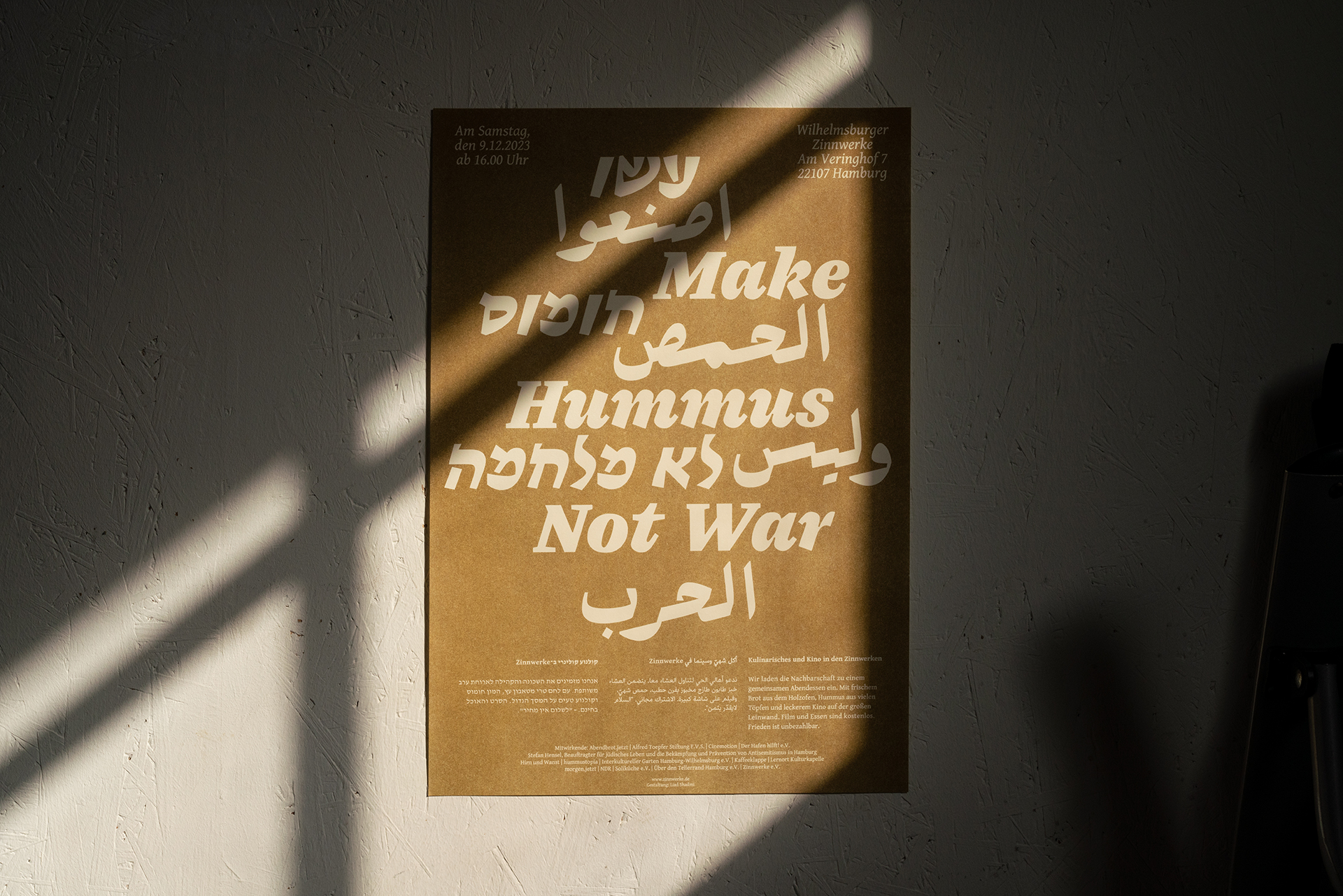


MAKE HUMMUS NOT WAR
Trilingual posters and postcards were designed for Zinnwerke e.V. for the screening of the film "Make Hummus not War" and an open discussion following the screening. While the languages needed to harmonize with each other, I endeavored to remain faithful to the letterforms of each language.Title font: Alfa Bravo, Hagilda, Michal Sahar
Body text: Arabic: Athelas arabic, Sahar Afshar, Adobe fonts
German: Gentium, SIL international, Google fonts
Hebrew: David Libre, originally designed by Ismar David, revival by Meir Sadan, Google fonts
Client: Zinnwerke e.V.
Paper: Arena IVORY, Fedrigoni
Printing: Risofort, single color gold pigment
Support with Arabic: Sama Abu Hanna, 29 Studio
Commissioned project, 2023
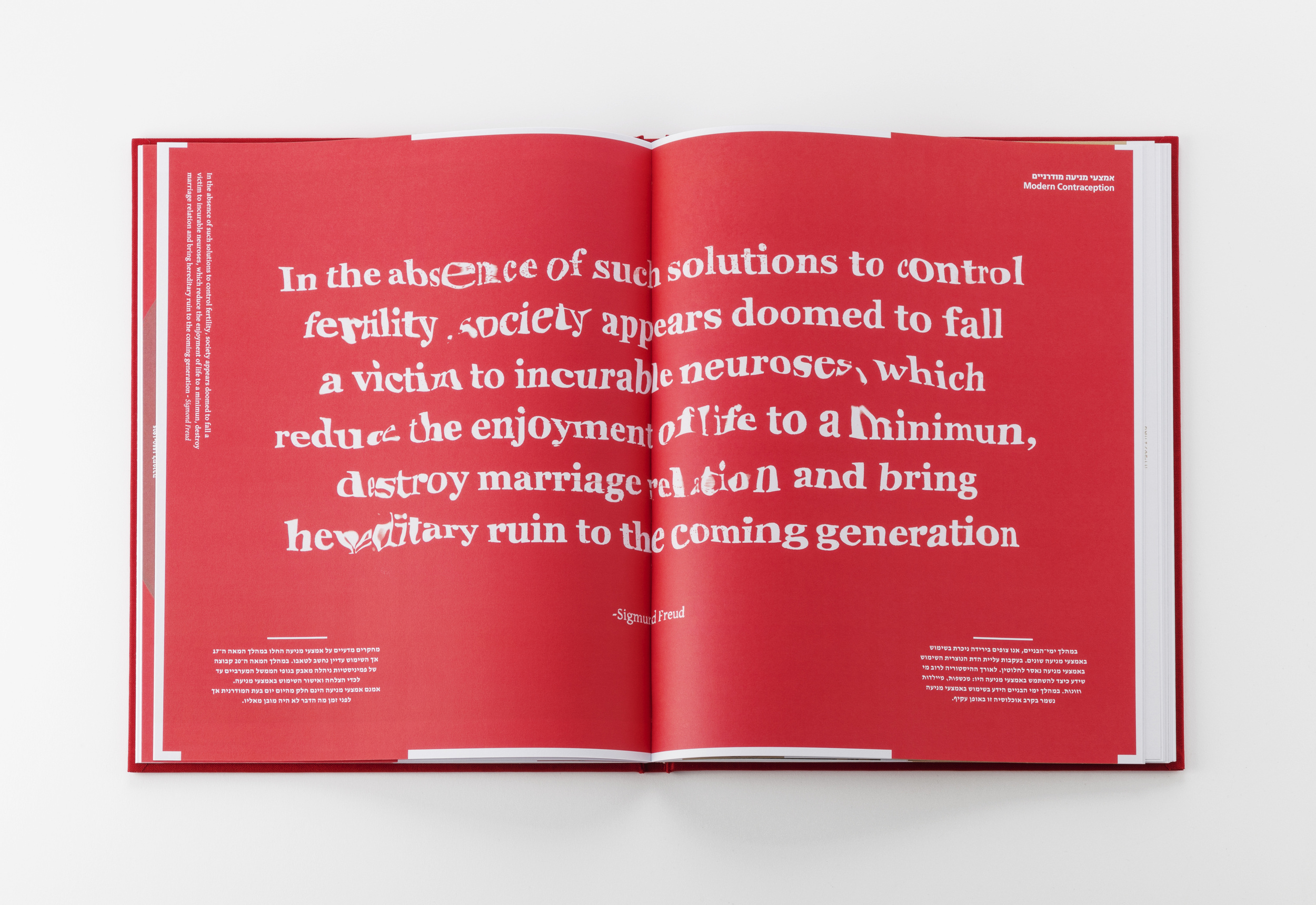
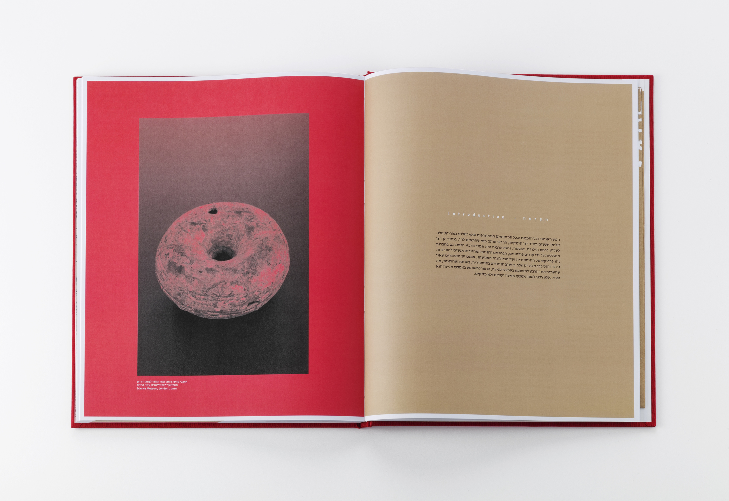
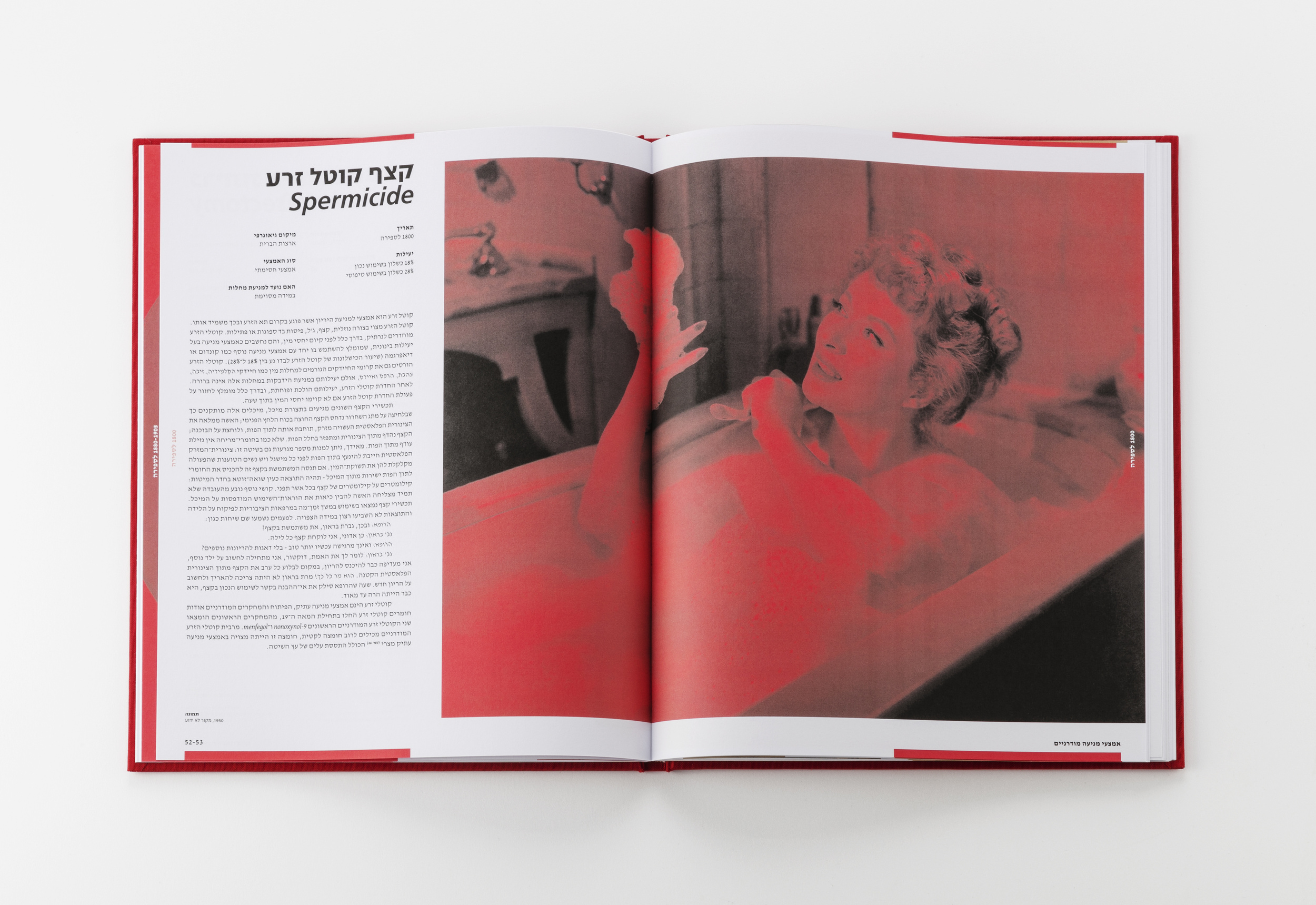
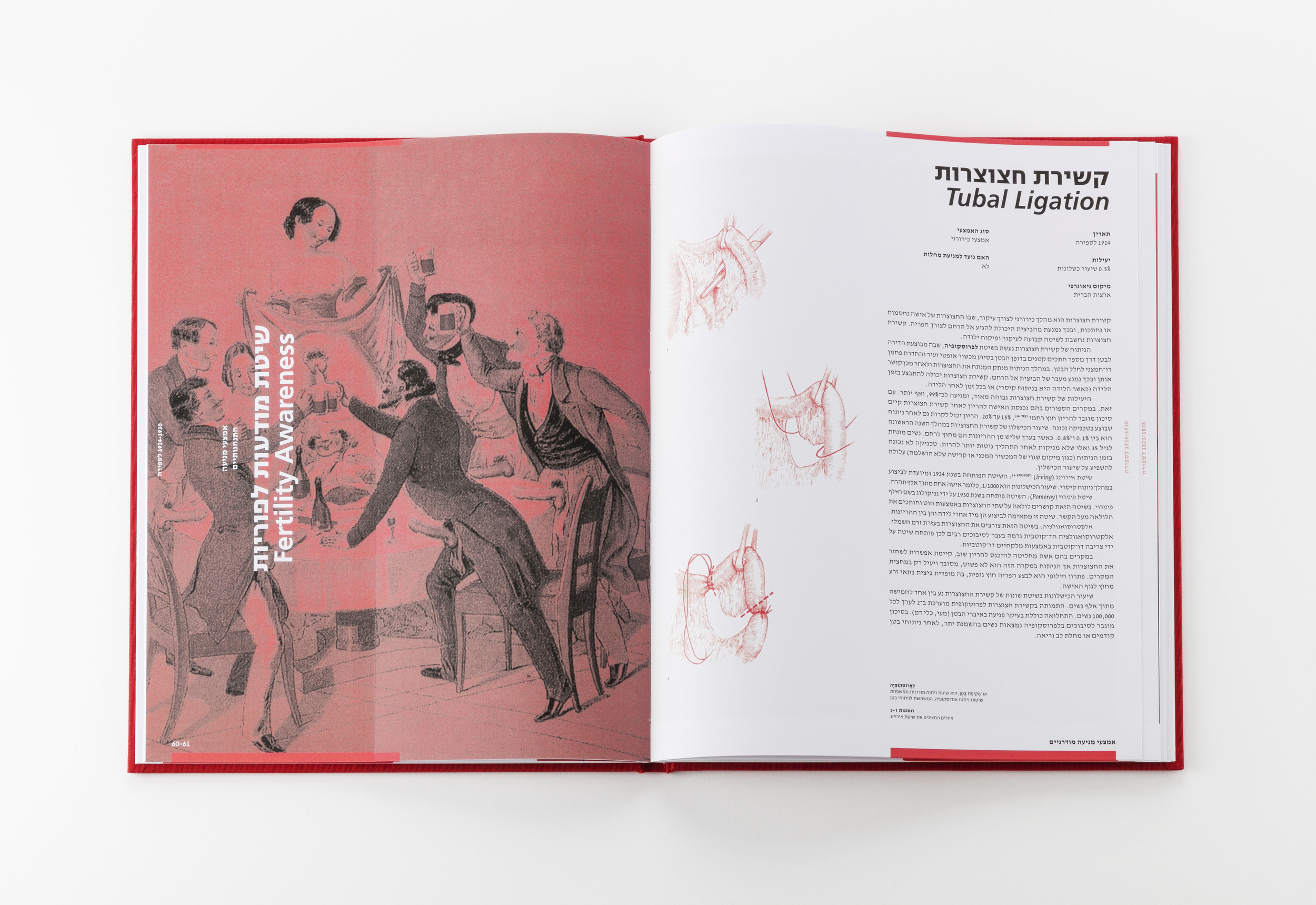
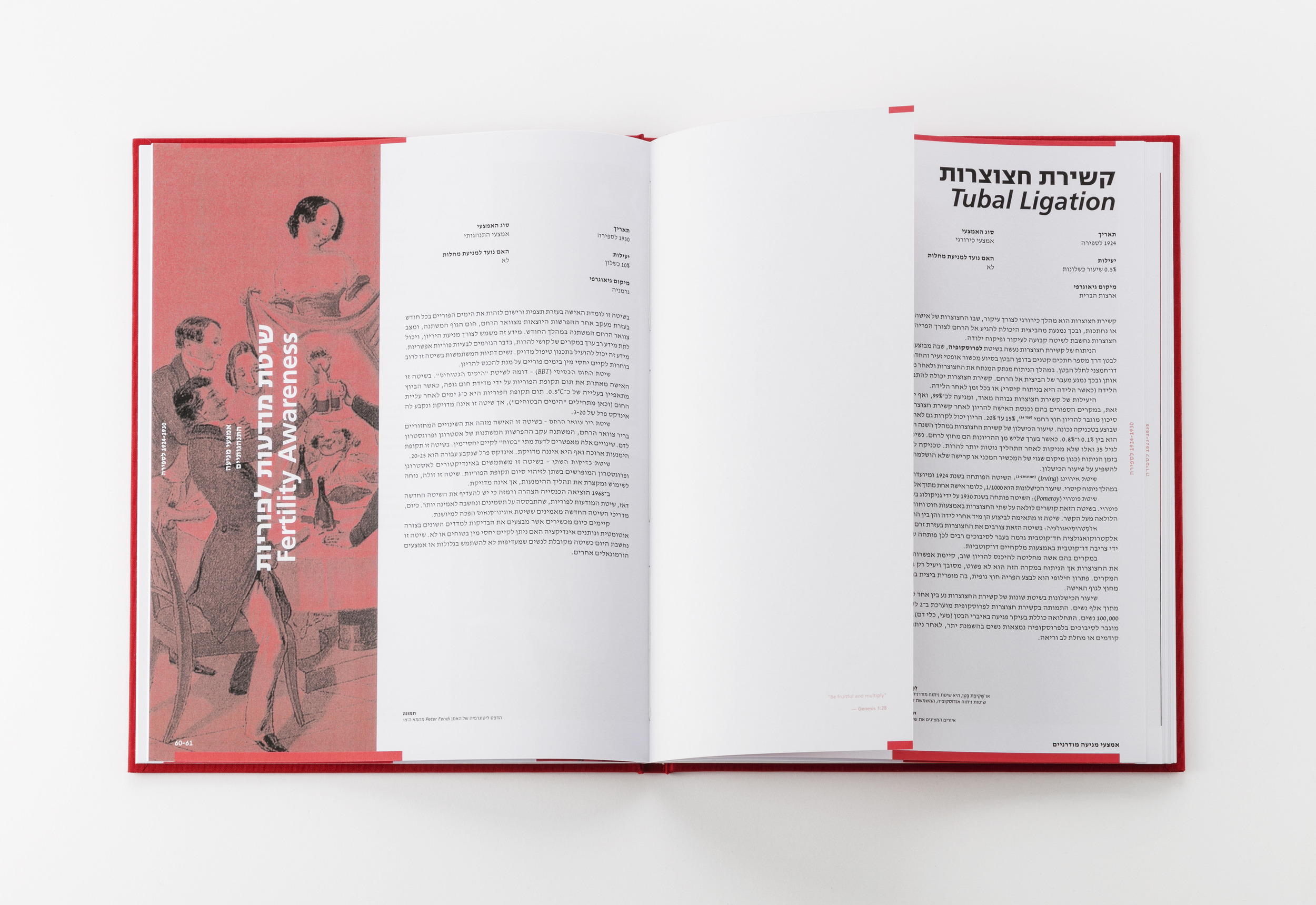
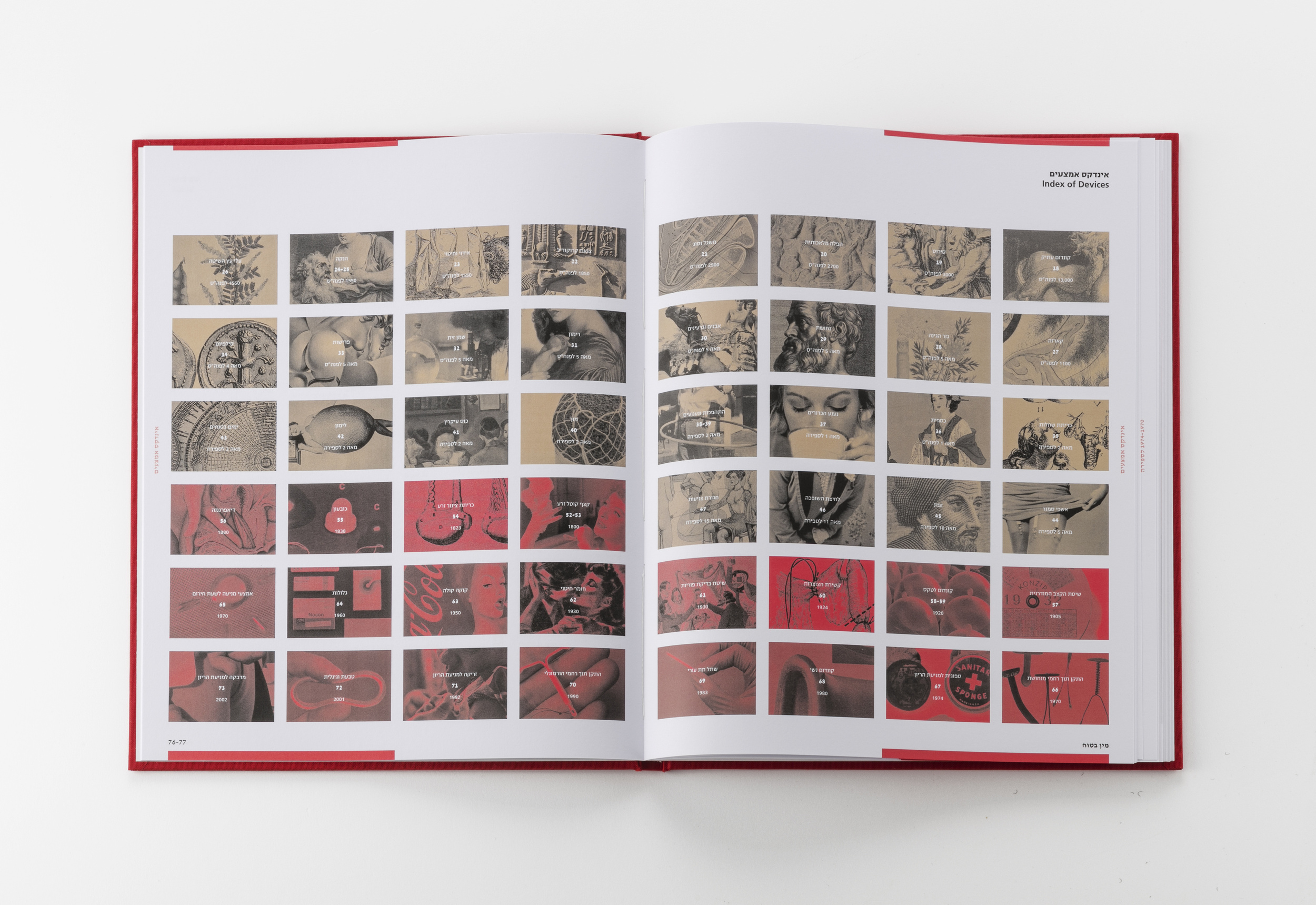
SAFE SEX
This book focuses on the history of contraception and contains 48 different methods used throughout human history. The book is divided into two chapters, one covering modern methods and the other ancient techniques. The methods are organized chronologically, with some of the most well-known contraceptives such as condoms, IUDs, and pills, as well as more obscure ones like crocodile dung, lemon halves, pennyroyal tea, and even Coca-Cola.
The design of the book is intended to resemble a design of a museum exhibit on the history of human behavior and sexuality, with a formal font and layout reminiscent of an encyclopedia or history book. Despite the classic design, I incorporated contemporary elements into the overall design system.
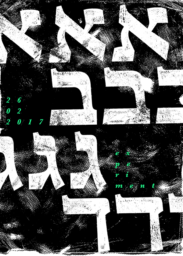
Featured on ExperimentaTypography Course, Shenkar, 2017 | Guidance: Michal Pauzner
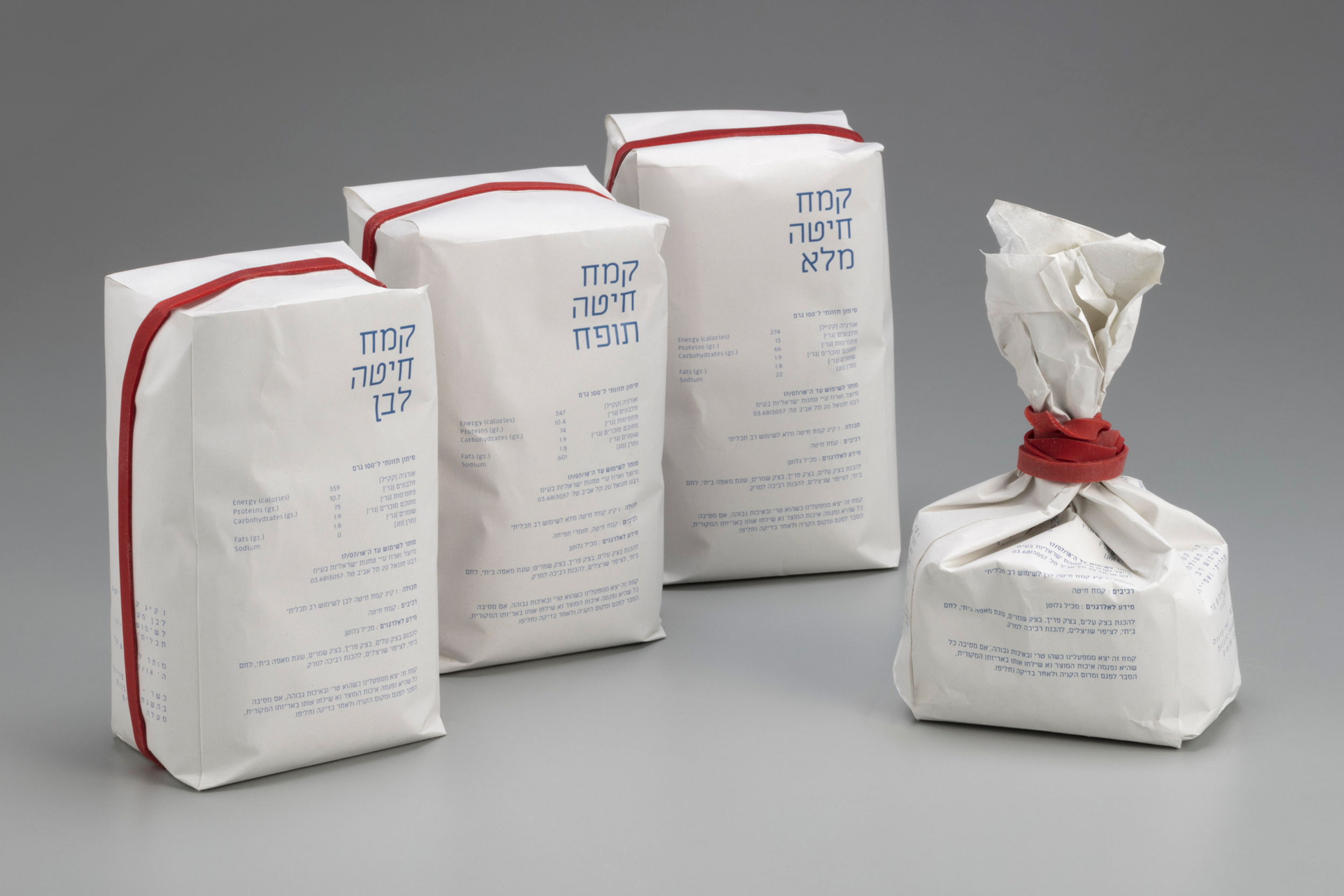
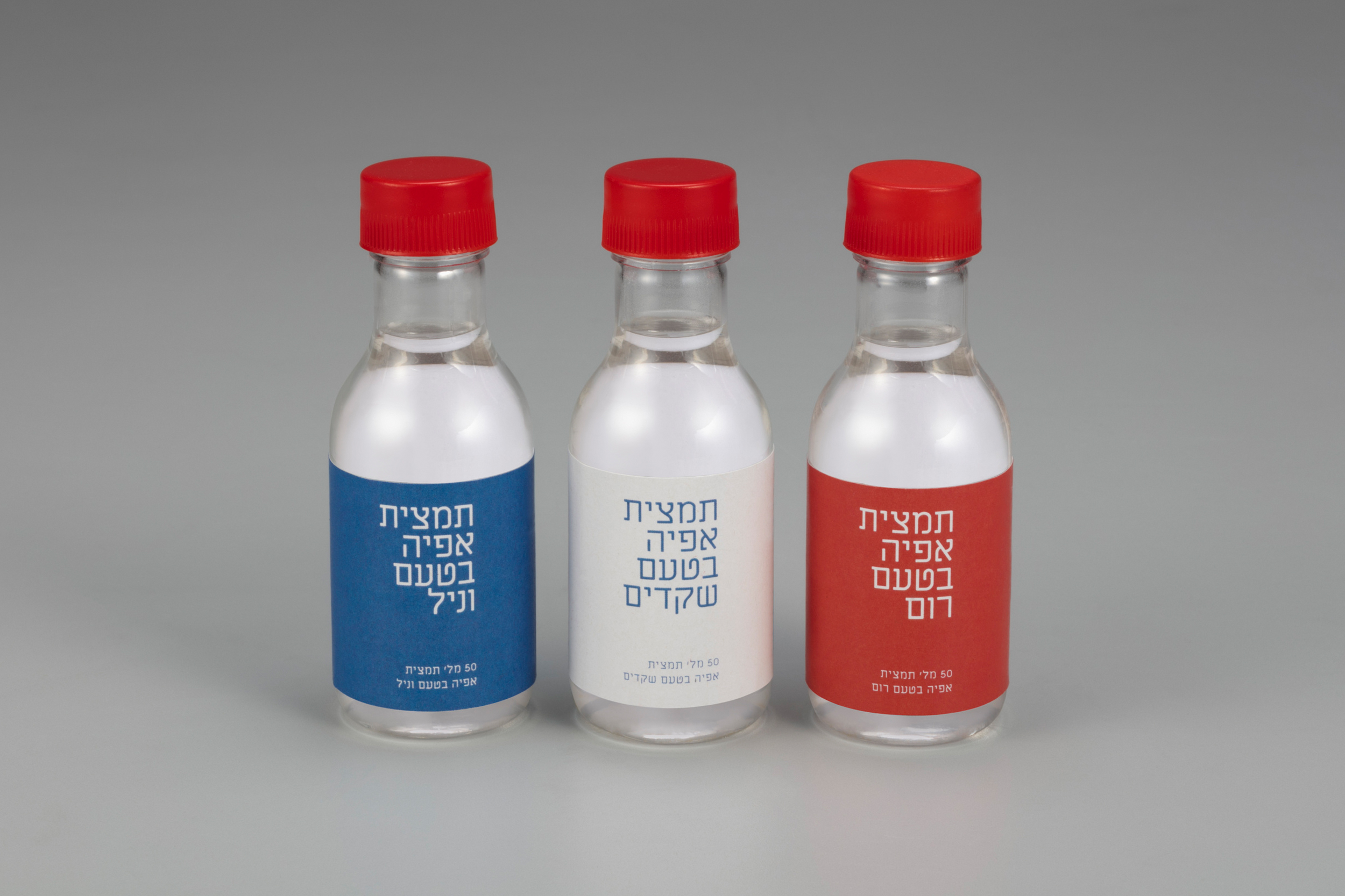
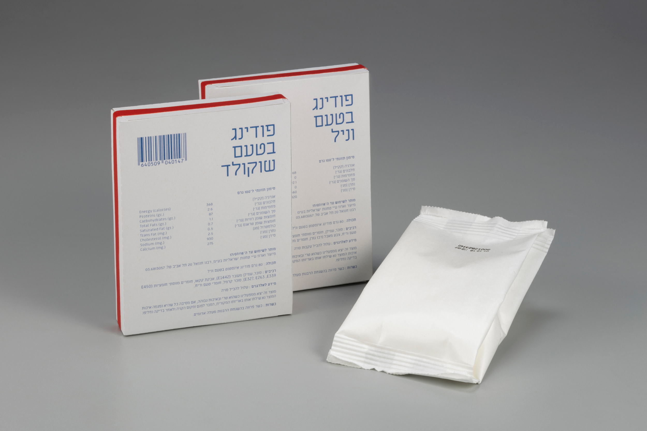
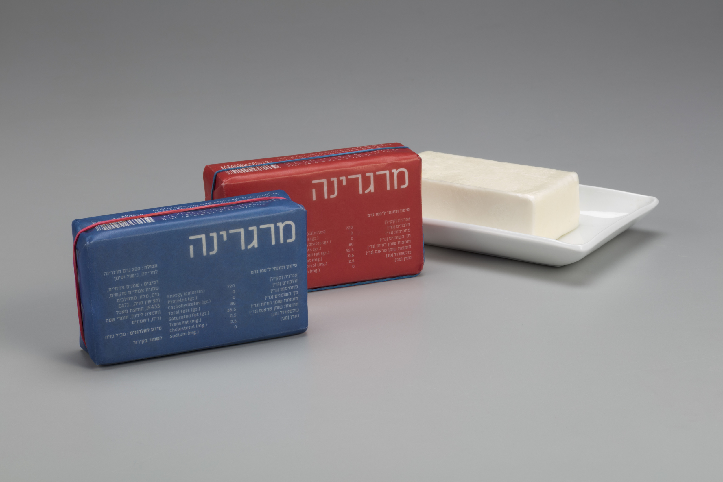
AUSTERITY PACKAGING
Baking materials Packaging influenced from the Austerity regime in Israel. From 1949 to 1959, the state of Israel was, to a varying extent, under a regime of austerity (Hebrew: צנע, Tzena'), during which rationing and similar measures were enforced.
The design draws values of simplicity, functionality and meagerness. Each package has a red mark that indicates the opening.
Featured on Packaging of the World
Featured on World of Packaging Design
Featured on Fonts in Use
Selected as semifinalist on Adobe Awards
Packaging Design Course, Shenkar, 2018 | Guidance: Dekel J. Maimon
HAIMKE
This is a type specimen poster for Fontimonim Type foundry - a remake of the "Chaim" typeface. Originally created during the 1920s in East Europe, this modern geometrical Hebrew font has been meticulously redesigned for contemporary use. The poster is printed in A3 size using screen print technique.Personal Project, 2019

SELECTED VISUALS
Various artworks & posters from the archive.Personal Projects


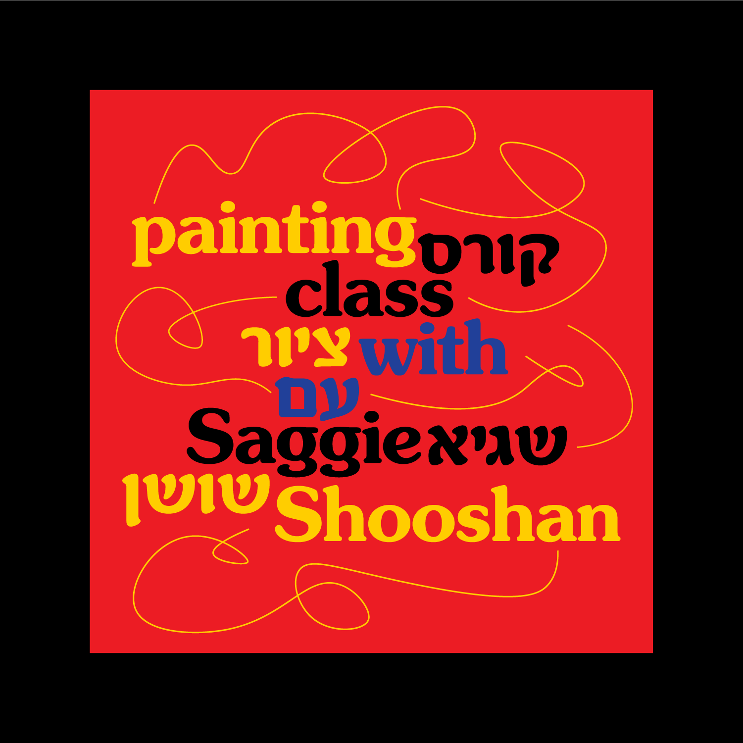


GOOD ENOUGH PAINTING
For this project, I created a bilingual brand identity and logo for a drawing school in Tel-Aviv. The school's target audience consisted mostly of young millennials who may not necessarily speak Hebrew. My objective was to tap into the nostalgic memory that people often have from their first drawing lesson in school - the magic of mixing primary colors to create a full spectrum of colors. I aimed to connect the target audience with their childhood memories and to encourage them to overcome their inhibitions about drawing in a playful and creative way.
To achieve this, I used the Hebrew font Narkis Hen together with the Latin font Souvenir, which is associated with the Art Nouveau and Arts & Crafts movements, both of which have a strong connection to drawing and painting. I also incorporated elements from the Bauhaus movement, which is closely tied to the city of Tel-Aviv.
Commissioned Project, 2022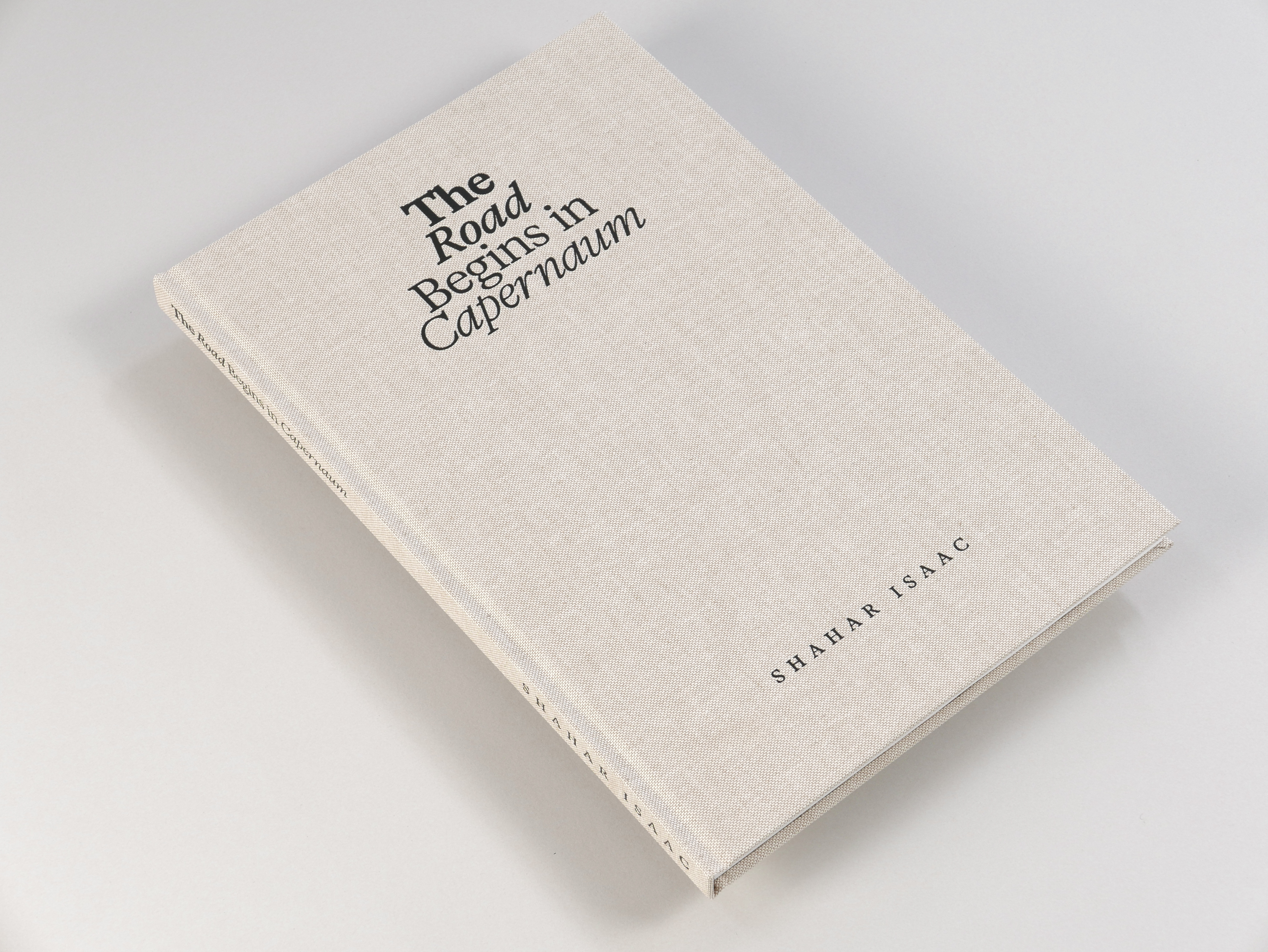
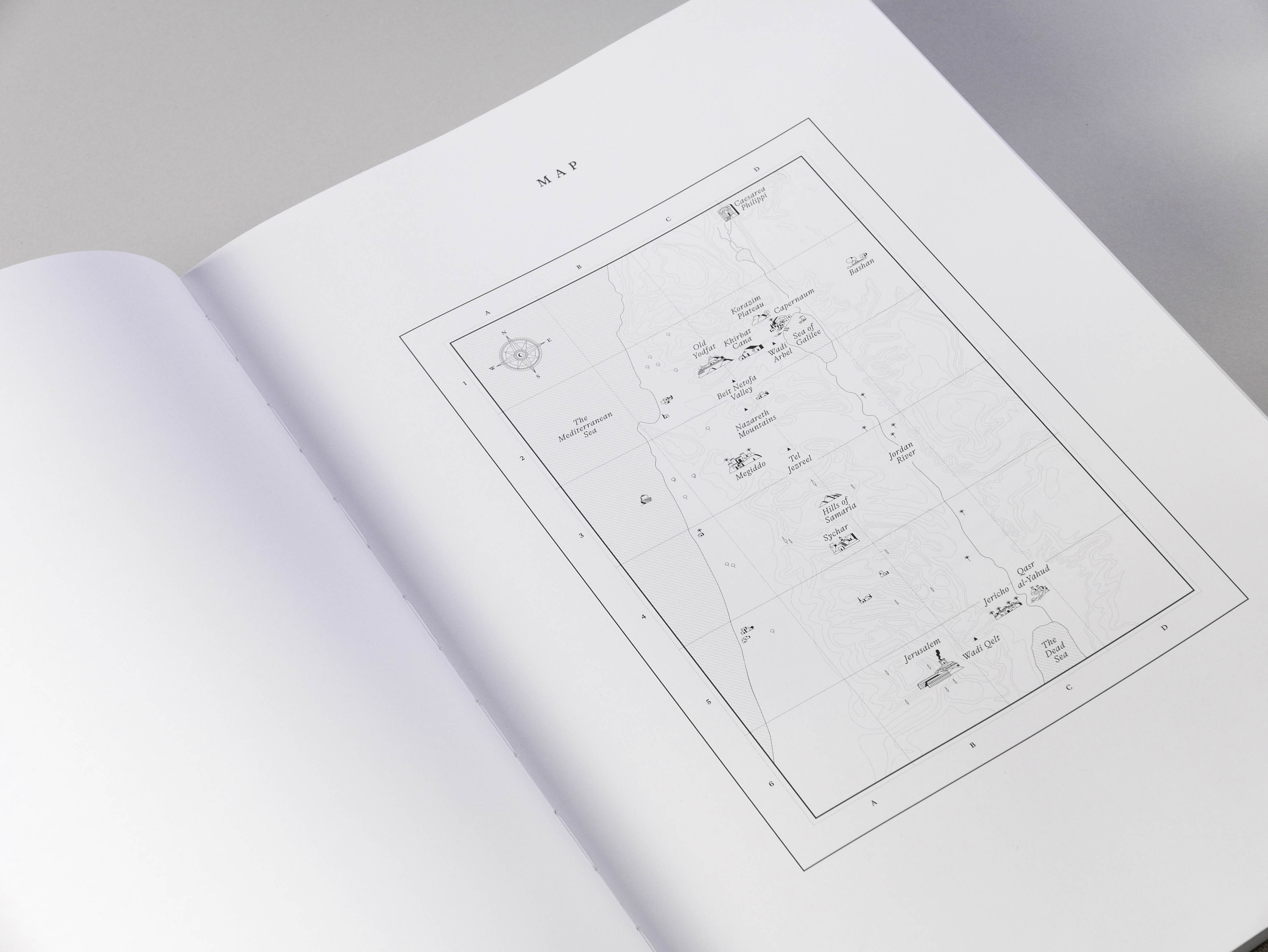


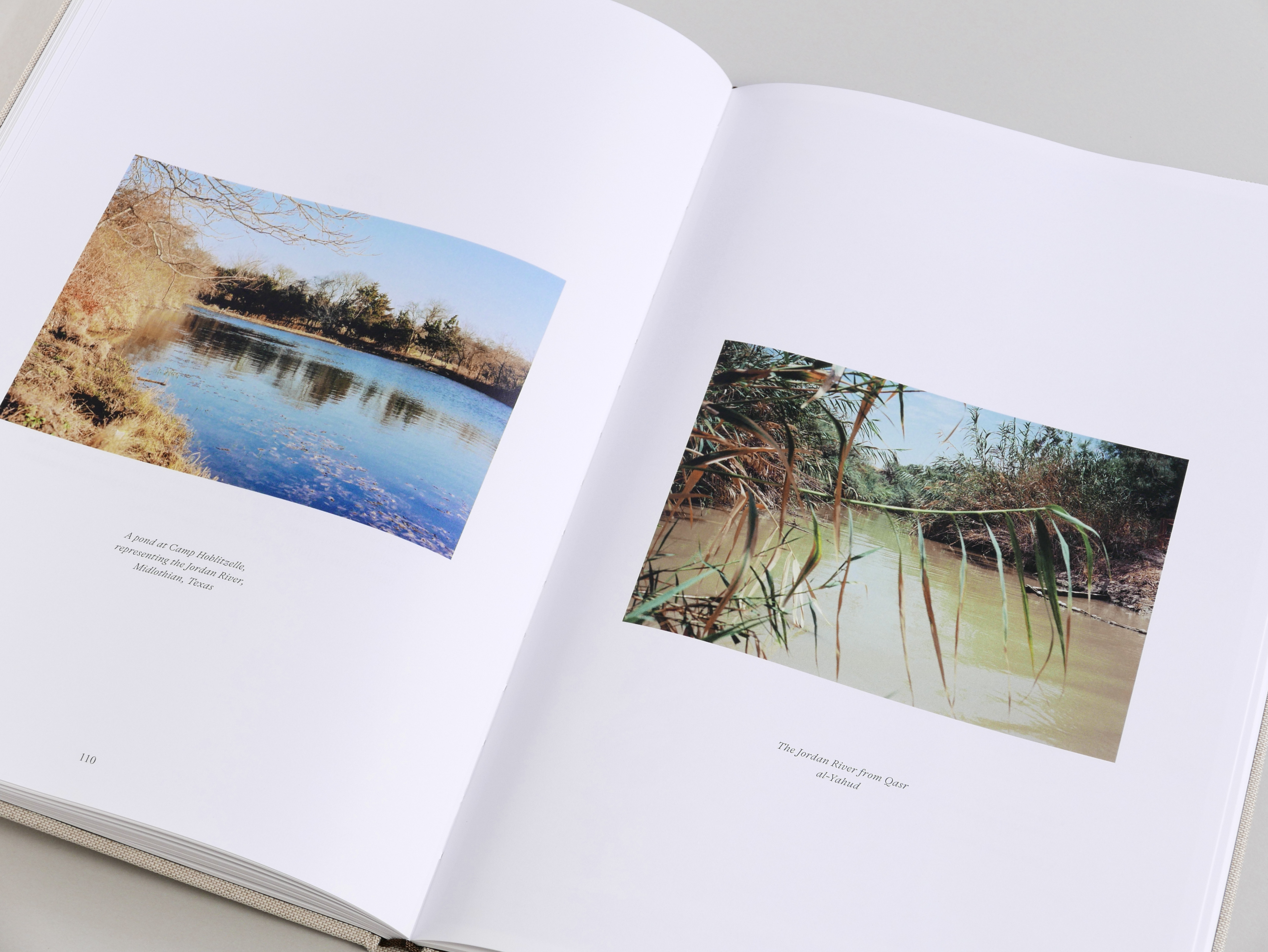
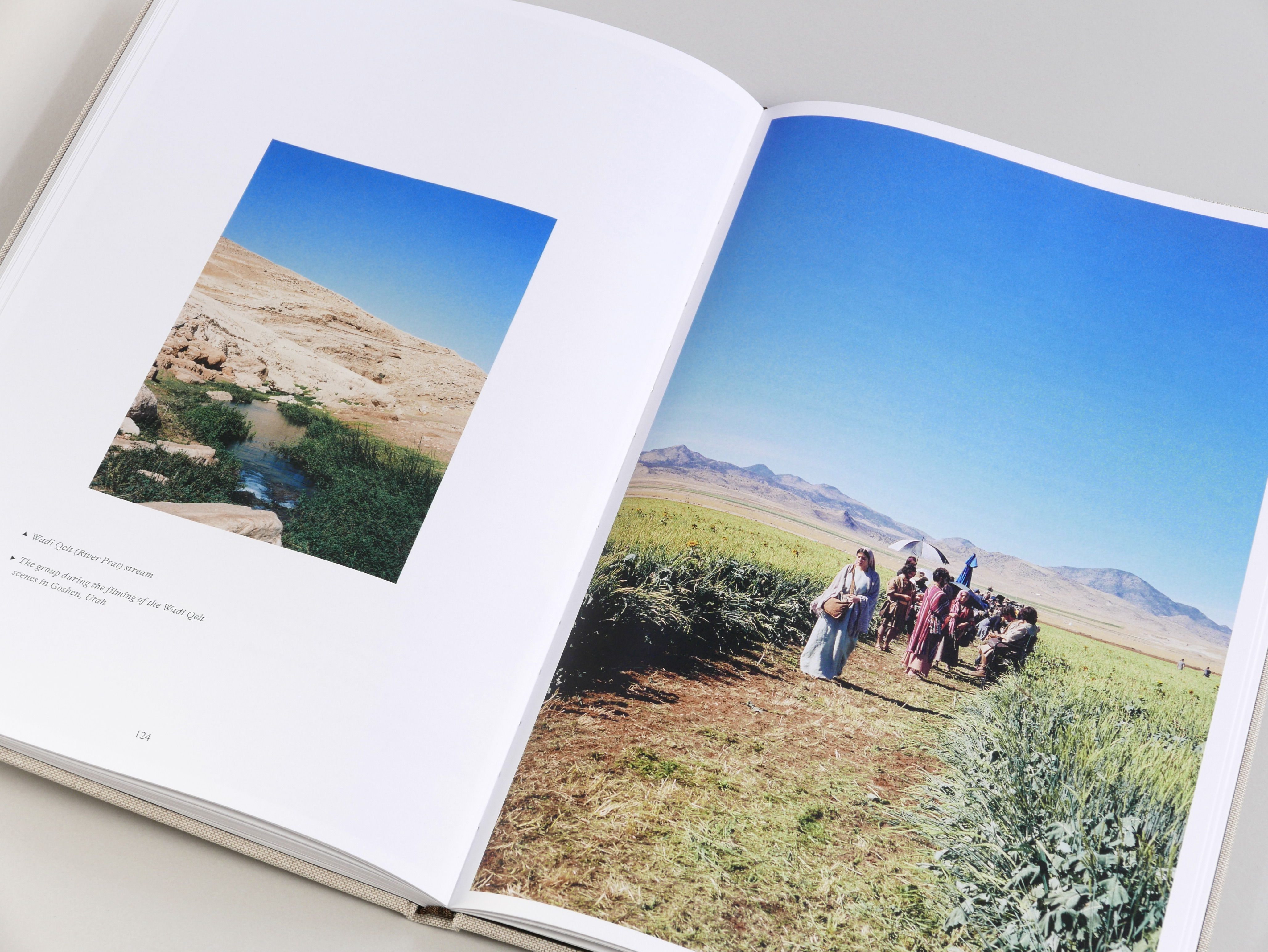
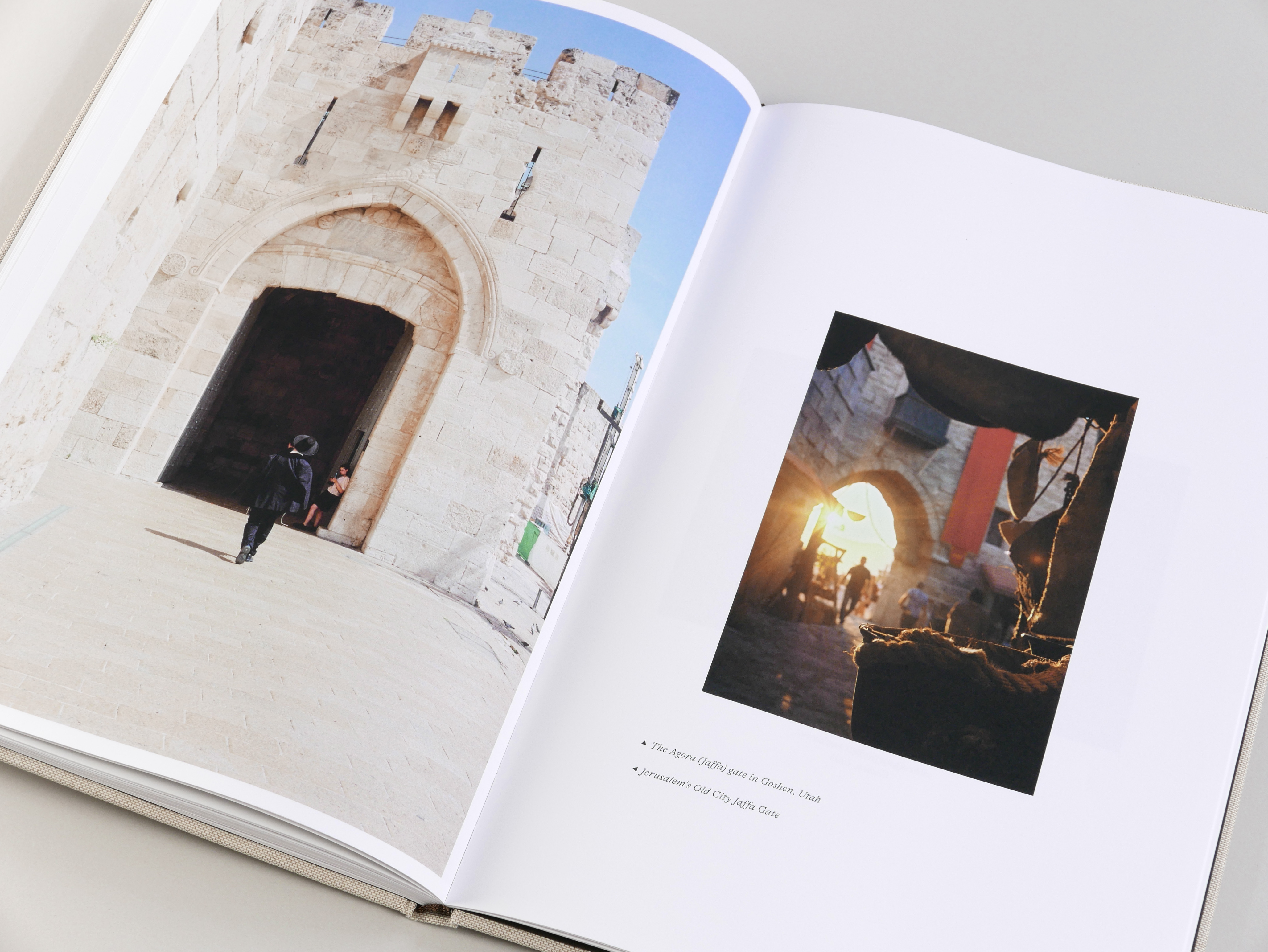
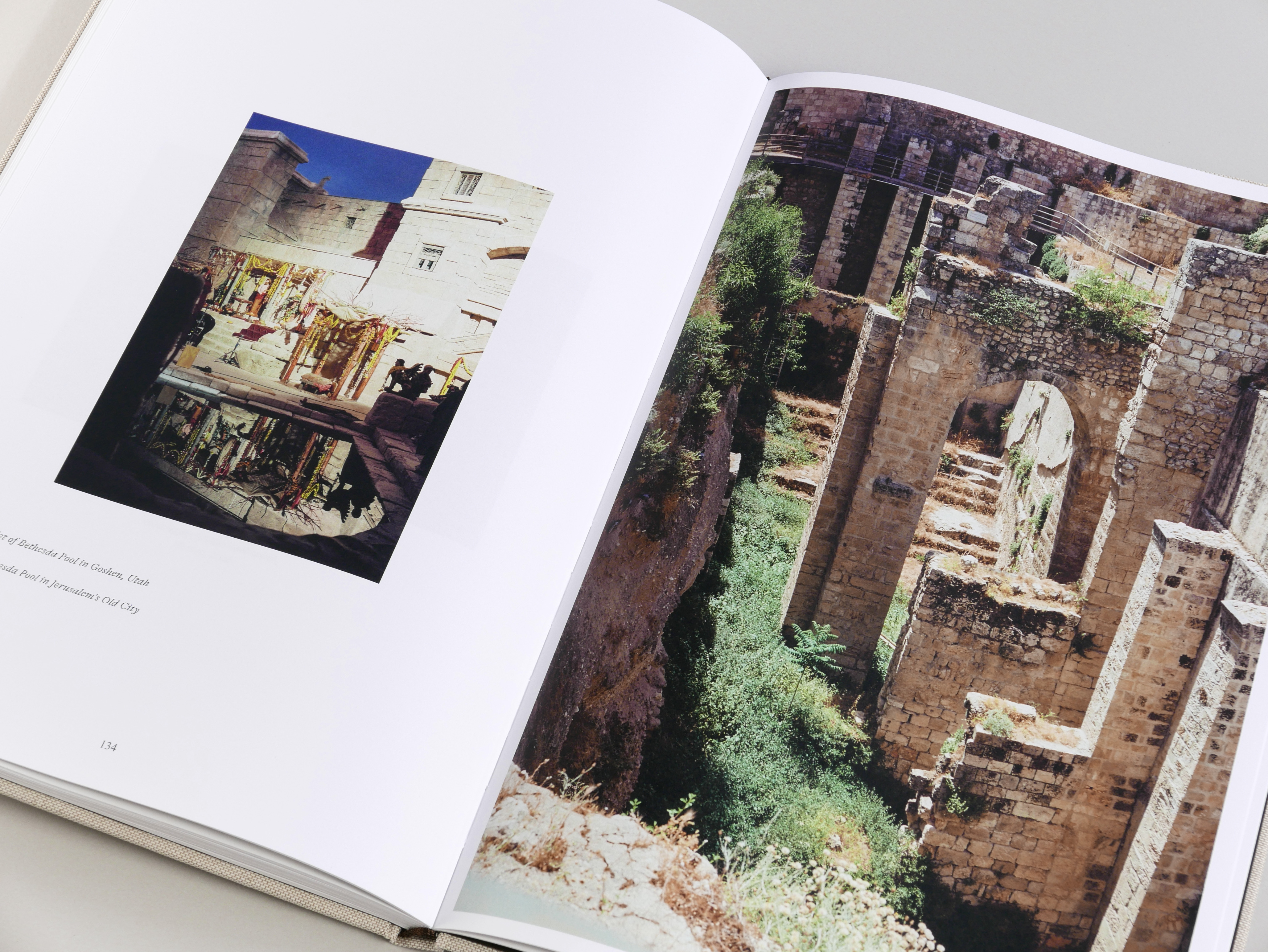
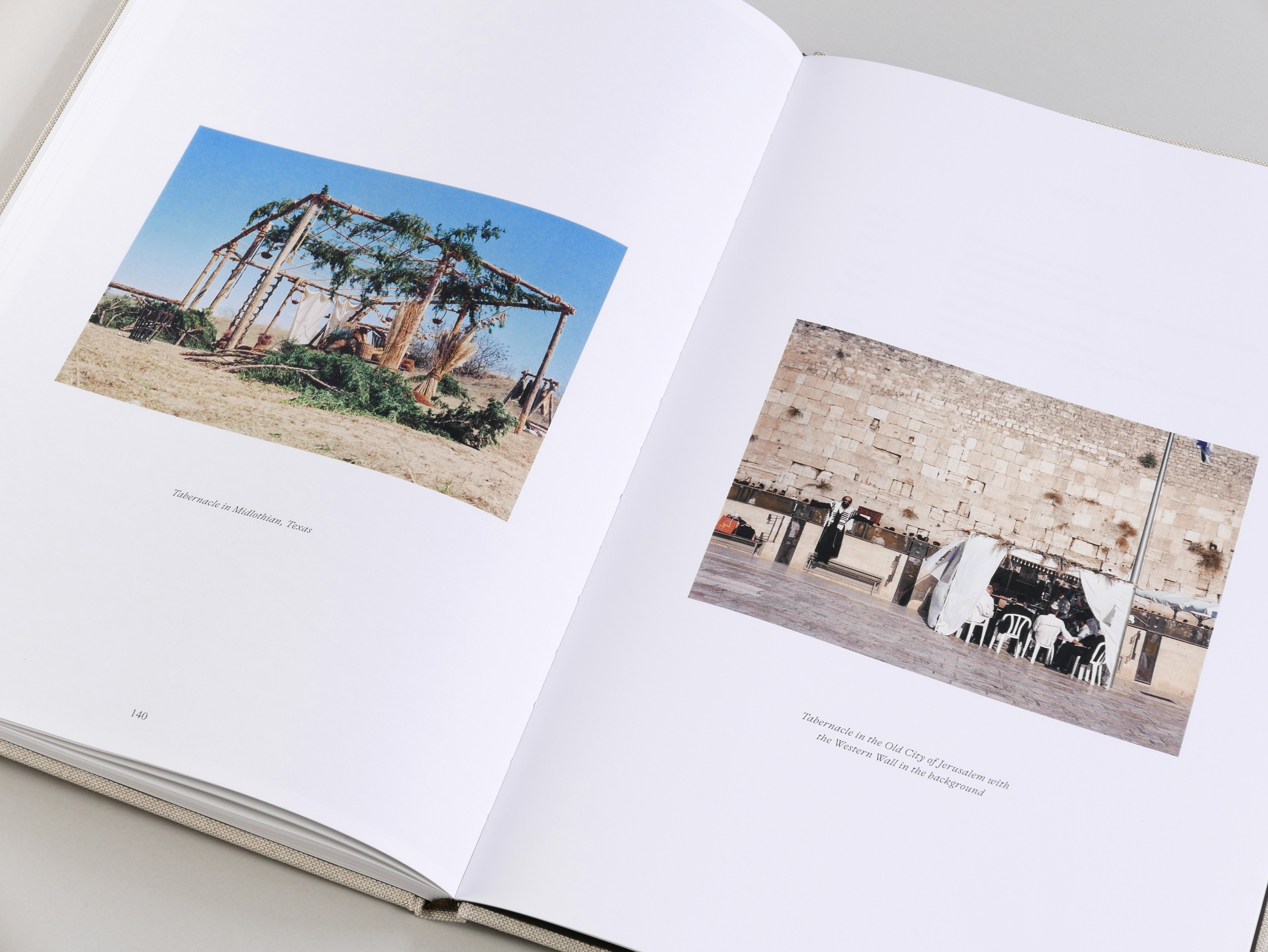

THE ROAD BEGINS IN CAPERNAUM
Photobook for the photographer and actor Shahar Isaac, documenting the filming of the series "The Chosen," Seasons 1 & 2, and the original locations in Israel that inspired the series. All photos were shot on an analog camera by the photographer during the series.
The design was inspired by memorabilia, with the format of the book and the images derived from old postcards. This approach enhances the contrast between ancient times, the present, reality, and staged scenery.
Commissioned Project, 2024Design & Art Direction: Liad Shadmi
Map Illustration: Itai Raveh
Proofreading: Rotem Alter, Philippa Watts
Printing: Robstolk, Amsterdam
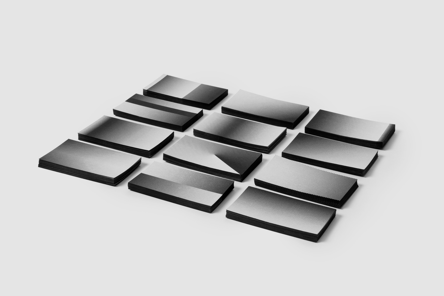
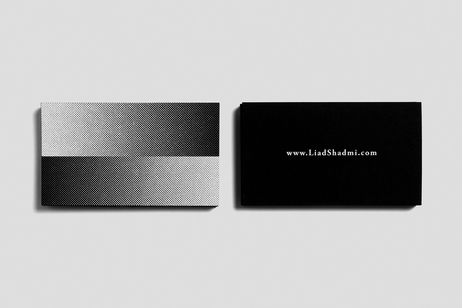
SELF PROMOTED BUSINESS CARDS
Personal Project, 2019
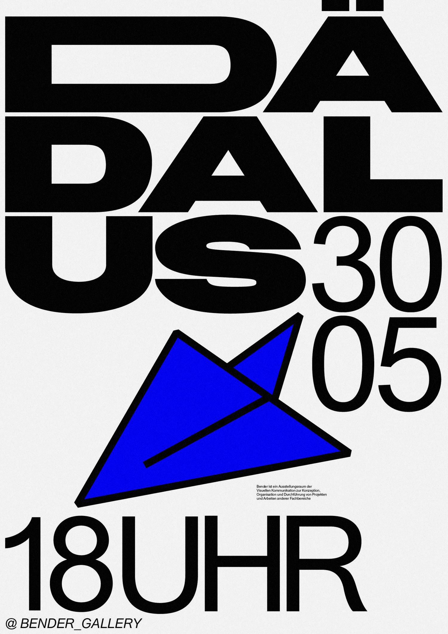
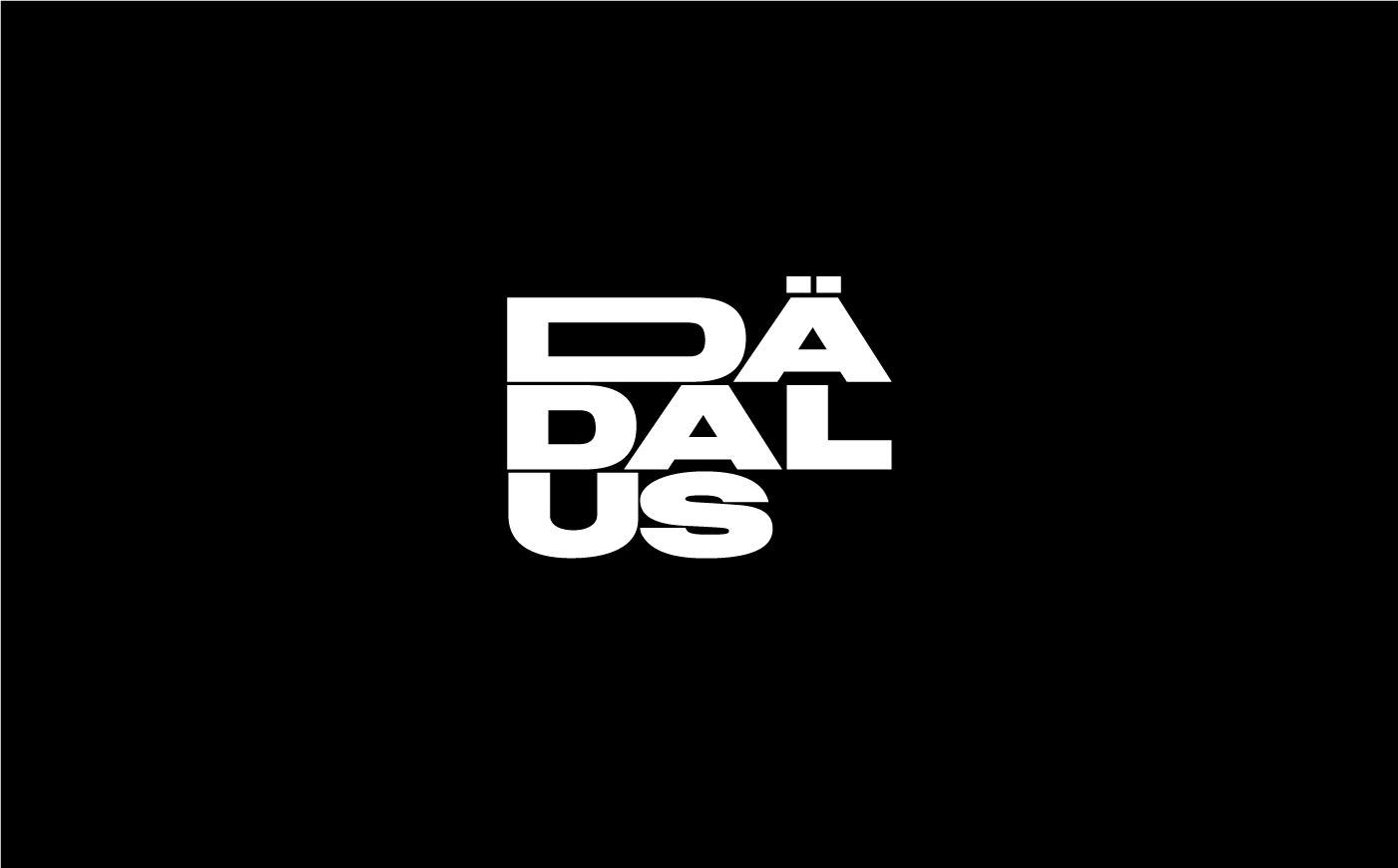
DÄDALUS
Poster & logo design for an exhibition at the Bender Gallery in Weißensee Academy of Art Berlin. The exhibition was about a surreal flight experience.Poster workshop, Student exchange program, Weißensee Academy of Art Berlin, 2018

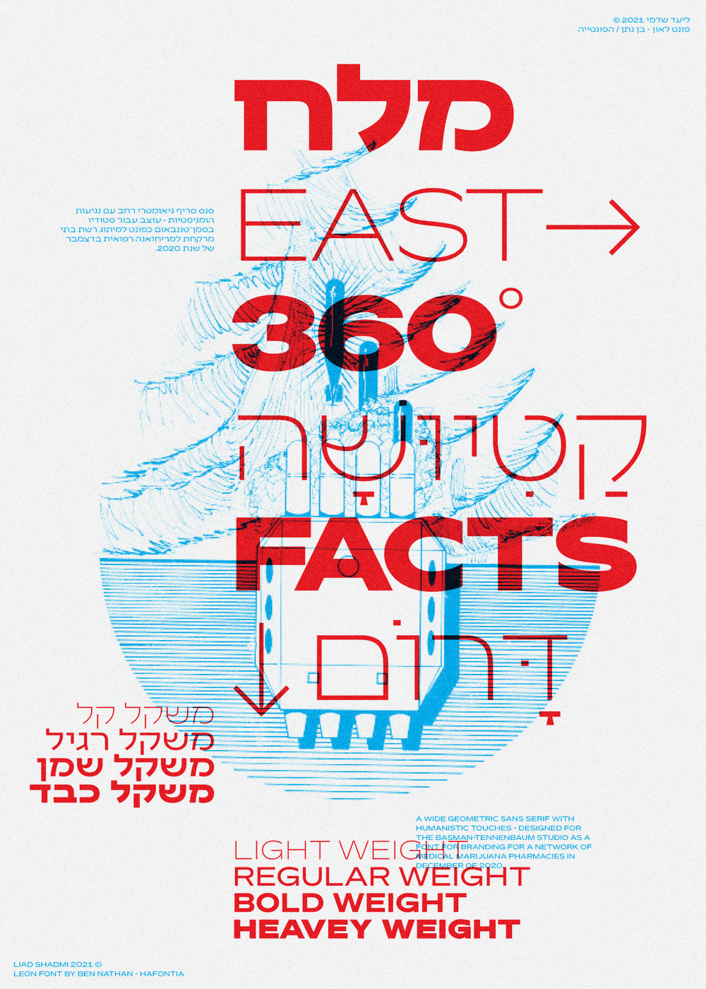
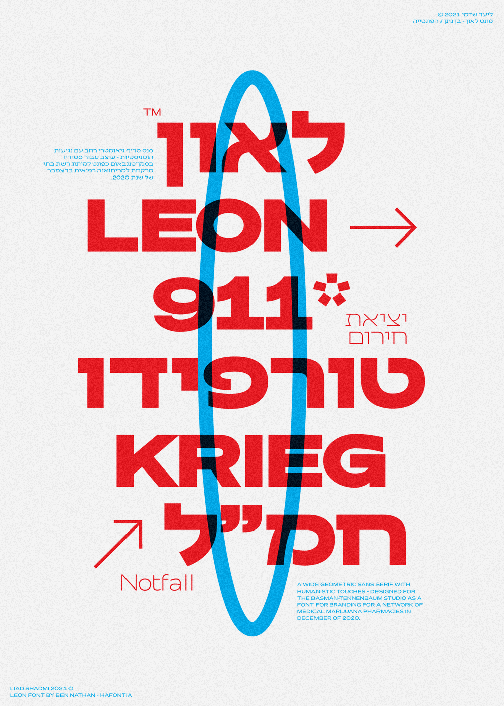
LEON
Type specimen posters for Hafontia Type foundry presenting the new bi-langual “Leon” typeface, Riso Print (34,5X26 cm).Personal Project, 2021

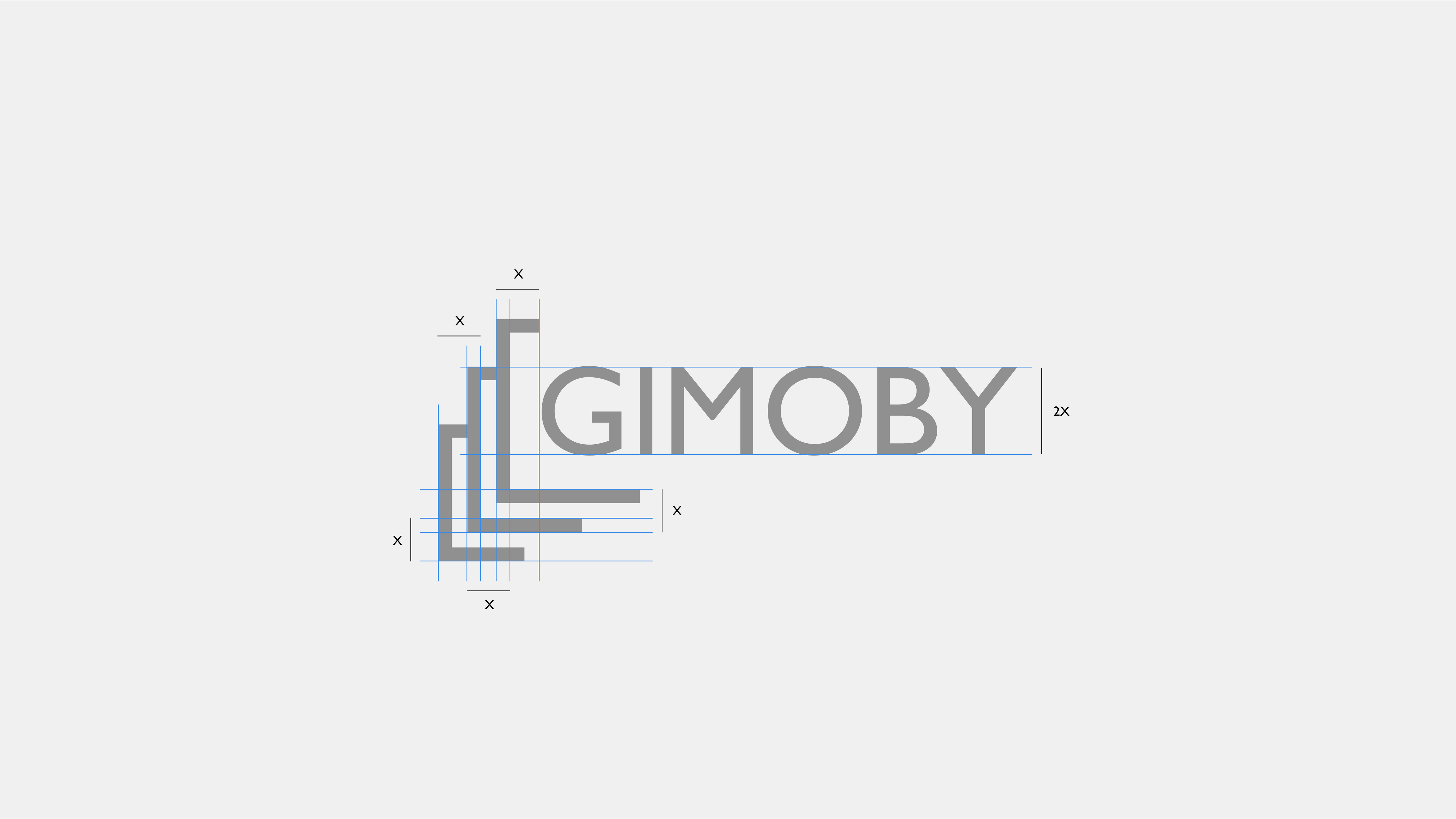

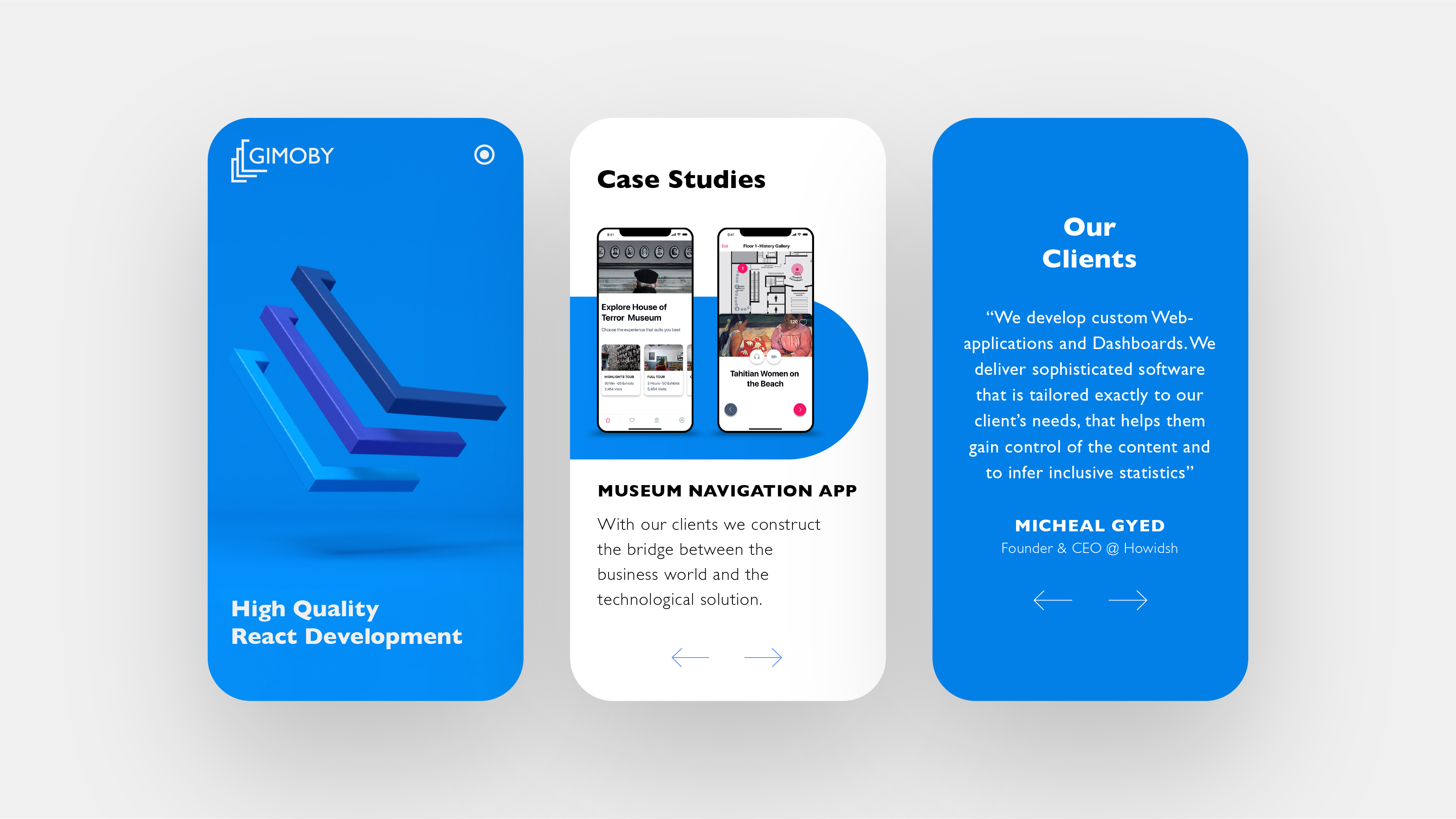
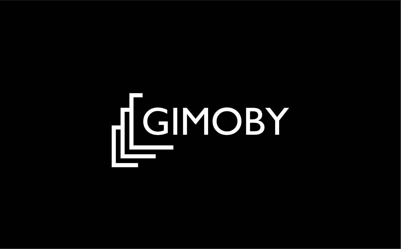
GIMOBY
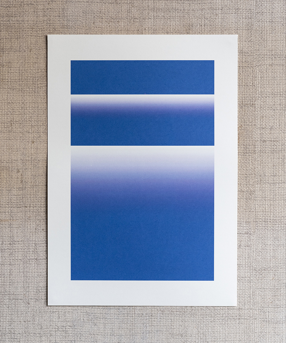
Branding for React software development company based in Tel Aviv. The company provides quick, tailored end-to-end technological development services. Gimoby was established to fill this perpetual need and supply the market with fast, custom-made interfaces.
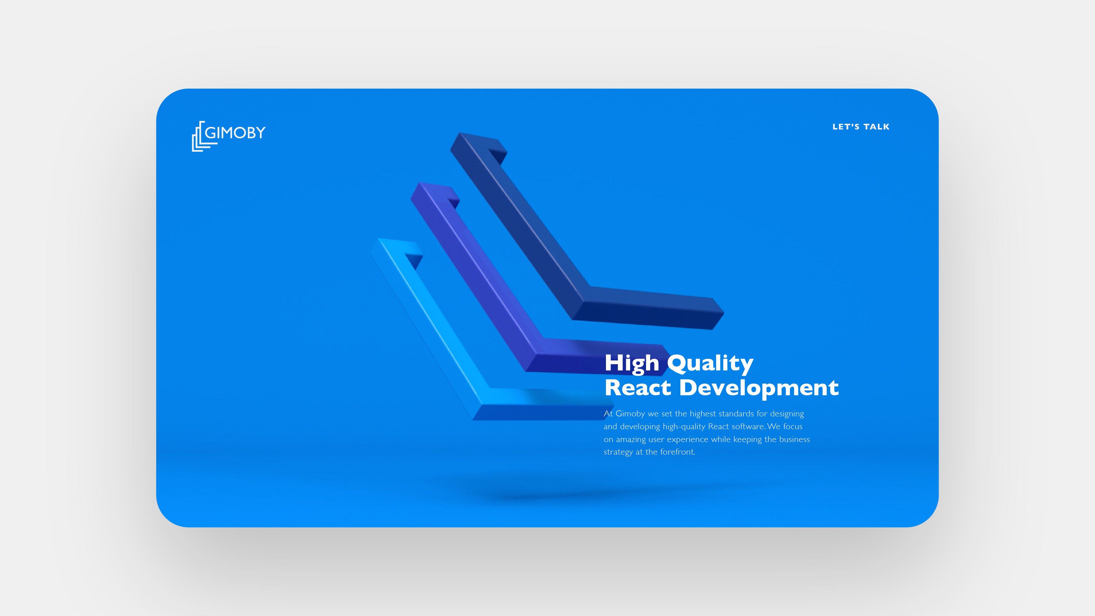
In software development, there are ones and zeros, and then there’s the developer. Three parts that come together and make a program. This concept was used as inspiration for the Gimoby logo: three elements resembling brackets – a shout out to the very brackets used in coding – that merge together to create a three-tiered unit.
The design language is minimalist, evoking vibes of hi-tech innovation with three shades of blue. Here, again, the triple-actor element was brought to life. The banner ...is a three dimensional representation of the logo, to inspire a sense of realness, nearly plastic, of the product itself. This is technology incarnate – ideas and code materializing.
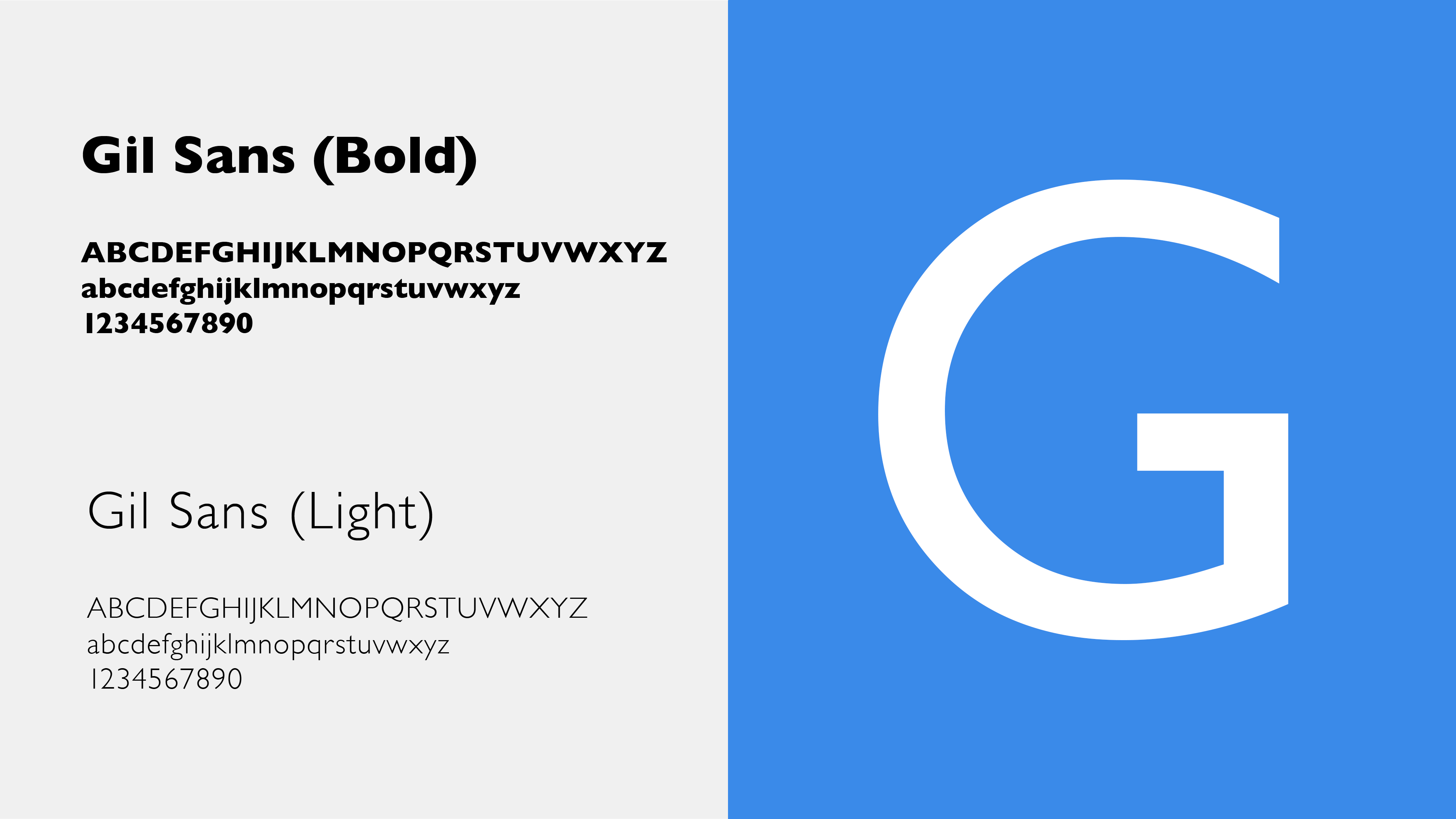
The rest of the website follows a very minimalist theme – linear icons in three variants of blue, alongside black texts in Gill sans, a font associated with a sort of restrained professionalism. The larger bold fonts grab the attention of the reader and attract their attention.
Commissioned work, 2019
Creative Director & Designer: Liad Shadmi
3D Animation: Elad Malca
Icon Animation: Ron Baltuch
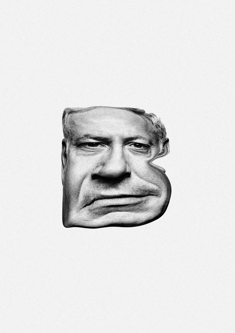
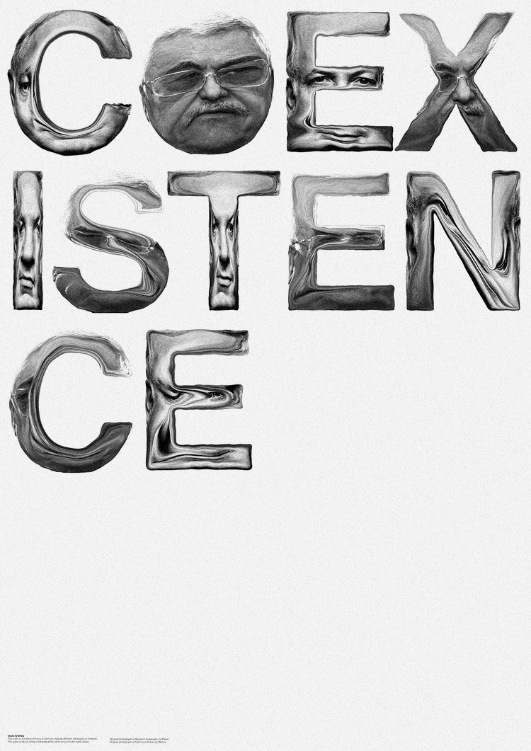
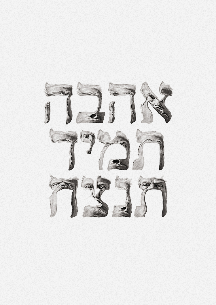
ALLWAYS POLITICAL
Poster serie made from politicians portraits.Personal Project, 2018-2019
Original photograph of Benjamin Netanyahu by Platon
Original photograph of Mahmoud Abbas by Medea
Original photograph of Donald Trump by Finlay Macky/Trunk Archive
Image Credits: Store Closing Everything Must Go, Safe-Sex, Austerity Baking Brand, Kleen (P. 1, 2) and Typography in Circular Motion (P. 1, 9) were shot by Keith Glassman. The Alphabetical Room, Falafel Humanity Shirt (P. 2–4) were shot by Michael Kohls. Falafel Humanity Shirt (P. 1, 5) were shot by Nikolai Dobreff. Make Hummus Not War was shot by Michael Schwarze. Fahrenheit 451 was shot by Revital Topiol. The Road Begins in Capernaum shot by robstolk®. Unverzollt Catalog was shot by Thomas Schmidt.